- Home
- /
- SAS Communities Library
- /
- Primary votes for Hillary Clinton and Donald Trump seen through the le...
- RSS Feed
- Mark as New
- Mark as Read
- Bookmark
- Subscribe
- Printer Friendly Page
- Report Inappropriate Content
Primary votes for Hillary Clinton and Donald Trump seen through the lens of SAS
- Article History
- RSS Feed
- Mark as New
- Mark as Read
- Bookmark
- Subscribe
- Printer Friendly Page
- Report Inappropriate Content
Editor's note: SAS programming concepts in this and other Free Data Friday articles remain useful, but SAS OnDemand for Academics has replaced SAS University Edition as a free e-learning option. Hit the orange button below to start your journey with SAS OnDemand for Academics:
Anyone who has access to any sort of media, whether it’s social, TV, print, or radio, can't ignore that the U.S. presidential election is soon -- and unlike any other.
Being Canadian, my friends and I watch with intense fascination the mechanics behind this election – from the Electoral College to the different types vote-counting machines used across the nation. (In Ontario, we still use pencil and paper ballots). The U.S. has a vastly different process that takes much longer than Canadians experience.
I thought it would be interesting to use SAS to poke around freely available data from the U.S. presidential primary election and (egged on by certain friends) here's what I learned about the selections of Hillary Clinton and Donald Trump in the primaries.
Get the Data
I found a wide variety of datasets on the Election, from Internet memes to Twitter analysis, geospatial data to breakdowns by all sorts of demographics. I wanted to keep this simple, and found a great dataset on Kaggle – you can get the data here.
Get Started with SAS OnDemand for Academics
Getting the data ready
I imported the data into SAS with the Import task, and had no issues. It has just over 24,000 rows and so will give us lots of data to play with.
The Results
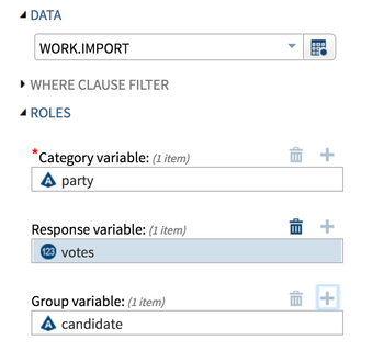
The dataset is fairly straightforward – Party, Candidate, Votes, State, and County. So the first thing I’m going to do is create a simple bar chart looking at Party and the total number of votes by party and candidate.
When I run this, I find out a) I’d forgotten (or didn’t know) that some of these people ran and b) Republicans had significantly more candidates than the Democrats.
I don’t know if that’s a normal trend, if that’s the GOP way, or some other anomaly for this election, but as a data analyst, that’s interesting to me. It looks as though in the primaries, more people were hoping for a Republican outcome, but couldn’t agree on a single candidate.
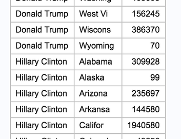
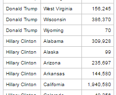
Next, I want to see how the final two candidates fared; to do this I write a simple SQL query:
proc sql;
select candidate, state, sum(votes)
from work.import
where candidate in ('Donald Trump', 'Hillary Clinton')
group by candidate, state
order by candidate, state
I’m selecting the variables I’m interested in, but limiting my results to just Trump and Clinton. As in previous articles on SQL, the Group By and Order By are needed when doing aggregate (summary) statistics like Sum.
In the above image, I’ve scrolled down part way to show you that although this is informative, it’s not easy to make comparisons. Ideally, we would have Clinton and Trump side-by-side, allowing for a more efficient review.
In order to do this, we have to make our SQL query slightly more complicated. I’m again selecting State, but this time I am doing a Sum based on specific criteria – that the Candidate is equal to ‘Donald Trump’ in the first case or equal to ‘Hillary Clinton’ in the second. I then do a sum of all votes.
proc sql;
select state,
sum(case when (candidate = 'Donald Trump') then votes end) as Trump,
sum(case when (candidate = 'Hillary Clinton') then votes end) as Clinton,
sum(votes) as Total
from work.import
group by state
order by state;
quit;
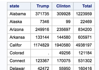
Now when I run my query, I get a much easier table to review and I can clearly see where there are significant differences.
I may want to look into Colorado, however, as it does appear to be odd that 0 votes in the entire state were for Trump. But this still isn’t quite ideal, as having just straight numbers makes comparisons possible, but not easy.
My final query is to take the counts, but also to bring in percentages – this will give a very clear picture of how everything fit together.
proc sql;
select state,
sum(case when (candidate = 'Donald Trump')
    then votes end) as Trump,
sum(case when (candidate = 'Hillary Clinton')
    then votes end) as Clinton,
sum(votes) as total,
100*sum(case when (candidate = 'Donald Trump')
    then votes end) / sum(votes) as Trump_Perc,
100*sum(case when (candidate = 'Hillary Clinton')
    then votes end) / sum(votes) as Clinton_Perc
from work.import
group by state
order by state;
quit;
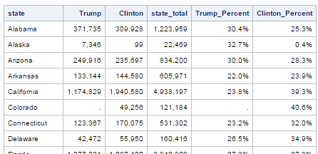
You’ll notice that I’m keeping in the raw counts, as I like to see those, but I’m also calculating the percentages and calling them Clinton_Perc and Trump_Perc. These are the only two additions from the code above.
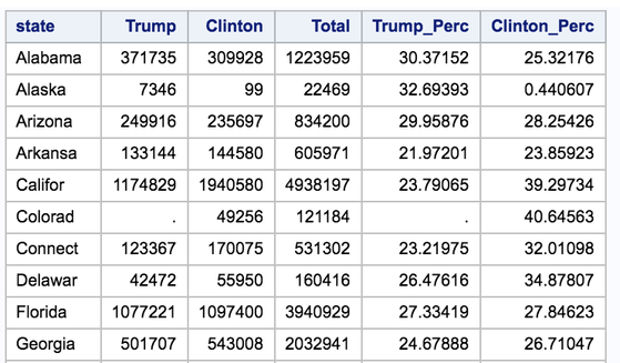
Now when I run this, I get this table:
Very easy to read, making comparisons by percentages simply a matter of going row by row.
Now it’s your turn!
Did you find something else interesting in this data? Share in the comments. I’m glad to answer any questions.
- Mark as Read
- Mark as New
- Bookmark
- Permalink
- Report Inappropriate Content
According to Ballotpedia.org, Republicans in Colorado did not hold a presidential preference poll in 2016. So...that explains it!
- Mark as Read
- Mark as New
- Bookmark
- Permalink
- Report Inappropriate Content
Mystery solved, and a key thing in data analytics - understanding your data! Thanks for clarifying!
Chat soon
Chris
- Mark as Read
- Mark as New
- Bookmark
- Permalink
- Report Inappropriate Content
Election data is always interesting to look at 🙂
I have a few suggestions for this particular data & analysis...
It appears the import truncated some of the text state names. This could happen, for example, when proc import uses only the first few lines of data to 'guess' what length to make the character variables. You can specify guessingrows=all to have it look at all the lines of csv data to determine the necessary lengths when creating the dataset.
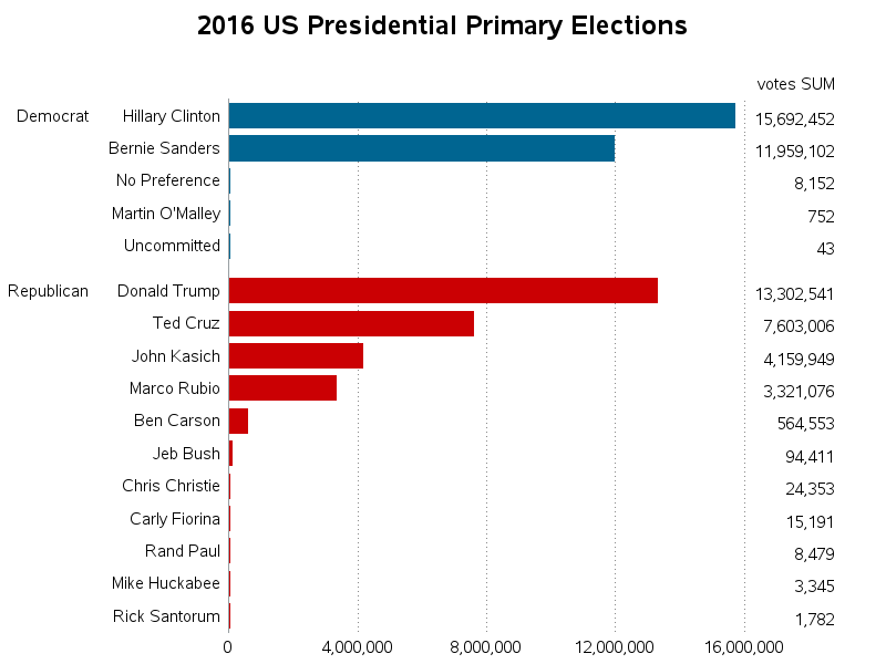
In the bar chart, I notice the axis says it is showing the 'mean' (I'm assuming that's the mean number of votes per state?) I'm not sure that's the value you really want to show - I would think the sum might be more intuitive and useful. Also, rather than making each bar a separate color, and requiring users to look in the color legend to find out which candidate name goes with which bar, I would recommend using a horizontal bar chart so that each name can be printed right beside the bars. Here's a graph I created with Proc Gchart, showing what the data would look like plotted with both of these changes:
In the first SQL table, I would recommend applying a comma format, to make the magnitude of the numbers easier to quickly see (for example, when I first looked at the numbers, it wasn't easy to quickly tell whether they were 10 thousands, 100 thousands, or millions).
And in the 2nd table, rather than multiplying the percents by 100, I would recommend using the percent format, so they are shown with the '%' character - this makes it easier for the user to quickly glance at the values and know they are percents.
- Mark as Read
- Mark as New
- Bookmark
- Permalink
- Report Inappropriate Content
Thanks for posting a comment @GraphGuy - always honoured when such experts read and comment on my writing!
I absolutely agree with you and have learnt that I need to figure out a way to write my blogs more effectively - i try and show "proof of concept" rather than focus on findings in the data, but balancing the two is important. I try and keep this blog to around 1000 words, so may focus on fewer concepts and dig into the data more. Considering I have a post started for tomorrow, I will keep this in mind!
Thanks again for your time (and really interesting comments!). Looking forward to chatting more about this!
Chris

Register Today!
Join us for SAS Innovate 2025, our biggest and most exciting global event of the year, in Orlando, FL, from May 6-9. Sign up by March 14 for just $795.
Free course: Data Literacy Essentials
Data Literacy is for all, even absolute beginners. Jump on board with this free e-learning and boost your career prospects.
Get Started
- Find more articles tagged with:
- Data for learning
- Free Data Friday

