- Home
- /
- Programming
- /
- Graphics
- /
- customizing axis labels in sgplot
- RSS Feed
- Mark Topic as New
- Mark Topic as Read
- Float this Topic for Current User
- Bookmark
- Subscribe
- Mute
- Printer Friendly Page
- Mark as New
- Bookmark
- Subscribe
- Mute
- RSS Feed
- Permalink
- Report Inappropriate Content
I need to plot a horizontal bar chart and will like to make certain labels bold, also with borders and background colors.
I have being struggling with this issue for a while please I need urgent help .
I have included a sample of my program for any one who wish to help
ods listing style=listing;
ods graphics/ width= 10in height=10.81in ;
goptions  gunit=pct rotate=landscape ftext= "Arial";
goptions htext=13pt htitle=15pt gsfname=cgrt1;
ods graphics on / reset=index imagename="test1";

data anno;
 length label $25;
 set test.exports;
 retain function 'text' xsys 'datavalue'  width 80   textweight 'bold' border 'true' linecolor 'lightblue'  fillcolor 'lightblue'  ;
 yc1=melde_grup ;
 label=melde_grup;
  if grup in ("Cars") then x1=-10;
  if grup in ("Electronics") then x1=8;
  if grup in ("Utensils") then x1=11;
  run;

title "my exports";
proc sgplot data=test.exports  sganno=anno pad=(bottom=5%);
styleattrs datacolors=(gray green);
yaxis grid type=discrete discreteorder=data;
hbar type /response=reported group=area  groupdisplay=cluster
                    barwidth=0.8 missing ;
yaxis display=(nolabel) offsetmin=0.05 offsetmax=0.05;
xaxis label='exports in %' grid offsetmin=0.0 offsetmax=0.05;
keylegend / location=outside position=bottomleft across=1 title=""
            exclude=(" ");
run;| order | Type | reported | area | grup |
| 1 | Cars | |||
| 2 | Pegueot | 100 | your_company | Cars |
| 3 | Fiat | 84,1 | your_company | Cars |
| 4 | Nissan | 92,6 | your_company | Cars |
| 5 | Electronics | your_company | ||
| 6 | TV | 15,2 | your_company | Electronics |
| 7 | Radio | 15,2 | your_company | Electronics |
| 8 | Iron | 15,2 | your_company | Electronics |
| 9 | Tablett | 15,2 | your_company | Electronics |
| 10 | Utensils | your_company | ||
| 11 | Frying pan | 70 | your_company | Utensils |
| 12 | Cutleries | your_company | Utensils | |
| 13 | Plates | 12,8 | your_company | Utensils |
| 14 | Knives | your_company | Utensils | |
| 15 | Pots | 50,4 | your_company | Utensils |
| 1 | Cars | |||
| 2 | Pegueot | 88,3 | region | Cars |
| 3 | Fiat | 88,3 | region | Cars |
| 4 | Nissan | region | Cars | |
| 5 | Electronics | 99,6 | region | |
| 6 | TV | 84,7 | region | Electronics |
| 7 | Radio | 73,4 | region | Electronics |
| 8 | Iron | 70,2 | region | Electronics |
| 9 | Tablett | 70,6 | region | Electronics |
| 10 | Utensils | 84,8 | region | |
| 11 | Frying pan | region | Utensils | |
| 12 | Cutleries | 69,1 | region | Utensils |
| 13 | Plates | 68,1 | region | Utensils |
| 14 | Knives | 68,1 | region | Utensils |
| 15 | Pots | 51,7 | region | Utensils |
I want the cars , electronics and Utensils to be bold with borders and background color as in data anno. This is not working fine. I will appreciate any help
Accepted Solutions
- Mark as New
- Bookmark
- Subscribe
- Mute
- RSS Feed
- Permalink
- Report Inappropriate Content
- Mark as New
- Bookmark
- Subscribe
- Mute
- RSS Feed
- Permalink
- Report Inappropriate Content
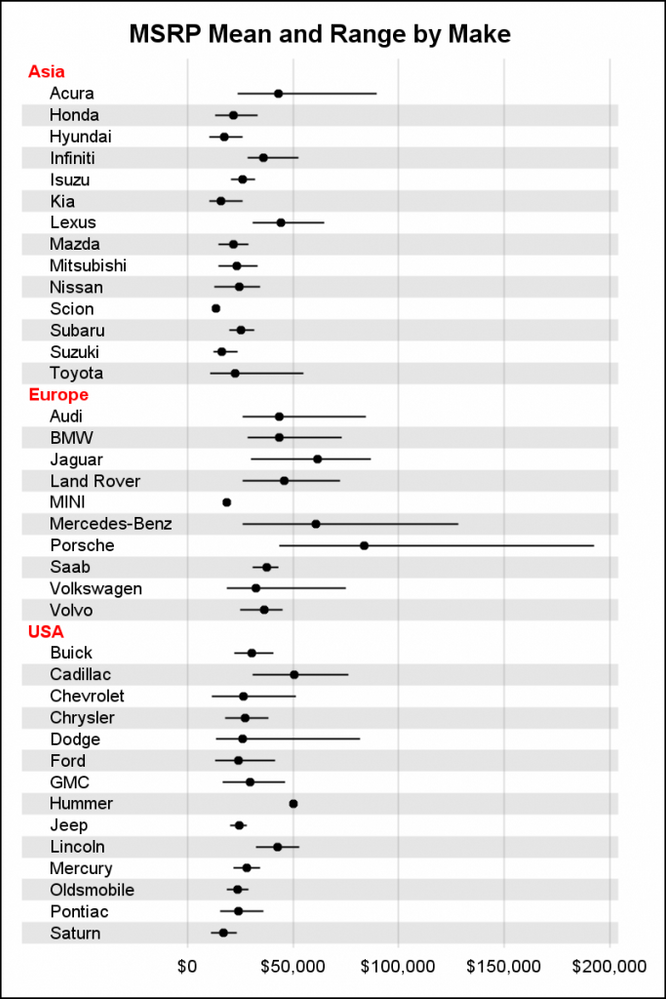
This seems similar in nature to the Forest Plot example in this blog article. You can do some of this using the AxisTable with SAS 9.4 or later. Backgrounds may require some other solution.
- Mark as New
- Bookmark
- Subscribe
- Mute
- RSS Feed
- Permalink
- Report Inappropriate Content
Thanks I will try that to see if it works
- Mark as New
- Bookmark
- Subscribe
- Mute
- RSS Feed
- Permalink
- Report Inappropriate Content
- Mark as New
- Bookmark
- Subscribe
- Mute
- RSS Feed
- Permalink
- Report Inappropriate Content
Thanks a lot Sanjay for your support. When I use the yaxistable in sgplot, it displays the whole group as table on the yaxis.
That is not what I really want. When I use sganno it works but if I apply the same syntax for another procedure with different variable it doesn't . I don't really understand that because every is the same only the variable change.
Anyway if am able to solve that I will leave a post.
Thanks

Register Today!
Join us for SAS Innovate 2025, our biggest and most exciting global event of the year, in Orlando, FL, from May 6-9. Sign up by March 14 for just $795.
Learn how use the CAT functions in SAS to join values from multiple variables into a single value.
Find more tutorials on the SAS Users YouTube channel.
SAS Training: Just a Click Away
Ready to level-up your skills? Choose your own adventure.


