- Home
- /
- Analytics
- /
- Stat Procs
- /
- Re: Suggestions for SGPlot with groups and multiple series
- RSS Feed
- Mark Topic as New
- Mark Topic as Read
- Float this Topic for Current User
- Bookmark
- Subscribe
- Mute
- Printer Friendly Page
- Mark as New
- Bookmark
- Subscribe
- Mute
- RSS Feed
- Permalink
- Report Inappropriate Content
Anyone have suggestions for simple ways to present this sort of data: multiple series with groups. The following codes doesn't work, the legend only has information for the groups in the first series. If I can't get both the series and groups in the legend, I'd like to have the series in the legend with a consistent formatting for the groups (eg group B always dotted lines).
data temp;
input x grp $ s1 s2 s3;
cards;
1 A 1 1 1
2 A 2 3 4
3 A 1 2 3
1 B 1.2 1.2 1.2
2 B 2.2 3.2 4.2
3 B 1.2 2.2 3.2
;
run;

proc sgplot data=temp;
series x=x y=s1 /markers group=grp ;
series x=x y=s2 /markers group=grp ;
series x=x y=s3 /markers group=grp ;
run;
Accepted Solutions
- Mark as New
- Bookmark
- Subscribe
- Mute
- RSS Feed
- Permalink
- Report Inappropriate Content
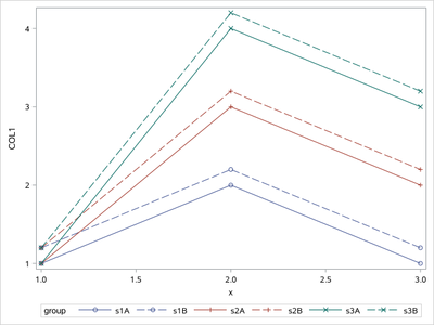
Then you need to change your data structure by proc transpose.
data temp;
input x grp $ s1 s2 s3;
cards;
1 A 1 1 1
2 A 2 3 4
3 A 1 2 3
1 B 1.2 1.2 1.2
2 B 2.2 3.2 4.2
3 B 1.2 2.2 3.2
;
run;

proc sort data=temp;by grp x;run;
proc transpose data=temp out=temp2;
by grp x;
var s:;
run;
proc sort data=temp2 out=temp3;by _name_ grp x;run;
data temp4;
 set temp3;
 group=cats(_name_,grp);
run;
proc sgplot data=temp4;
series x=x y=col1/markers group=group grouplc=_name_ grouplp=grp groupms=_name_ groupmc=_name_;
run;
- Mark as New
- Bookmark
- Subscribe
- Mute
- RSS Feed
- Permalink
- Report Inappropriate Content
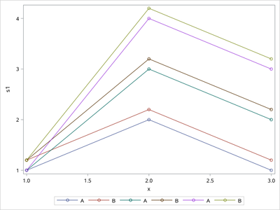
You want this ?
data temp;
input x grp $ s1 s2 s3;
cards;
1 A 1 1 1
2 A 2 3 4
3 A 1 2 3
1 B 1.2 1.2 1.2
2 B 2.2 3.2 4.2
3 B 1.2 2.2 3.2
;
run;

proc sgplot data=temp;
series x=x y=s1 /markers group=grp name='a' ;
series x=x y=s2 /markers group=grp name='b';
series x=x y=s3 /markers group=grp name='c';
keylegend 'a' 'b' 'c';
run;
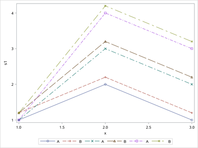
Or this one ?
ods graphics/attrpriority=none;
proc sgplot data=temp;
series x=x y=s1 /markers group=grp name='a' ;
series x=x y=s2 /markers group=grp name='b';
series x=x y=s3 /markers group=grp name='c';
keylegend 'a' 'b' 'c';
run;
- Mark as New
- Bookmark
- Subscribe
- Mute
- RSS Feed
- Permalink
- Report Inappropriate Content
- Mark as New
- Bookmark
- Subscribe
- Mute
- RSS Feed
- Permalink
- Report Inappropriate Content
Then you need to change your data structure by proc transpose.
data temp;
input x grp $ s1 s2 s3;
cards;
1 A 1 1 1
2 A 2 3 4
3 A 1 2 3
1 B 1.2 1.2 1.2
2 B 2.2 3.2 4.2
3 B 1.2 2.2 3.2
;
run;

proc sort data=temp;by grp x;run;
proc transpose data=temp out=temp2;
by grp x;
var s:;
run;
proc sort data=temp2 out=temp3;by _name_ grp x;run;
data temp4;
 set temp3;
 group=cats(_name_,grp);
run;
proc sgplot data=temp4;
series x=x y=col1/markers group=group grouplc=_name_ grouplp=grp groupms=_name_ groupmc=_name_;
run;
- Mark as New
- Bookmark
- Subscribe
- Mute
- RSS Feed
- Permalink
- Report Inappropriate Content
- Reshape the data to use one series with groups (and use the 9.4m2+ options to control the group colours and patterns).
- I guess reshaping the data and using multiple series without groups would also work (but not as elegant).
Thanks.
- Mark as New
- Bookmark
- Subscribe
- Mute
- RSS Feed
- Permalink
- Report Inappropriate Content
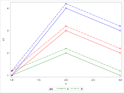
Yes. You are right. The following code is more simple than the post of mine above (GROUPLC= option make me to complcate the code).
data temp;
input x grp $ s1 s2 s3;
cards;
1 A 1 1 1
2 A 2 3 4
3 A 1 2 3
1 B 1.2 1.2 1.2
2 B 2.2 3.2 4.2
3 B 1.2 2.2 3.2
;
run;

ods graphics/attrpriority=none;
proc sgplot data=temp nocycleattrs;
series x=x y=s1 /markers group=grp lineattrs=(color=green) markerattrs=(symbol=plus);
series x=x y=s2 /markers group=grp lineattrs=(color=red) markerattrs=(symbol=circle);
series x=x y=s3 /markers group=grp lineattrs=(color=blue) markerattrs=(symbol=X);
run;
- Mark as New
- Bookmark
- Subscribe
- Mute
- RSS Feed
- Permalink
- Report Inappropriate Content
- Mark as New
- Bookmark
- Subscribe
- Mute
- RSS Feed
- Permalink
- Report Inappropriate Content
- Mark as New
- Bookmark
- Subscribe
- Mute
- RSS Feed
- Permalink
- Report Inappropriate Content
Another option might be to move to SGPANEL and display each series in a different graph:
Using the data set Temp3 as created by @Ksharp
proc sgpanel data=temp3;
   panelby _name_;
   series x=x y=col1/markers group=grp ;
   label _name_ ='Series';
run;
If each series were to have more than 2 values for Grp, or if values are very similar or more complex it might be hard to tell things apart based just on the line style attributes. Using options in Sgpanel to produce on column of graphs would place them one over another for possibly easier interpretation.
Catch up on SAS Innovate 2026
Dive into keynotes, announcements and breakthroughs on demand.
Explore Now →ANOVA, or Analysis Of Variance, is used to compare the averages or means of two or more populations to better understand how they differ. Watch this tutorial for more.
Find more tutorials on the SAS Users YouTube channel.


