- Home
- /
- SAS Viya
- /
- Visual Analytics
- /
- Re: getting 3d plot right
- RSS Feed
- Mark Topic as New
- Mark Topic as Read
- Float this Topic for Current User
- Bookmark
- Subscribe
- Mute
- Printer Friendly Page
- Mark as New
- Bookmark
- Subscribe
- Mute
- RSS Feed
- Permalink
- Report Inappropriate Content
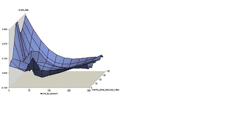
I am trying a 3d plot using proc g3grid and proc g3d.
But it doesn't seem to be giving the information the way i expected.
The g3grid seems to be modified the original values(maybe standardize or something). How can i get the same graph using original values in axis? I tried using noscale option, but that seems to have no effect.
Also the x axis values seem to be changing not horizontally but inside the graph(which should be for months).
I want to similar scale as g3d procedure, but graph as smooth as splines.

- Mark as New
- Bookmark
- Subscribe
- Mute
- RSS Feed
- Permalink
- Report Inappropriate Content
It helps to post the code you used, some data in the form of a datastep and a bit more detailed description of how the output doesn't match your expectations.
G3GRID does do interpolation so it is possible that some of the results for x,y pairs without data in the original set may result in a Z value a bit outside of the original data range. Also, from the online documentation for G3GRID:
by default, the interpolation is performed after both (horizontal) variables are similarly scaled, because the interpolation methods assume that the scales of x and y are comparable.
But that is only for the interpolation, the original X Y values are in the results.
Did you use the SPLINE and SMOOTH= options in G3Grid?
- Mark as New
- Bookmark
- Subscribe
- Mute
- RSS Feed
- Permalink
- Report Inappropriate Content
proc g3grid data=x out=x1;where cnt>100;
grid months_since_last_had_video*tenure_by_account=event_rate/noscale spline ;
run;
proc g3d data=x ;
plot months_since_last_had_video*tenure_by_account=event_rate;
run;
Now I want the scale to be remained original while splines are performed on data
Catch up on SAS Innovate 2026
Dive into keynotes, announcements and breakthroughs on demand.
Explore Now →See how to use one filter for multiple data sources by mapping your data from SAS’ Alexandria McCall.
Find more tutorials on the SAS Users YouTube channel.


