- Home
- /
- SAS Viya
- /
- Visual Analytics
- /
- SAS VA Plot inputs and outputs chart
- RSS Feed
- Mark Topic as New
- Mark Topic as Read
- Float this Topic for Current User
- Bookmark
- Subscribe
- Mute
- Printer Friendly Page
- Mark as New
- Bookmark
- Subscribe
- Mute
- RSS Feed
- Permalink
- Report Inappropriate Content
Hi, all!
I have a dataset like this:
client_ID| open_date | close_date
abc123 | yyyy-mm-dd | yyyy-mm-dd
I wonder how I can plot in SAS VA a chart of number of opened and minus number of closed clients by years?
- Mark as New
- Bookmark
- Subscribe
- Mute
- RSS Feed
- Permalink
- Report Inappropriate Content
I'd created a couple of calculated items to show open and closed calls
something like
IF ( 'close_date'n Missing )
RETURN 0
ELSE 1
then an aggregated measure
Sum [_ByGroup_] ('closed'n)to aggregate
If you want open - closed would be something like
Sum [_ByGroup_] ('open'n) - Sum [_ByGroup_] ('closed'n)Then use the aggregated measures in your chart object
- Mark as New
- Bookmark
- Subscribe
- Mute
- RSS Feed
- Permalink
- Report Inappropriate Content

I need a graph like this. I've tried to group but it doesn't plot in one chart.
- Mark as New
- Bookmark
- Subscribe
- Mute
- RSS Feed
- Permalink
- Report Inappropriate Content
Can you post some sample data?
- Mark as New
- Bookmark
- Subscribe
- Mute
- RSS Feed
- Permalink
- Report Inappropriate Content
Sorry, but I can't send you data. All I can tell is just that datatable consists of 3 columns: client_ID, open_date, close_date. Everyone has open-date but only someone has close date.
I need to show how many clients has opened and closed by year. It's very simple to do in Excel. But I'm creating a dashboard in SAS VA for web-site. I've tried to use barchart and count clients grouping by date, but such approach doesn't allow to put datasets on the same plot. I'm puzzled.
- Mark as New
- Bookmark
- Subscribe
- Mute
- RSS Feed
- Permalink
- Report Inappropriate Content
Hi,
What goes on the Y axis? ClientID?
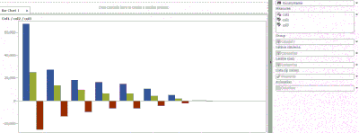
I have done a really quick exampe based on the formula I described above, mine looks like
- Mark as New
- Bookmark
- Subscribe
- Mute
- RSS Feed
- Permalink
- Report Inappropriate Content
Number of clients on Y-axis and years on X-axis.
- Mark as New
- Bookmark
- Subscribe
- Mute
- RSS Feed
- Permalink
- Report Inappropriate Content
Have a look at how I set up the roles in my example, should give you that (unless I've missunderstood)
If year is a measure, duplicate it (right click on it) and set the new version as a category (another right click) to allow you to select it as the category (x-axis)
Catch up on SAS Innovate 2026
Dive into keynotes, announcements and breakthroughs on demand.
Explore Now →See how to use one filter for multiple data sources by mapping your data from SAS’ Alexandria McCall.
Find more tutorials on the SAS Users YouTube channel.


