- Home
- /
- SAS Viya
- /
- Visual Analytics
- /
- Problems with custom graph - line and stacked bar
- RSS Feed
- Mark Topic as New
- Mark Topic as Read
- Float this Topic for Current User
- Bookmark
- Subscribe
- Mute
- Printer Friendly Page

- Mark as New
- Bookmark
- Subscribe
- Mute
- RSS Feed
- Permalink
- Report Inappropriate Content
Hi,
I need to create the following stacked bar - line graph:
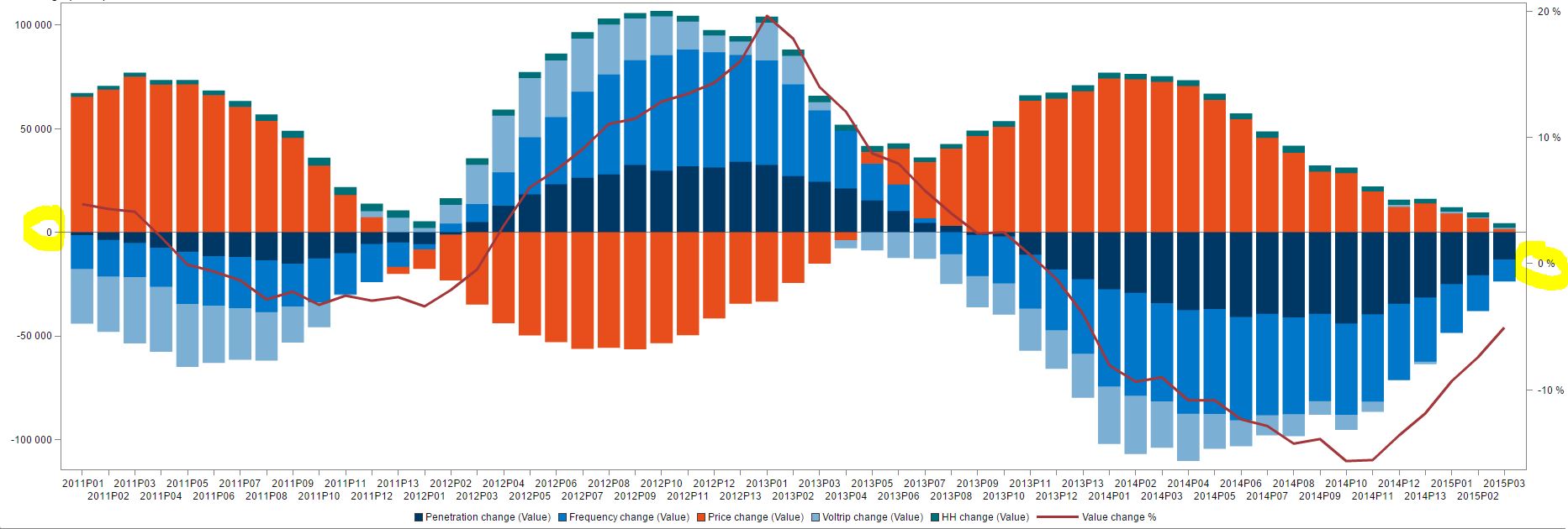
On the left Y axis, is the value change (in absolute value stacked bars), and on the right Y axis is the %-change in value (Line). All of this is ok, BUT, I need the 0 line to be at the same point for both axes (in the middle). As you can see here, the 0-value is a bit lower on the right Y-axis, and this can quickly be misleading. So is there a way for me to define so that the 0-axis would be the same for both axes?
Greatful for any answers ![]()
Br,
Kia

- Mark as New
- Bookmark
- Subscribe
- Mute
- RSS Feed
- Permalink
- Report Inappropriate Content
Which proc are you using to create your bar-line graph?
(there are a couple of different ways to create bar-lines in SAS, and the answer depends on which you are using)

- Mark as New
- Bookmark
- Subscribe
- Mute
- RSS Feed
- Permalink
- Report Inappropriate Content

- Mark as New
- Bookmark
- Subscribe
- Mute
- RSS Feed
- Permalink
- Report Inappropriate Content
Kia,
might sound simple, but could you use forced min-max axes values.
so 100/-100 and 20/-20
greetings, Peter

Don't miss out on SAS Innovate - Register now for the FREE Livestream!
Can't make it to Vegas? No problem! Watch our general sessions LIVE or on-demand starting April 17th. Hear from SAS execs, best-selling author Adam Grant, Hot Ones host Sean Evans, top tech journalist Kara Swisher, AI expert Cassie Kozyrkov, and the mind-blowing dance crew iLuminate! Plus, get access to over 20 breakout sessions.
See how to use one filter for multiple data sources by mapping your data from SAS’ Alexandria McCall.

Find more tutorials on the SAS Users YouTube channel.
-
3 replies
-
05-04-2015 09:22 AM
-
1375 views
-
0 likes
-
4 in conversation
-
