- Home
- /
- SAS Viya
- /
- Visual Analytics
- /
- How to remove white space aroung a gchart pie graph ?
- RSS Feed
- Mark Topic as New
- Mark Topic as Read
- Float this Topic for Current User
- Bookmark
- Subscribe
- Mute
- Printer Friendly Page
- Mark as New
- Bookmark
- Subscribe
- Mute
- RSS Feed
- Permalink
- Report Inappropriate Content
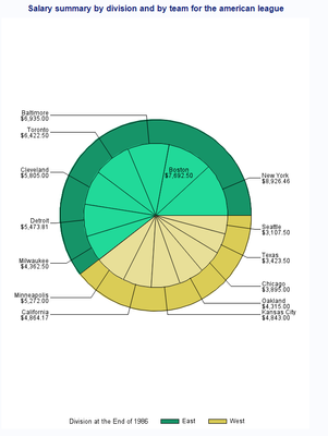
I want to display my data with a circular graph. I tried using the proc gchart procedure, but I find the white space around the graph very annoying and I would like to remove it.
Here is my code.
title "Salary summary by division and by team for the american league";
proc gchart data=sashelp.baseball ;
where league="American";
   pie  division / detail=team
              detail_value=best
              detail_slice=best
			  detail_threshold=0.0001
              legend
			  sumvar=salary
			  noheading
   ;
	format salary dollar12.2;
run;
quit;
And here is below the image it creates for me. See how the white space above and below the figure is abnoxiously large for nothing ? How can I remove this white space ?
I don't know it it makes a difference, but ultimately I want to export this figure to Word using a ods rtf statement.
- Mark as New
- Bookmark
- Subscribe
- Mute
- RSS Feed
- Permalink
- Report Inappropriate Content
You might investigate the GOPTIONS settings for VSIZE or YMAX. VSIZE specifies the height of the graphics output area, YMAX is similar but may have technical differences because these are device based parameters. So the interpretation may be interchangeable for image files or not...
Catch up on SAS Innovate 2026
Dive into keynotes, announcements and breakthroughs on demand.
Explore Now →See how to use one filter for multiple data sources by mapping your data from SAS’ Alexandria McCall.
Find more tutorials on the SAS Users YouTube channel.


