- Home
- /
- SAS Viya
- /
- Visual Analytics
- /
- Display rules in Crosstabs
- RSS Feed
- Mark Topic as New
- Mark Topic as Read
- Float this Topic for Current User
- Bookmark
- Subscribe
- Mute
- Printer Friendly Page
- Mark as New
- Bookmark
- Subscribe
- Mute
- RSS Feed
- Permalink
- Report Inappropriate Content
Is it possible to apply display rules to only one categorical value instead for all value in a column.
For example, in the attached crosstab can I apply display rules to only FICO bucket ">=660" if Percent of column total is less than 70%?

Accepted Solutions
- Mark as New
- Bookmark
- Subscribe
- Mute
- RSS Feed
- Permalink
- Report Inappropriate Content
Hi @akychong,
I've thought of a workaround that hopefully works for you. In the example below, we want to only highlight percentages > 7.8% where Produc Brand = Novelty. By default, a display rule defined on Frequency Percent would highlight cells in the Toy row as well.
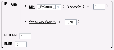
Solution: create a flag that is 1 only if the logic above is true (Frequency Percent > 7.8% and Produc Brand = Novelty), otherwise it's 0, then use this flag to define the display rule.
Downside: the new flag column needs to be added to the crosstab so it can be used in the display rule.
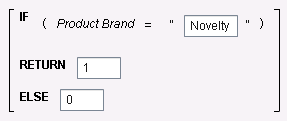
The first thing we need to do is identify the rows for Novelty. We do that by creating a calculated item called Is Novelty:
Next we are going to create the Flag as an aggregated measure:
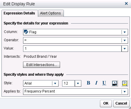
Now we can add the Flag in the crosstab and define the display rule that looks like this (that's the only display rule needed - you can remove the one used initially):
To minimize the side effect and make the Flag column less noticeable, you can rename it to . (a dot) and define a display rule for this column that makes the font color the same as the background color.
Best,
Renato
- Mark as New
- Bookmark
- Subscribe
- Mute
- RSS Feed
- Permalink
- Report Inappropriate Content
Has there been any progress on this since 2016?
Visual Analytics is generally used to present reports to senior management. Having an unnecessary column like that just does not sound right.
Regards
- Mark as New
- Bookmark
- Subscribe
- Mute
- RSS Feed
- Permalink
- Report Inappropriate Content
You can now add such columns as a Hidden column which prevents them from being displayed, but still allows conditional formatting to be based on them.
- Mark as New
- Bookmark
- Subscribe
- Mute
- RSS Feed
- Permalink
- Report Inappropriate Content
@AndreaZimmerman Thanks for the update, but this isn't an option in crosstab objects which the original question is about, at least not in version 7.51 (build date = August 2021).
I have a similar use case: I have a cross tab with two aggregated measures, say x and y, I want to apply conditional formatting based on the difference between those two. Said difference is captured in a third aggregated measure (x - y basically).
The solution from @Renato_sas works functionally, but it's not pretty - if I can somehow fully hide the column which captures the difference that'd be great.
Don't miss out on SAS Innovate - Register now for the FREE Livestream!
Can't make it to Vegas? No problem! Watch our general sessions LIVE or on-demand starting April 17th. Hear from SAS execs, best-selling author Adam Grant, Hot Ones host Sean Evans, top tech journalist Kara Swisher, AI expert Cassie Kozyrkov, and the mind-blowing dance crew iLuminate! Plus, get access to over 20 breakout sessions.
See how to use one filter for multiple data sources by mapping your data from SAS’ Alexandria McCall.
Find more tutorials on the SAS Users YouTube channel.


