- Home
- /
- SAS Viya
- /
- Visual Analytics
- /
- Create a GeoMap with nodes and lines
- RSS Feed
- Mark Topic as New
- Mark Topic as Read
- Float this Topic for Current User
- Bookmark
- Subscribe
- Mute
- Printer Friendly Page
- Mark as New
- Bookmark
- Subscribe
- Mute
- RSS Feed
- Permalink
- Report Inappropriate Content
Hello Everyone,
I am new to SAS Visual Analytics and I want to create a GIS with nodes and Lines connecting each other.
The nodes and Lines represent different data and I have color coded the same using ArcGIS.
Could you suggest some references so that I can produce the same result like in ArcGIS image attached below with SAS Visual Analytics.
Thanks.
Accepted Solutions
- Mark as New
- Bookmark
- Subscribe
- Mute
- RSS Feed
- Permalink
- Report Inappropriate Content
Hi,
SAS Visual Analytics supports a network visualization which should come pretty close to what you require. Details how to use this visualization is covered in the VA users guide. Note, that the network analysis requires a special node-link data set structure indicating the source and target for each of your stops. Also, in order for you to render the network on a geographical map - both your source and target data items need to be configured as geographical item (e.g. by assigning associated latitude/longitude coordinates).
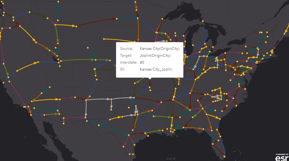
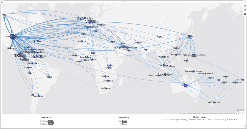
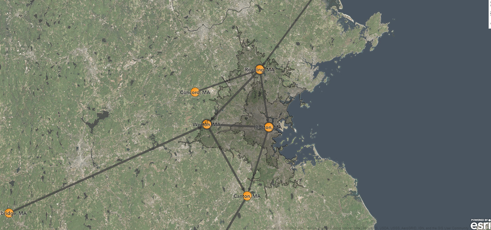
Below a few examples - how such would render given different data sources and different ArcGIS background map services.
- United States interstates road network
- Global flight connections for selected airlines
- Truck traffic routes with drive-time analysis (20,30 minutes drive-time polygons):
- London bus route network with selected bus routes:
Hope this helps. Cheers, Falko
- Mark as New
- Bookmark
- Subscribe
- Mute
- RSS Feed
- Permalink
- Report Inappropriate Content
Hi Falko,
Can we work with Network Analysis Objects in SAS VA release 7.3 ?
Thanks
- Mark as New
- Bookmark
- Subscribe
- Mute
- RSS Feed
- Permalink
- Report Inappropriate Content
I'm not Falko, but yes 🙂 This functionality was added in VA 6.3.
- Mark as New
- Bookmark
- Subscribe
- Mute
- RSS Feed
- Permalink
- Report Inappropriate Content
Thanks Sam
- Mark as New
- Bookmark
- Subscribe
- Mute
- RSS Feed
- Permalink
- Report Inappropriate Content
Hi Team,
I am working with SAS VA 7.3 and I realized that it is not possible to create a report with network diagram.
Is there any other way I could represent the links along with nodes in the report designer?
Thanks
- Mark as New
- Bookmark
- Subscribe
- Mute
- RSS Feed
- Permalink
- Report Inappropriate Content
Unfortunately network visualization introduced back in VA 6.x - is only available in Visual Analytics Explorer (user guide documentation: https://support.sas.com/documentation/cdl/en/vaug/68648/HTML/default/viewer.htm#p06eosr7smtwskn1qphl... )
Starting with VA 8.1 both interfaces are now merged and as such you will have access to full reporting capabilities across all visualizations. I'm not aware of any work-around in VA 7.x unfortunately.
Cheers, Falko
- Mark as New
- Bookmark
- Subscribe
- Mute
- RSS Feed
- Permalink
- Report Inappropriate Content
Thanks Falco,
Is there any way I could represent links in the network diagram as heat maps so that I could present the same in the Report?
- Mark as New
- Bookmark
- Subscribe
- Mute
- RSS Feed
- Permalink
- Report Inappropriate Content
So my final display is the report with nodes and heat maps instead of links in the same geomap?
Is that possible ? Thanks
- Mark as New
- Bookmark
- Subscribe
- Mute
- RSS Feed
- Permalink
- Report Inappropriate Content
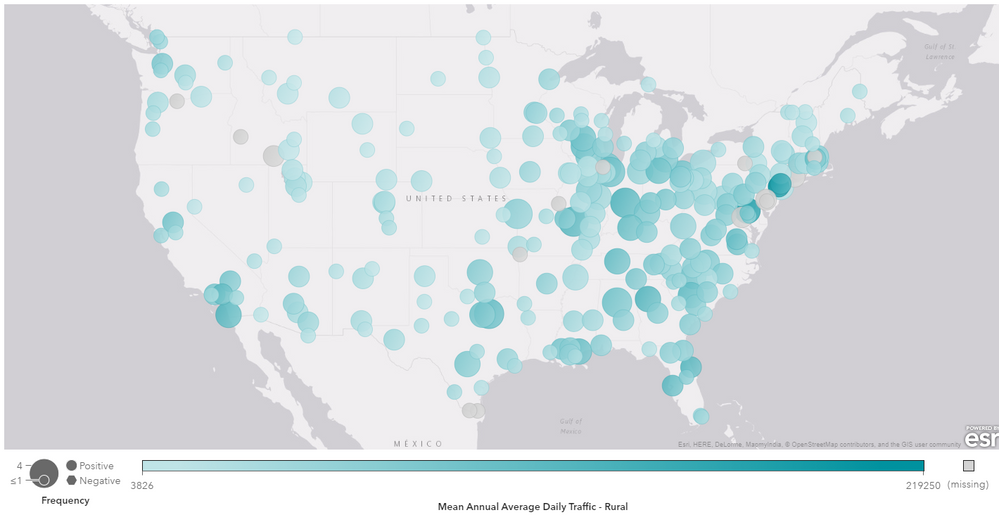
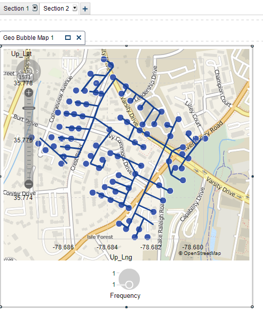
Hmm..but this is not really the same, is it? But yes, you could generate a geo map with just the nodes. A geo map is supported in both Designer and Explorer. So given my US Interstates network example above - you would get something like this with every data point representing the city crossing one or more interstates:
But now you are missing the actual link between the nodes indicating the actual interstate - so not really what you after?
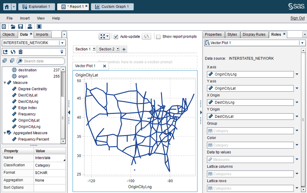
I guess you could use a Vector Plot (you may need to manually 'show' this visualization type in the object panel - it's hidden by default if I remember correctly). It would render the network like this - but unfortunately without geo map background:
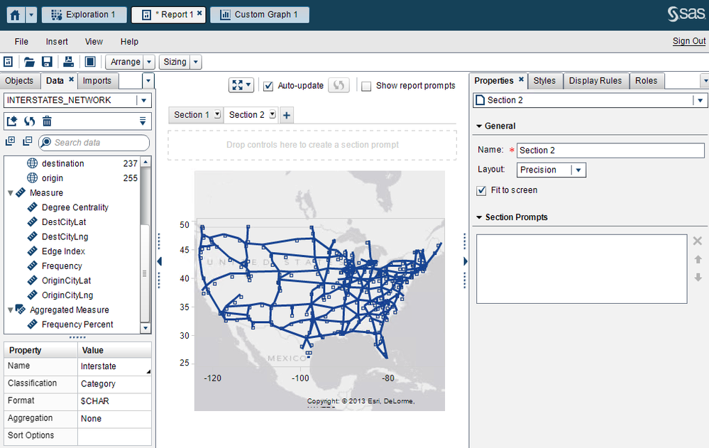
Now, (and be gentle with me :-)) - you could try precision layout and overlay this plot on top of the geo map. It will be a bit fiddly as you would need to position both exactly on top of each other and also make sure to set wall transparency on the Vector Plot to 100%. I have just done a quick test and it comes up ok:
Again, this is just rough work-around and really only good for a static report as things like zooming/panning wouldn't be in sync - so if possible I would suggest upgrading to the latest VA version as things will be much more elegant.
Hope this helps! Cheers, Falko
- Mark as New
- Bookmark
- Subscribe
- Mute
- RSS Feed
- Permalink
- Report Inappropriate Content
Thanks a lot Falko.
I will try this and keep posted on the updates.
Thanks once again for your valuable suggestions.
- Mark as New
- Bookmark
- Subscribe
- Mute
- RSS Feed
- Permalink
- Report Inappropriate Content
Hi Falko,
I was able to implement this roughly.
As this vector plot is above the geomap I am not able to see the values of the geomap bubbles. Is there any way to disable the vector plot so that I can only use the geomap in report ?
Thanks
- Mark as New
- Bookmark
- Subscribe
- Mute
- RSS Feed
- Permalink
- Report Inappropriate Content
I'm impressed! Excellent work!
Well, do you need the geo map values? In my example I used the geo coordinates plot and made the marker size super small (styles panel) - almost not visible. Given that the Vector Plot data points represent the same - it's probably sufficient? You could add some additional data tip or color values here if required. The geo map is really only needed as geographical background sort of speak. I'm not aware how you could disable the overlaid visualization to allow selection in the bottom one.
Cheers, Falko
- Mark as New
- Bookmark
- Subscribe
- Mute
- RSS Feed
- Permalink
- Report Inappropriate Content
Hi Falko,
If I select the geomap coordinates ( Node) I must be able to show another info window displaying another set of data for that node values.
- Mark as New
- Bookmark
- Subscribe
- Mute
- RSS Feed
- Permalink
- Report Inappropriate Content
Well, as I said - as soon as you need interactivity things become a bit tricky - and shows the limitation of this work-around.
You could setup interactivity using the Vector Plot but I believe it only supports such if you assign a group-by variable. To get the same results you may have to adjust your data set to include a unique value per row unless your data set already supports group-by.
Hopefully you are able to upgrade to VA 8.x soon. Cheers, Falko
Catch up on SAS Innovate 2026
Dive into keynotes, announcements and breakthroughs on demand.
Explore Now →See how to use one filter for multiple data sources by mapping your data from SAS’ Alexandria McCall.
Find more tutorials on the SAS Users YouTube channel.


