- Home
- /
- SAS Viya
- /
- Visual Analytics
- /
- Column Displays and arrangements
- RSS Feed
- Mark Topic as New
- Mark Topic as Read
- Float this Topic for Current User
- Bookmark
- Subscribe
- Mute
- Printer Friendly Page

- Mark as New
- Bookmark
- Subscribe
- Mute
- RSS Feed
- Permalink
- Report Inappropriate Content
I want to display the KPI's in my report in a manner that the same KPI for different months appear adjacent to each other. So If I have two KPI's says Sales, User Count, I want two groups, Sales (that will show Sales in columns for Jan, Feb, Mar,etc.) and another group User Count that will show this metric for Jan, Feb, Mar....in a continuous manner. This type of arrangement is possible in Excel Pivot tables but I am not sure about SAS VA. As of now, I show data like for Jan and under this Sales, User Count adjacent to each other and then again for Feb with the same kind of arrangement and so on. This kind of arrangement makes it difficult to "trend read' a metric over a period of time especially if there are many metrics. I would like each metric to appear together for all months.
Also, is it possible to give a distinct background color to every column (read metric) in the report.
Thanks
Manish

- Mark as New
- Bookmark
- Subscribe
- Mute
- RSS Feed
- Permalink
- Report Inappropriate Content
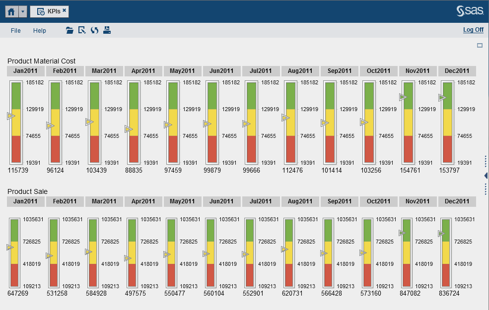
Hi Manish,
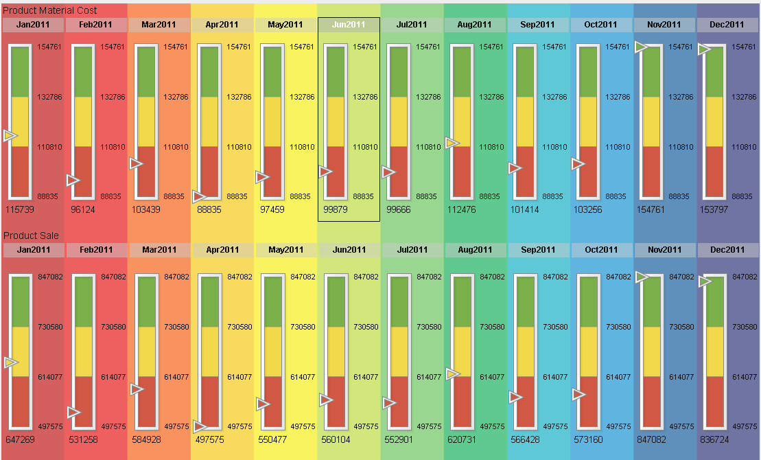
If I got it right, you can accomplish that by adding two Gauge objects to your report, each one using different metrics, but both grouped by month. The one at the top shows Product Material Cost by Month and the one at the bottom Has Product Sale by Month. As per controlling the background color, so that each month is different, VA 6.4 has the ability to control transparency and if you have and image that properly divides the screen in 12 regions in this case, we could accomplish something as described. I'm accessing VA 6.3 right now, but I'll try something later with 6.4 and update this thread.
- Mark as New
- Bookmark
- Subscribe
- Mute
- RSS Feed
- Permalink
- Report Inappropriate Content
This is the version with a background image. I hope this is what you were looking for:

Don't miss out on SAS Innovate - Register now for the FREE Livestream!
Can't make it to Vegas? No problem! Watch our general sessions LIVE or on-demand starting April 17th. Hear from SAS execs, best-selling author Adam Grant, Hot Ones host Sean Evans, top tech journalist Kara Swisher, AI expert Cassie Kozyrkov, and the mind-blowing dance crew iLuminate! Plus, get access to over 20 breakout sessions.
See how to use one filter for multiple data sources by mapping your data from SAS’ Alexandria McCall.

Find more tutorials on the SAS Users YouTube channel.
-
2 replies
-
03-22-2014 11:36 PM
-
1042 views
-
0 likes
-
2 in conversation
-
