- Home
- /
- SAS Viya
- /
- Visual Analytics
- /
- Re: Butterfly Chart
- RSS Feed
- Mark Topic as New
- Mark Topic as Read
- Float this Topic for Current User
- Bookmark
- Subscribe
- Mute
- Printer Friendly Page
- Mark as New
- Bookmark
- Subscribe
- Mute
- RSS Feed
- Permalink
- Report Inappropriate Content
Hi,
I would like to seek your help regarding our issue in SAS VA Butterfly chart. Our requirement is to display the Headcount by Age Group (>=60, 55-59, 50-54 up to <=24) for the Previous Year and Current Year. The left side of the butterfly is the Previous Year and the right side is the Current Year and the data and legend is dynamic based on the selected drop-down list control Period 1 (Previous) and Period 2 (Current) plus there are 6 controls like Org Level, Personnel Group etc. I already created the butterfly chart. Yes, the Period 1 and Period 2 legend is dynamic the butterfly chart displays the correct data. However, if we select specific Org Level and that Org level let say has no data really not available in the datasource for Age Group >=60 or <=24 for Previous Year but has a value for Current Year the sorting of Age Group (Y axis) will not be sorted properly even there's a custom sort. Also we created a diffefent version of butterfly chart but there are some requirement that will/might be compromise. Please help. Thank you so much.
Regards,
Carrot17
Accepted Solutions
- Mark as New
- Bookmark
- Subscribe
- Mute
- RSS Feed
- Permalink
- Report Inappropriate Content
Regards,
Carrot17
- Mark as New
- Bookmark
- Subscribe
- Mute
- RSS Feed
- Permalink
- Report Inappropriate Content
A screenshot would be very helpful for us to understand what you want to do. Your scenario is rather complicated.
Thanks,
Sam
- Mark as New
- Bookmark
- Subscribe
- Mute
- RSS Feed
- Permalink
- Report Inappropriate Content
Hi,
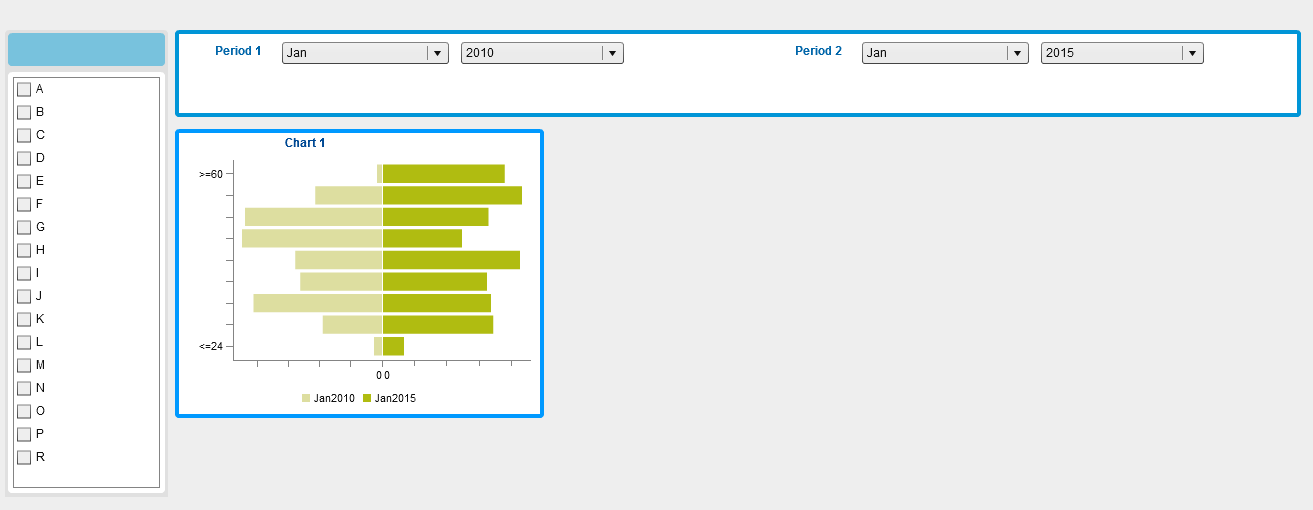
Before screenshot is the chart that I created, by default, the categories will be sorted and the colours are displayed light for Jan 2010 and dark for Jan 2015.
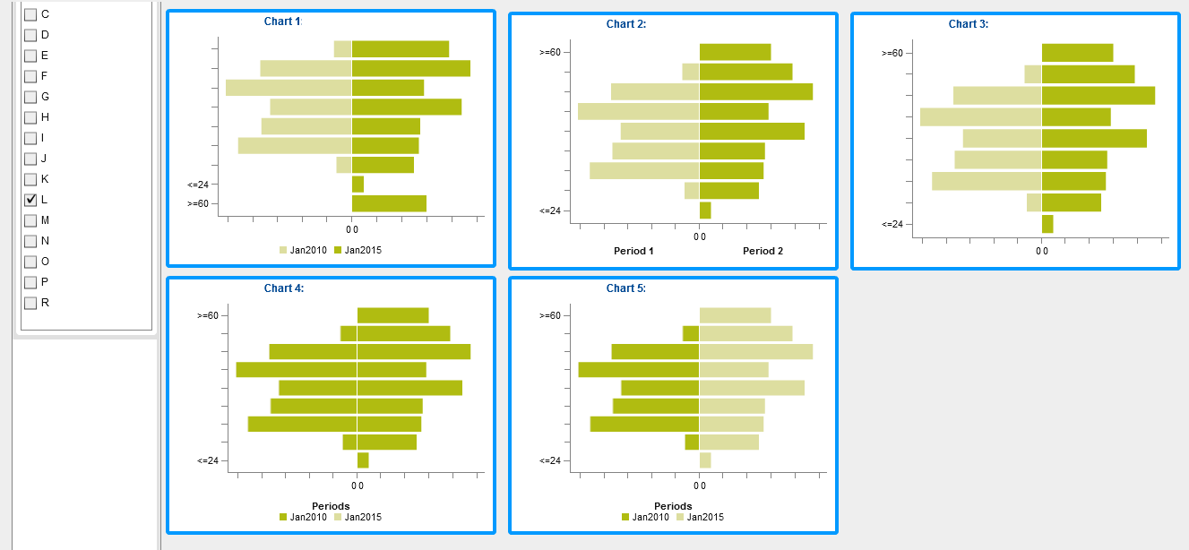
After screenshot, I had tried to create several charts however the issue is not resolved.
The requirements :
Category : To be sort as descending
Bar Color: Left side should always Light color, Right side should always dark color
Period: Period 1 (Previous Year) always on the Left side, Period 2 (Current Year) always on the Right side
Chart 1: Custom Chart
Category is shared role
Bar Chart 1 Measure
Bar Chart 2 Measure
Bar Group 1
Bar Group 2
Bar 1 Fill color – is set to Data Color 1
Bar 2 Fill color – is set to Data Color 2
X-Axis: Under Missing Data: the “Show missing groups” is not selected both Bar 1 and Bar 2
Note:
Category: not sorted.
Bar Color: display correctly. Doesn’t switch (which is correct)
Period: Display properly
Chart 2: Custom Chart
Category is shared role
Bar Chart 1 Measure
Bar Chart 2 Measure
Bar Group 1
Bar Group 2
Bar 1 Fill color – is set to Data Color 1
Bar 2 Fill color – is set to Data Color 2
Under Missing Data: the “Show missing groups” is selected both Bar 1 and Bar 2
X-Axis: Under Axis Label: “Show axis label” is selected both Bar 1 and Bar 2
Legend is set to Visible Off
Note:
Category: sorted properly
Bar Color: display correctly. Doesn’t switch (which is correct)
Period: Static Period
Having static period, we will not able to know what is the period values unless we mouse over the bar
Chart 3: Custom Chart
Role:
Category is shared role
Bar Chart 1 Measure
Bar Chart 2 Measure
Bar Group 1
Bar Group 2
Property:
Bar 1 Fill color – is set to Data Color 1
Bar 2 Fill color – is set to Data Color 2
Under Missing Data: the “Show missing groups” is selected both Bar 1 and Bar 2
X-Axis: Under Axis Label: “Show axis label” is not selected both Bar 1 and Bar 2
Legend is set to Visible Off
Note:
Category: sorted properly
Bar Color: display correctly. Doesn’t switch (which is correct)
Period: Not visible
Issue same as Chart 2, we will not know what is the period if we hide the period value
Chart 4: Custom Chart
Role:
Category is shared role
Bar Chart 1 Measure
Bar Chart 2 Measure
Group is shared role
Property:
Bar 1 Fill color – is set Automatic default
Bar 2 Fill color – is set Automatic default
Under Missing Data: the “Show missing groups” is selected both Bar 1 and Bar 2
X-Axis: Under Axis Label: “Show axis label” is not selected both Bar 1 and Bar 2
Legend is set to Visible
Display Legend: Bar Chart 1 only.
Note:
Category: sorted properly
Bar Color: came to same color both Bar 1 and Bar 2 (if age is not available in the data source based on the selected Group)
Period: display correctly
Chart 5: Custom Category
Role:
Category is shared role
Bar Chart 1 Measure
Bar Chart 2 Measure
Group is shared role
Property:
Bar 1 Fill color – is set Automatic default
Bar 2 Fill color – is set Data Color 2
Under Missing Data: the “Show missing groups” is selected both Bar 1 and Bar 2
X-Axis: Under Axis Label: “Show axis label” is not selected both Bar 1 and Bar 2
Legend is set to Visible
Display Legend: Bar Chart 1 only.
Note:
Category: sorted properly
Bar Color: color switch (if age is not available in the data source based on the selected Group)
Period: display correctly
I had tried several ways however it is still not able to meet the requirements. I realised that issue for chart 1, 4 & 5 were existed if the selected group have missing data - no corresponding age range in the data source.
Please advise if there is any other solution to overcome this.
Thank you!
- Mark as New
- Bookmark
- Subscribe
- Mute
- RSS Feed
- Permalink
- Report Inappropriate Content
If you don't mind, I will post your images inline for the convenience of other readers:
Before:
After:
- Mark as New
- Bookmark
- Subscribe
- Mute
- RSS Feed
- Permalink
- Report Inappropriate Content
If I understand correctly, Chart 2 is the closest to what you want but it is using a static period and you want the period(s) to be selectable through prompts. Is that right?
- Mark as New
- Bookmark
- Subscribe
- Mute
- RSS Feed
- Permalink
- Report Inappropriate Content
To me the closest is Chart 1 if Age is not missing. The only problem in Chart 1 is the sort issue of category when data is really not exist in the datasource.
Thanks for the reply. Appreciated. ☺
- Mark as New
- Bookmark
- Subscribe
- Mute
- RSS Feed
- Permalink
- Report Inappropriate Content
Any update on this? 😃 Thank you.
Regards,
Carrot17
- Mark as New
- Bookmark
- Subscribe
- Mute
- RSS Feed
- Permalink
- Report Inappropriate Content
Hi Carrot17,
This scenario is best directed to Technical Support. Feel free to open a track. For information on other ways to contact Tech Support, refer to: http://support.sas.com/techsup/contact/index.html.
Best,
Anna
- Mark as New
- Bookmark
- Subscribe
- Mute
- RSS Feed
- Permalink
- Report Inappropriate Content
Regards,
Carrot17
- Mark as New
- Bookmark
- Subscribe
- Mute
- RSS Feed
- Permalink
- Report Inappropriate Content
Hi,
Above solution is technically correct. However, we encountered long run due to our lookup DQs generate 36billion+ of raw data. Any suggestion to reduce the data? Thanks in advance.
In addition, below is the implementation we did.
We created a 9 lookup dq(s) to get the unique data please note that the data source of lookup dq(s) are from transaction table. After we created the 9 dq(s), we combined the 9 dq(s) to get the unique possible combination which generate 36billion of raw data. Please help. Thank you.
Best Regards,
Carrot17
- Mark as New
- Bookmark
- Subscribe
- Mute
- RSS Feed
- Permalink
- Report Inappropriate Content
Thanks for the update, Carrot17, I checked around with some SAS experts here and think it'd still be best to contact Tech Support with this one. http://support.sas.com/techsup/contact/index.html.
Anna
Catch up on SAS Innovate 2026
Dive into keynotes, announcements and breakthroughs on demand.
Explore Now →See how to use one filter for multiple data sources by mapping your data from SAS’ Alexandria McCall.
Find more tutorials on the SAS Users YouTube channel.


