- Home
- /
- SAS Viya
- /
- Visual Analytics
- /
- Buliding overlay Bar Charts in SAS Visual Analytics (9.4)
- RSS Feed
- Mark Topic as New
- Mark Topic as Read
- Float this Topic for Current User
- Bookmark
- Subscribe
- Mute
- Printer Friendly Page
- Mark as New
- Bookmark
- Subscribe
- Mute
- RSS Feed
- Permalink
- Report Inappropriate Content
Hello,
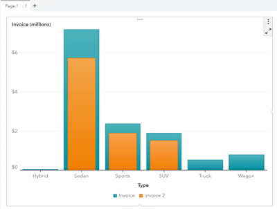
One of the design asked from us is to build an overlay bar chart to showcase something of a price volume comparison.
For reference (https://blogs.sas.com/content/graphicallyspeaking/2014/07/27/overlay-bar-charts/).
Would love to understand if we can build this thing with existing objects in Visual Analytics and any guidance around it.
- Mark as New
- Bookmark
- Subscribe
- Mute
- RSS Feed
- Permalink
- Report Inappropriate Content
You can do this with the Custom Graph Builder.
When you are in Visual Analytics, go to the top left, the Applications Menu, you should see the Custom Graph Builder. If not, then you are missing some authorizations, contact your SAS Administrator.
In the Custom Graph Builder
- create a new custom graph
- on the left you have the elements, add two bar charts on top of each other
- for the second bar chart go to the options on the right
- increase the value for spacing, this will make the bars smaller
- There is already a shared role (the category) and two measures (one for each bar)
- save the new custom graph in a SAS Folder
In Visual Analytics Report Builder
- create a new report
- in the objects pane top right, click on the 3 vertical dots and choose "Import custom graph", choose the one you created
- assign the proper data items to the roles (category and two measures)
- finished
Catch up on SAS Innovate 2026
Dive into keynotes, announcements and breakthroughs on demand.
Explore Now →See how to use one filter for multiple data sources by mapping your data from SAS’ Alexandria McCall.
Find more tutorials on the SAS Users YouTube channel.


