- Home
- /
- SAS Viya
- /
- Visual Analytics
- /
- Re: 100% Stacked Bar Charts
- RSS Feed
- Mark Topic as New
- Mark Topic as Read
- Float this Topic for Current User
- Bookmark
- Subscribe
- Mute
- Printer Friendly Page

- Mark as New
- Bookmark
- Subscribe
- Mute
- RSS Feed
- Permalink
- Report Inappropriate Content
Hi All,
I'm trying to put a basic bar chart together to show by month the relative percentage split of each category, but am running into difficulty!
I have tried creating a graph and using the grouping style 'Stack' and then using the aggregated measure 'frequency percent', however this is giving me the percentage over the overall time period / dataset. I need it fixed to each month so that it shows the percentage of the total for that specific month. Can someone advise how I can do this, or whether there is a specific aggregated measure I need to create to do this?
Cheers!
Alex

- Mark as New
- Bookmark
- Subscribe
- Mute
- RSS Feed
- Permalink
- Report Inappropriate Content
Show your work.
- Mark as New
- Bookmark
- Subscribe
- Mute
- RSS Feed
- Permalink
- Report Inappropriate Content
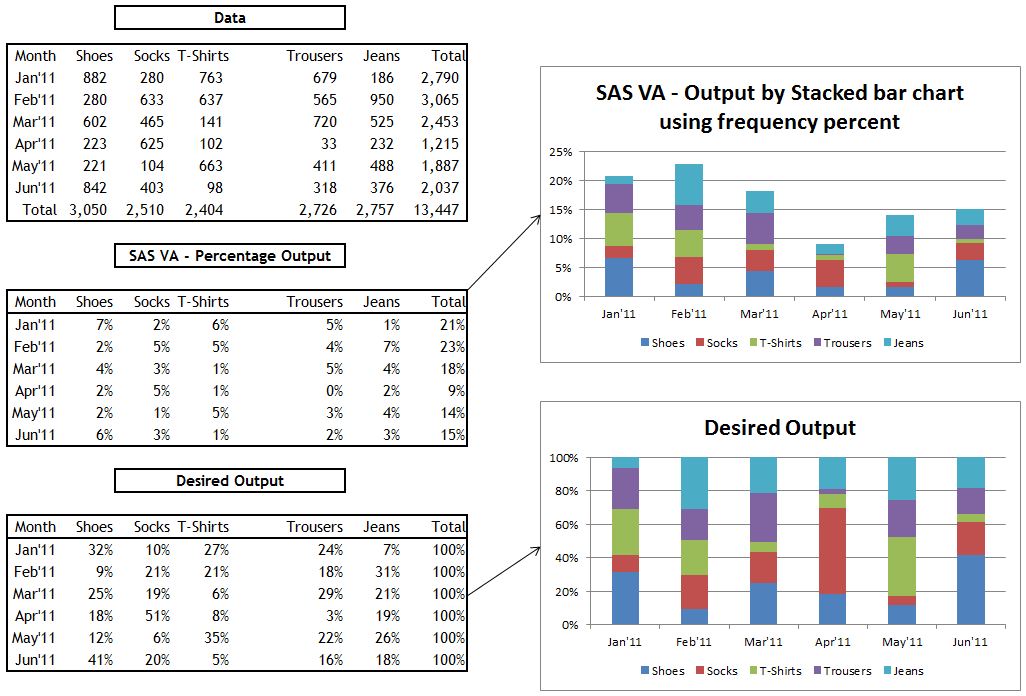
It's a hard one to easily explain in SAS VA, but here's an example in Excel, where I have 5 categories by months to show their sales. I want to see the relative split of sales by month by the different categories, but when I try using the 'frequency percent' aggregated measure in SAS VA, it simply looks for the percentage of the overall total over the 6 months. For example, Shoes has 882 sales in January, and there were 2,790 total sales in January across the 5 products, so I want to see 882/ 2,790 (32%). However, SAS VA is calculating it as the percentage of the entire sales which is 882/13,447 (7%).
Here's a screenshot to explain it further:

- Mark as New
- Bookmark
- Subscribe
- Mute
- RSS Feed
- Permalink
- Report Inappropriate Content
How about this?
- I am using just a sample of your data;
data in2;
input grp $ sell month $;
datalines;
shoes 882 Jan
shoes 280 Feb
shoes 602 Mar
shoes 223 Apr
shoes 221 May
shoes 842 Jun
socks 280 Jan
socks 633 Feb
socks 465 Mar
socks 625 Apr
socks 104 May
socks 403 Jun
tee 763 Jan
tee 637 Feb
tee 141 Mar
tee 102 Apr
tee 663 May
tee 98 Jun
;
/* Suppress the group axis label and values */
axis1 label=none value=none;
/* Angle the label for the response axis */
axis2 label=(angle=90 'Percent');
proc gchart data=in2;
vbar month / discrete subgroup=grp
group=month g100 nozero
freq=sell type=percent
inside=percent width=20
gaxis=axis1 raxis=axis2 ;
run;
quit;
Good luck.
Anca.

- Mark as New
- Bookmark
- Subscribe
- Mute
- RSS Feed
- Permalink
- Report Inappropriate Content
Even though your solution works fine, I do not think this is what the author was looking for.
As far as I know, he would like to solve this problem solely using Visual Analytics.
I have tried out a couple of things myself, but nothing seemed to deliver the expected results.
- Mark as New
- Bookmark
- Subscribe
- Mute
- RSS Feed
- Permalink
- Report Inappropriate Content
Yes, I'm trying to do this using solely SAS Visual Analytics,
Cheers,
Alex

- Mark as New
- Bookmark
- Subscribe
- Mute
- RSS Feed
- Permalink
- Report Inappropriate Content
Hi Anca,
Your code is working for one of my analysis, but can you please tell me how do I create 100% stack bar on character variable. Let say grp (% of type of grp) on month in this case.
I would much appreciate if you can help.
Thanks,

- Mark as New
- Bookmark
- Subscribe
- Mute
- RSS Feed
- Permalink
- Report Inappropriate Content
In VA 6.3 (release planned for December 2013), you will be able to do that by combining aggregated measures with the ability to define new chart templates (this is new in 6.3). I've added a screenshot.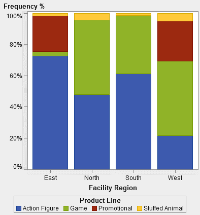
- Mark as New
- Bookmark
- Subscribe
- Mute
- RSS Feed
- Permalink
- Report Inappropriate Content
Thanks a lot for this Renato, good to know this is very shortly going to be available!
Cheers,
Alex
- Mark as New
- Bookmark
- Subscribe
- Mute
- RSS Feed
- Permalink
- Report Inappropriate Content
You could use a filter on the month attribute selecting any one month. This way the sum of percentages over the stacked categories on that month sums up to 100%.
To compare two month, just create another chart next to it.
This is quite dirty, but does the trick for the time being ![]()
- Mark as New
- Bookmark
- Subscribe
- Mute
- RSS Feed
- Permalink
- Report Inappropriate Content
Hi Renato, I need to do exactly the same thing, and your answer sounds very promising. However still I can't figure out how to do it. I'm assuming you use the Custom Graph Builder in VA 6.3, but that's where I get stuck. Could you elaborate a bit more on how you tune the definition of a bar chart (I'm assuming) in Graph Builder to get it to show the % on the Y-axis? Anything else I need to know? What (aggregated) measure do I create or use?
Regards, Bastiaan
- Mark as New
- Bookmark
- Subscribe
- Mute
- RSS Feed
- Permalink
- Report Inappropriate Content
Hi Bastiaan,
I'll put some instructions together and share it here, hopefully today.
Stay tuned!
- Mark as New
- Bookmark
- Subscribe
- Mute
- RSS Feed
- Permalink
- Report Inappropriate Content
It's attached.
Sorry it took so long, but I wanted to make sure I covered every aspect of it.
Let me know if you have questions.
Renato.
- Mark as New
- Bookmark
- Subscribe
- Mute
- RSS Feed
- Permalink
- Report Inappropriate Content
Renato, thank you so much for these instructions! It's really great that you took the effort of pulling these together. This method is a bit of a workaround, but it is suitable if the number of categories on the X-axis is fixed, known and limited. I need to do some more analysis on my side to see if this will work in my client's situation. I'll let you know.
On a related note: is another graph type, or maybe an extension of the properties of the existing bar chart, on the roadmap for VA? This type seems to be fairly common in Excel, and I think many clients find it useful.
Kind regards, Bastiaan

- Mark as New
- Bookmark
- Subscribe
- Mute
- RSS Feed
- Permalink
- Report Inappropriate Content
Hey Bastiaan,
The 100% stacked bar chart is on the roadmap for VA, we will let you know when we know for sure which release it will be in.
Regards,
Justin
.jpg")
Catch up on SAS Innovate 2026
Nearly 200 sessions are now available on demand with the SAS Innovate Digital Pass.
Explore Now →See how to use one filter for multiple data sources by mapping your data from SAS’ Alexandria McCall.

Find more tutorials on the SAS Users YouTube channel.
-
19 replies
-
11-22-2013 04:36 AM
-
41543 views
-
15 likes
-
10 in conversation
-
