- Home
- /
- SAS Viya
- /
- VA Gallery
- /
- Flight cancellations and delays in the United States
- RSS Feed
- Mark as New
- Mark as Read
- Bookmark
- Subscribe
- Printer Friendly Page
- Report Inappropriate Content
Flight cancellations and delays in the United States
- Article History
- RSS Feed
- Mark as New
- Mark as Read
- Bookmark
- Subscribe
- Printer Friendly Page
- Report Inappropriate Content
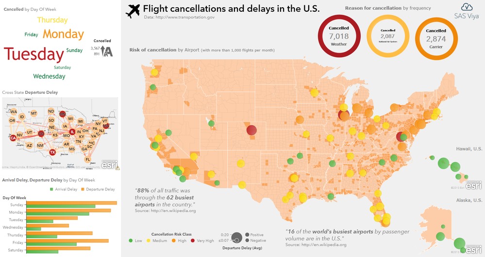
This SAS Visual Analytics report shows the flight cancellations and delays across airports in the United States. Additional network route information highlight most affected connections.
Data has been obtained from the US Department of Transportation.
- Mark as Read
- Mark as New
- Bookmark
- Permalink
- Report Inappropriate Content
What do the random darker polygons actually represent on this map? Since they are all the same color I don't see that they are actually related to the key colors for delays.
Also the gray circles on the bottom center with "positive" and "negative" don't seem to have any actual connection to the map or other displayed items as there is nothing gray on the map.
- Mark as Read
- Mark as New
- Bookmark
- Permalink
- Report Inappropriate Content
Hi, my fault not having a proper legend to explain! The polygons represent population density (on county level) across the United States.
The bottom row below the map is the actual legend. The gray circles represent the measure used for the bubble size (indicating more delay in larger bubbles). Left of it is the legend explaining the color distribution with red for examples indicating high cancellations.
Hope this helps. Regards, Falko
- Mark as Read
- Mark as New
- Bookmark
- Permalink
- Report Inappropriate Content
Hi Falco,
In the Fatality analysis, did you use the normal layout with the three graph objects on the left side dropped on to thje visualization pane and on the right side you used a container and used "Container Type" as precision and dropped the map and the three key values and text data in there?
- Mark as Read
- Mark as New
- Bookmark
- Permalink
- Report Inappropriate Content
Assuming you refer to this infographic about flight cancellations and not fatality analysis?
Yes, the left side is just a normal flow container in vertical direction (so the visuals appear from top to bottom). The right side is indeed a precision container (with a light gray background) given the number of visuals and the fact I had to overlay some of the visual on top of the geographical map. I often use the options panel (Options -> Layout) to fine tune the actual position of a visual given you can enter values. In VA 8.3 we also introduced a nice grid which makes it pretty straight forward to snap visuals into position. If you hold CTRL key down while dragging the grid becomes even more fine grained for more precise positioning.
Cheers, Falko
Don't miss out on SAS Innovate - Register now for the FREE Livestream!
Can't make it to Vegas? No problem! Watch our general sessions LIVE or on-demand starting April 17th. Hear from SAS execs, best-selling author Adam Grant, Hot Ones host Sean Evans, top tech journalist Kara Swisher, AI expert Cassie Kozyrkov, and the mind-blowing dance crew iLuminate! Plus, get access to over 20 breakout sessions.


