- Home
- /
- Analytics
- /
- Stat Procs
- /
- Why does LOGISTIC show predictions outside the range of independent va...
- RSS Feed
- Mark Topic as New
- Mark Topic as Read
- Float this Topic for Current User
- Bookmark
- Subscribe
- Mute
- Printer Friendly Page
- Mark as New
- Bookmark
- Subscribe
- Mute
- RSS Feed
- Permalink
- Report Inappropriate Content
A user on Twitter asks:
.@SASsoftware Why does the output graph in PROC LOGISTIC PLOTS=ALL show predicted values outside of the range of the independent variable?
— Sam Van Horne (@LearningPlaces) August 4, 2016
I think the explanation might be longer than can fit in a tweet, so I thought I'd post here to see what the experts say. I'm hoping I understand his question correctly. I tried to create an example using the SAS documentation.
data Neuralgia;
   input Treatment $ Sex $ Age Duration Pain $ @@;
   datalines;
P  F  68   1  No   B  M  74  16  No  P  F  67  30  No
P  M  66  26  Yes  B  F  67  28  No  B  F  77  16  No
A  F  71  12  No   B  F  72  50  No  B  F  76   9  Yes
A  M  71  17  Yes  A  F  63  27  No  A  F  69  18  Yes
B  F  66  12  No   A  M  62  42  No  P  F  64   1  Yes
A  F  64  17  No   P  M  74   4  No  A  F  72  25  No
P  M  70   1  Yes  B  M  66  19  No  B  M  59  29  No
A  F  64  30  No   A  M  70  28  No  A  M  69   1  No
B  F  78   1  No   P  M  83   1  Yes B  F  69  42  No
B  M  75  30  Yes  P  M  77  29  Yes P  F  79  20  Yes
A  M  70  12  No   A  F  69  12  No  B  F  65  14  No
B  M  70   1  No   B  M  67  23  No  A  M  76  25  Yes
P  M  78  12  Yes  B  M  77   1  Yes B  F  69  24  No
P  M  66   4  Yes  P  F  65  29  No  P  M  60  26  Yes
A  M  78  15  Yes  B  M  75  21  Yes A  F  67  11  No
P  F  72  27  No   P  F  70  13  Yes A  M  75   6  Yes
B  F  65   7  No   P  F  68  27  Yes P  M  68  11  Yes
P  M  67  17  Yes  B  M  70  22  No  A  M  65  15  No
P  F  67   1  Yes  A  M  67  10  No  P  F  72  11  Yes
A  F  74   1  No   B  M  80  21  Yes A  F  69   3  No
;

ods graphics on;

/* capture value ranges */
proc means data=Neuralgia min max; run;

proc logistic data=Neuralgia plots=all;
   class Treatment Sex;
   model Pain= Treatment Sex Treatment*Sex Age Duration / expb;
run;
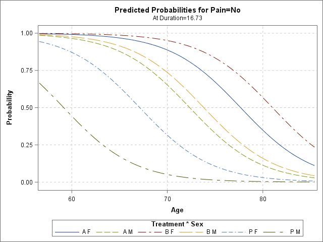
Even though MAX of Age is 83, the prediction plot goes beyond that (looks like through Age 90).
Accepted Solutions
- Mark as New
- Bookmark
- Subscribe
- Mute
- RSS Feed
- Permalink
- Report Inappropriate Content
PROC LOGISTIC fits a model. The model is valid for any values of the continuous variables, but most statisticians agree that you should not extrapolate a model to data outside the range of the data.
However, SAS does not enforce that restriction when scoring a model. If you score a regression model by using the SCORE statement, PROC SCORE, or PROC PLM, you can input any value you want for a continuous variable. In the case of PROC SCORE and PROC PLM, the input data set/item store do not even have a copy of the data; they only contain the parameter estimates for the model.
The graph that you are seeing in this example is a view of the MODEL, not a view of the data. In many cases, this is what the analyst wants to see. Notice that this model is evaluated for Duration=16.73, which is not even a value of Duration in the data set.
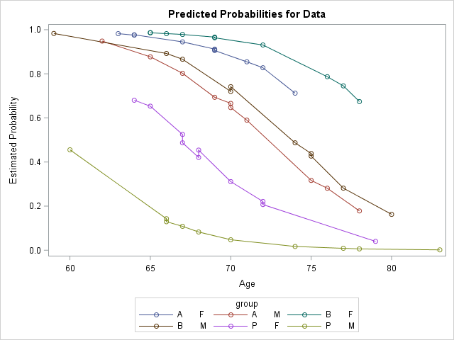
If you want to see ONLY the predicted values at the data points, you can use the OUTPUT= option to create an output data set that contains the predicted probabilities. You can then use PROC SGPLOT to visualize the predicted values. You should really use a scatter plot for this, but many analysts try to "connect the dots" by using a series plot. Note, however, that if you have repeated values, you might get jagged lines if you attempt to connect the data points.
For your example, the SAS code follows:
proc logistic data=Neuralgia plots(only)=effectplot;
   class Treatment Sex;
   model Pain= Treatment Sex Treatment*Sex Age Duration / expb;
   output out=LogiPred predicted=PredProb;
run;

data M;
   set LogiPred;
   group = Treatment || " " || Sex;
run;

proc sort data=M;
   by group age;
run;

title "Predicted Probabilities for Data";
proc sgplot data=M;
   series x=age y=PredProb / group=group markers;
run;
- Mark as New
- Bookmark
- Subscribe
- Mute
- RSS Feed
- Permalink
- Report Inappropriate Content
Because what if an 84 year old walks into the neurologist's office tomorrow? 🙂
The sigmoid shape of the curve does ensure that predictions fall between 0 and 1, though.
- Mark as New
- Bookmark
- Subscribe
- Mute
- RSS Feed
- Permalink
- Report Inappropriate Content
PROC LOGISTIC fits a model. The model is valid for any values of the continuous variables, but most statisticians agree that you should not extrapolate a model to data outside the range of the data.
However, SAS does not enforce that restriction when scoring a model. If you score a regression model by using the SCORE statement, PROC SCORE, or PROC PLM, you can input any value you want for a continuous variable. In the case of PROC SCORE and PROC PLM, the input data set/item store do not even have a copy of the data; they only contain the parameter estimates for the model.
The graph that you are seeing in this example is a view of the MODEL, not a view of the data. In many cases, this is what the analyst wants to see. Notice that this model is evaluated for Duration=16.73, which is not even a value of Duration in the data set.
If you want to see ONLY the predicted values at the data points, you can use the OUTPUT= option to create an output data set that contains the predicted probabilities. You can then use PROC SGPLOT to visualize the predicted values. You should really use a scatter plot for this, but many analysts try to "connect the dots" by using a series plot. Note, however, that if you have repeated values, you might get jagged lines if you attempt to connect the data points.
For your example, the SAS code follows:
proc logistic data=Neuralgia plots(only)=effectplot;
   class Treatment Sex;
   model Pain= Treatment Sex Treatment*Sex Age Duration / expb;
   output out=LogiPred predicted=PredProb;
run;

data M;
   set LogiPred;
   group = Treatment || " " || Sex;
run;

proc sort data=M;
   by group age;
run;

title "Predicted Probabilities for Data";
proc sgplot data=M;
   series x=age y=PredProb / group=group markers;
run;
- Mark as New
- Bookmark
- Subscribe
- Mute
- RSS Feed
- Permalink
- Report Inappropriate Content
Thanks @Rick_SAS. I knew that wouldn't fit in a tweet. 🙂
- Mark as New
- Bookmark
- Subscribe
- Mute
- RSS Feed
- Permalink
- Report Inappropriate Content
Plots show model. Can get pred vals on data by using OUTPUT stmt. [LINK]
Don't miss out on SAS Innovate - Register now for the FREE Livestream!
Can't make it to Vegas? No problem! Watch our general sessions LIVE or on-demand starting April 17th. Hear from SAS execs, best-selling author Adam Grant, Hot Ones host Sean Evans, top tech journalist Kara Swisher, AI expert Cassie Kozyrkov, and the mind-blowing dance crew iLuminate! Plus, get access to over 20 breakout sessions.
ANOVA, or Analysis Of Variance, is used to compare the averages or means of two or more populations to better understand how they differ. Watch this tutorial for more.
Find more tutorials on the SAS Users YouTube channel.


