- Home
- /
- Analytics
- /
- Stat Procs
- /
- Re: ROC curve in PROC logistic
- RSS Feed
- Mark Topic as New
- Mark Topic as Read
- Float this Topic for Current User
- Bookmark
- Subscribe
- Mute
- Printer Friendly Page
- Mark as New
- Bookmark
- Subscribe
- Mute
- RSS Feed
- Permalink
- Report Inappropriate Content
Hello all,
I have a small problem with the look of my ROC curve. My dataset looks like this:
company total assets city flag
1 32432 Boston 0
2 32213 New York 1
3 12341 Chicago 0
4 32124 Boston 0
. . .
. . .
. . .
23626 7563 Chicago 0
So, we have observations on 23626 companies, with financials (there are more then just total assets), city and a flag, which says 0 if the company is not bankrupt or 1 if the company is bankrupt. So, i'm fitting a logistic regression, like this:
proc logistic data=have plots(only)=(roc(id=obs) effect);
class city (ref='chicago') / param = ref;
model flag(event='1') = TA EAToTA city;
run;
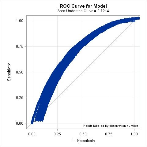
I get a curve like the one attached. Why does my curve look like that? I thought it should only be a line and not some sort of band? Does it have something to do with the number of observations which is 23626 ?
Furtheremore i would like to know how to get 3 curves in the same graph. As if i have 3 datasets, like the one above, and then two others with the same companies, just from a different year.
Thank you,
yocrashi

- Mark as New
- Bookmark
- Subscribe
- Mute
- RSS Feed
- Permalink
- Report Inappropriate Content
For the first part try modifying your code like this:
proc logistic data=have (obs=50) ....
to only use 50 observations (or other numbe much smaller than 23000). I suspect the "band" is actually coming from overlapping text labels
Do you have a Year variable? with 3 levels (if I understand the question)? adding Year to class and model and then perhaps the PLOTBY= option with the year variable might work
- Mark as New
- Bookmark
- Subscribe
- Mute
- RSS Feed
- Permalink
- Report Inappropriate Content
Actually, the band was coming from text labels!
No, i don't have a year variable. My dataset is only from the year 2007. The other dataset is from the year 2003.
Do you know how to remove the labels? i have tried:
proc logistic data=have plots(only)=(roc(id=obs) effect and plots=no label);
class city (ref='chicago') / param = ref;
model flag(event='1') = TA EAToTA city;
run;
proc logistic data=have plots(only)=(roc(id=obs) effect);
class city (ref='chicago') / param = ref;
model flag(event='1') = TA EAToTA city /
plots=no label;
run;
but this dosn't work.
- Mark as New
- Bookmark
- Subscribe
- Mute
- RSS Feed
- Permalink
- Report Inappropriate Content
You can actually send the data used for the chart to an output data set and then use another procedure such as SGPLOT to display data where you have more options.
IIRC use something like:
ODS OUTPUT graphname=yourdatasetname;
where graphname is the format name that SAS uses for the procedure such as ROCCurve or ROCOverlay and then the data set you want.
In SGPLOT don't include data labels and you should be close.
- Mark as New
- Bookmark
- Subscribe
- Mute
- RSS Feed
- Permalink
- Report Inappropriate Content
I think the problem is that you are using
ROC(ID=obs)
The ID= option labels the point. See the LOGISTIC doc for information about the ID= option,:
To follow up on Ballardw's suggestion, see the example "How to get data values out of ODS graphics."
- Mark as New
- Bookmark
- Subscribe
- Mute
- RSS Feed
- Permalink
- Report Inappropriate Content
Thank you both for your answers.
Actually, i used "/ outroc=something" and i got the curve withut labels.
Don't miss out on SAS Innovate - Register now for the FREE Livestream!
Can't make it to Vegas? No problem! Watch our general sessions LIVE or on-demand starting April 17th. Hear from SAS execs, best-selling author Adam Grant, Hot Ones host Sean Evans, top tech journalist Kara Swisher, AI expert Cassie Kozyrkov, and the mind-blowing dance crew iLuminate! Plus, get access to over 20 breakout sessions.
ANOVA, or Analysis Of Variance, is used to compare the averages or means of two or more populations to better understand how they differ. Watch this tutorial for more.
Find more tutorials on the SAS Users YouTube channel.


