- Home
- /
- Analytics
- /
- Stat Procs
- /
- Re: Proc Logistic: EffectPlot
- RSS Feed
- Mark Topic as New
- Mark Topic as Read
- Float this Topic for Current User
- Bookmark
- Subscribe
- Mute
- Printer Friendly Page

- Mark as New
- Bookmark
- Subscribe
- Mute
- RSS Feed
- Permalink
- Report Inappropriate Content
Hi All,
My doubt concerns the plot generated by the EffectPlot statement in the Proc Logistic procedure.
When I run the code below
ods graphics on;
proc logistic data=test plots(only maxpoints=none)=(roc) ;
model VDEP (event='1')= VINDEP1 VINDEP2 / RSQ lackfit ctable pprob=0.5 ;
score out=test_est;
effectplot fit(x=VINDEP2) / AT(VINDEP1=0.35);
run;
ods graphics off;
The effectplot statement generates the plot below.
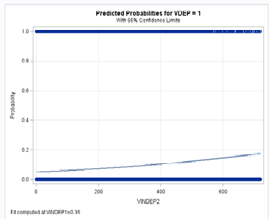
My question is: What are the values that are plotted at '0' and '1' of the predicted probability?
Because when I look at the predicted probabilities in the table produced by the Score statement, values remain between 0.04 and 0.3 .
In fact when I run
proc sql;
create table sgploteste as
select distinct test_est.*
from test_est
WHERE round(VINDEP1,0.01)=0.35;
quit;
proc sgplot data=sgploteste;
scatter x=VINDEP2 y=P_1;
xaxis values=(0 to 720 by 30);
yaxis values=(0 to 1 by 0.2);
run;
I get the plot below.
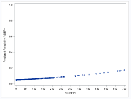
I just don't get what am I missing.
Thanks in advance for your help.
C

- Mark as New
- Bookmark
- Subscribe
- Mute
- RSS Feed
- Permalink
- Report Inappropriate Content
Since you apparently are restricting both graphs to values of VINDEP1 to 0.35 I would suspect that the values you ask about occur 1) when VINDEP1 is some other value or 2) not with your data in the range of values given for VINDEP2 for the model. You might try providing additional value to extend the range for VINDEP2 and VINDEP1=0.35 without values for VDEP to see if the predicted values show up for them.

- Mark as New
- Bookmark
- Subscribe
- Mute
- RSS Feed
- Permalink
- Report Inappropriate Content
The values at 0 and 1 are your OBSERVED values (with 1 for event and 0 for nonevent) at the different values of your predictor. The graph looks like you do not have much separation based on VINEP2. See the LOGISTIC User's Guide for examples of this plot.
- Mark as New
- Bookmark
- Subscribe
- Mute
- RSS Feed
- Permalink
- Report Inappropriate Content
Thanks.
In fact I did read some information in support.sas.com (http://support.sas.com/documentation/cdl/en/statug/63962/HTML/default/viewer.htm#statug_logistic_sec... , http://support.sas.com/documentation/cdl/en/statug/63962/HTML/default/viewer.htm#statug_introcom_a00...), but didn't saw that the observed values where also displayed in the plot, I thought that only the predicted probabilities and the independent variable value where displayed.
The closest example I found was output 51.7.4 in http://support.sas.com/documentation/cdl/en/statug/63347/HTML/default/viewer.htm#statug_logistic_sec...
, where I see some dots but didn't know what they were.
Concerning your helpful observation 'The graph looks like you do not have much separation based on VINEP2'. Can you please elaborate? (I'm having some problems in what statistics to use to choose my independent variables, I know that I shouldn't use an automatic stepwise, and your observation has led me to think that I can take more information of this plot that I was thinking )
Thanks again.
- Mark as New
- Bookmark
- Subscribe
- Mute
- RSS Feed
- Permalink
- Report Inappropriate Content
The one example you showed was for binomial data with data in the form of events/trials, or y/n. y events out of n in each experimental or observational unit. You have binary data (a special case of binomial), so your values are just y (n=1). You can have either a 0 or 1 for each observation. Hence the graph has a bunch of points at 0 and 1. Ideally, you want most of the 1s on the right and the 0s n the left. But you have lots of points across the X values. Further help is more than I can give in this forum. You should read the book Logistic Analysis Using SAS book by Allison. It is excellent.
- Mark as New
- Bookmark
- Subscribe
- Mute
- RSS Feed
- Permalink
- Report Inappropriate Content
Thanks for your help. Now it's clear for me what you meant. And I will follow your book recommendation.
(Sorry I don't know why but the option to tag your answers as corrects is not available)

Don't miss out on SAS Innovate - Register now for the FREE Livestream!
Can't make it to Vegas? No problem! Watch our general sessions LIVE or on-demand starting April 17th. Hear from SAS execs, best-selling author Adam Grant, Hot Ones host Sean Evans, top tech journalist Kara Swisher, AI expert Cassie Kozyrkov, and the mind-blowing dance crew iLuminate! Plus, get access to over 20 breakout sessions.
ANOVA, or Analysis Of Variance, is used to compare the averages or means of two or more populations to better understand how they differ. Watch this tutorial for more.

Find more tutorials on the SAS Users YouTube channel.
-
5 replies
-
07-28-2014 07:58 AM
-
2022 views
-
0 likes
-
3 in conversation
-
