- Home
- /
- Analytics
- /
- Stat Procs
- /
- Re: How to make a Charts/ Boxplots for Proportions of a Binary Variabl...
- RSS Feed
- Mark Topic as New
- Mark Topic as Read
- Float this Topic for Current User
- Bookmark
- Subscribe
- Mute
- Printer Friendly Page
- Mark as New
- Bookmark
- Subscribe
- Mute
- RSS Feed
- Permalink
- Report Inappropriate Content
My experiment arranged in Split Plot design. How to make a Charts/ Boxplots for Proportions of a Binary Variable ?
data Survival;
input A $ B $ Block Y; if Y=1 then 1='Survive'; else 0='Died';
datalines;
A1 B1 1 0
A1 B1 2 1
A1 B1 3 0
A1 B1 4 0
A1 B1 5 0
A1 B2 1 1
A1 B2 2 1
A1 B2 3 1
A1 B2 4 1
A1 B2 5 0
A1 B3 1 1
A1 B3 2 0
A1 B3 3 0
A1 B3 4 1
A1 B3 5 1
A2 B1 1 0
A2 B1 2 0
A2 B1 3 0
A2 B1 4 0
A2 B1 5 0
A2 B2 1 1
A2 B2 2 0
A2 B2 3 0
A2 B2 4 1
A2 B2 5 0
A2 B3 1 1
A2 B3 2 1
A2 B3 3 1
A2 B3 4 0
A2 B3 5 1
A3 B1 1 1
A3 B1 2 0
A3 B1 3 1
A3 B1 4 0
A3 B1 5 0
A3 B2 1 0
A3 B2 2 1
A3 B2 3 1
A3 B2 4 1
A3 B2 5 0
A3 B3 1 0
A3 B3 2 1
A3 B3 3 0
A3 B3 4 1
A3 B3 5 1
;
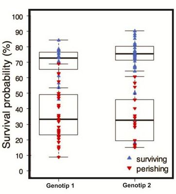
Is it true when it displayed in as shown below ? how to write the codes?
Please help me it is so important for me...
- Mark as New
- Bookmark
- Subscribe
- Mute
- RSS Feed
- Permalink
- Report Inappropriate Content
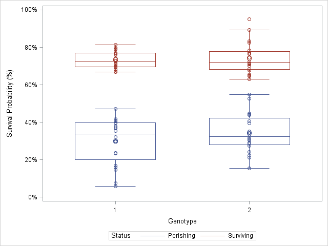
I assume you know how to model the data to obtain the probabilities, and that you are asking about how to create the box plot of the results.
You don't mention what version of SAS you are running, but here's how to create the plot in the current version:
data Sim;
label p = "Survival Probability (%)";
call streaminit(1);
do i = 1 to 20;
   Genotype = 1;  Status = "Perishing";
   p = rand("normal", 32, 10) / 100;
   output;
   Genotype = 1;  Status = "Surviving";
   p = rand("normal", 72, 5) / 100;
   output;
   Genotype = 2;  Status = "Perishing";
   p = rand("normal", 32, 10) / 100;
   output;
   Genotype = 2;  Status = "Surviving";
   p = rand("normal", 74, 8) / 100;
   output;
end;
run;

proc sgplot data=Sim;
format p PERCENT8.;
vbox p / category=Genotype group=Status nofill nooutliers groupdispay=overlay;
scatter y=p x=Genotype / group=Status;
run;
One question you might have is when to use CATEGORY= and when to use GROUP=. For an explanation, see the article "What is the difference between categories and groups in PROC SGPLOT?"

Don't miss out on SAS Innovate - Register now for the FREE Livestream!
Can't make it to Vegas? No problem! Watch our general sessions LIVE or on-demand starting April 17th. Hear from SAS execs, best-selling author Adam Grant, Hot Ones host Sean Evans, top tech journalist Kara Swisher, AI expert Cassie Kozyrkov, and the mind-blowing dance crew iLuminate! Plus, get access to over 20 breakout sessions.
ANOVA, or Analysis Of Variance, is used to compare the averages or means of two or more populations to better understand how they differ. Watch this tutorial for more.
Find more tutorials on the SAS Users YouTube channel.


