- Home
- /
- Analytics
- /
- Stat Procs
- /
- GLIMMIX: Plot marginal residulas Vs Predictor lineal
- RSS Feed
- Mark Topic as New
- Mark Topic as Read
- Float this Topic for Current User
- Bookmark
- Subscribe
- Mute
- Printer Friendly Page
- Mark as New
- Bookmark
- Subscribe
- Mute
- RSS Feed
- Permalink
- Report Inappropriate Content
Hi all,
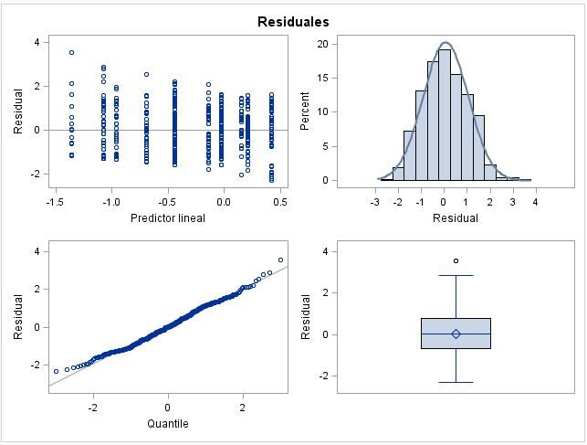
I would like which is the criterion to plot of marginal residuas Vs predictor lineal in the GLIMMIX proc.
I have done a GLMM with the seasons and months of the year as categorical variables (I put month nested into seasons).
I got the following plot (attached), can anyone explain the next questions?
1) Why are not the categorical residuals distributed homogeneously along the X axes? (some "months" are closer than others).
2) Which is the criterion to order the residuals? by name, by value...
_I get in all my plots of marginal residuas Vs predictor lineal a downward trend, and I don't know whether it is an artefact or it is real.
thank you all in advance

- Mark as New
- Bookmark
- Subscribe
- Mute
- RSS Feed
- Permalink
- Report Inappropriate Content
I would be elated to get plots like these for most data. Very little evidence of violations of assumptions.
Regarding the questions:
1. Without knowing the exact model being fit, and especially how your data is constructed, I can't come up with a good reason for the uneven spacing. I suspect something in the coding of month and season.
2. That looks like a trend that could be eliminated by differencing, but I am not sure.
Steve Denham
- Mark as New
- Bookmark
- Subscribe
- Mute
- RSS Feed
- Permalink
- Report Inappropriate Content
I am studying the tend of a parameter (VarX) along the differents seasons.
I have collected the data from multiple studies and know I am re-analyzing all data together. To take this into accoutn I have put ID_study as random factor.
As I have repeated measures from a same population, so I have nested Month with Season in the model; in addittion to put Population as Random factor.
As I have data from multiples species I have nested de Family-Genus-Species in other random factor.
proc glimmix data=data method=laplace plots=(ResidualPanel(conditional marginal));
class Season Species Genus Family Poblacion ID_study Month;
model VarX = Season Month (Season)
/dist=beta;
random intercept / subject = Poblacion (ID_study);
random intercept / subject= Species (Genus*Family);
nloptions maxiter=150;
lsmeans Season/cl diff PLOT=diff (NOabs center) adjust=tukey;
lsmeans Season/cl ilink;
run;
When I put only the seasons (without the Months) I have four columns in the marginal residuals, and they are also plotted in a downward trend.
So I don't know whether SAS plots it in an default way from higher residual values to lower residual values (so the downward trend is an artefact) or whether it is the real order of the months.
I have put the Months like: Jan, Feb, Mar, Apr, May, Jun, Jul, Aug, Sep, Oct, Nov, Dec. At the beginning I though that maybe it were plotted alphabetically, but the proximity of the columns do not correspond with it.
- Mark as New
- Bookmark
- Subscribe
- Mute
- RSS Feed
- Permalink
- Report Inappropriate Content
Try recoding the months as 1 to 12 and see if it makes any difference. I don't believe that the plot is from higher to lower residual values, but it wouldn't be the first time I was wrong on something regarding the ODS graphics.
Steve Denham
Don't miss out on SAS Innovate - Register now for the FREE Livestream!
Can't make it to Vegas? No problem! Watch our general sessions LIVE or on-demand starting April 17th. Hear from SAS execs, best-selling author Adam Grant, Hot Ones host Sean Evans, top tech journalist Kara Swisher, AI expert Cassie Kozyrkov, and the mind-blowing dance crew iLuminate! Plus, get access to over 20 breakout sessions.
ANOVA, or Analysis Of Variance, is used to compare the averages or means of two or more populations to better understand how they differ. Watch this tutorial for more.
Find more tutorials on the SAS Users YouTube channel.


