- Home
- /
- Programming
- /
- Graphics
- /
- sgscatter legend and axis values
- RSS Feed
- Mark Topic as New
- Mark Topic as Read
- Float this Topic for Current User
- Bookmark
- Subscribe
- Mute
- Printer Friendly Page
- Mark as New
- Bookmark
- Subscribe
- Mute
- RSS Feed
- Permalink
- Report Inappropriate Content
I'm using sgscatter and have two questions about controlling the output.
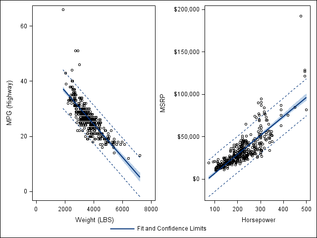
1. On the output, I would like to include a legend that includes 'fit' and prediction/confidence limits. It would be akin to the legendlabel="Fit" option in sgplot.
2. Is there a good work around to altering my xaxis value? I would like to control these for a couple of my plots, but am unsure of how to do so in sgscatter plot. Is it even possible?
Below is the basic structure for my code.
proc sgscatter data=have;
plot a1*b1 a2*b2 / reg =(clm cli) ;
Thanks!
- Mark as New
- Bookmark
- Subscribe
- Mute
- RSS Feed
- Permalink
- Report Inappropriate Content
Hi Sophia, instead of using SGSCATTER, you can use the Lattice Layout in GTL to obtain a scatterplot containing more than one cell, and the REGRESSIONPLOT, SCATTERPLOT and MODELBAND statements can produce your regression line with the various fits. You can then produce your legend with the DISCRETELEGEND statement which gives you more options. Also you can edit the x-axis with the XAXISOPTS options.
Below is example code that you can use.
proc template;
   define statgraph scattertemp;
      begingraph;
	     layout lattice / columns = 2;
	        layout overlay / xaxisopts = (linearopts=(viewmin=0 viewmax = 8000));
		       modelband "myclm";
		       modelband "mycli" / outlineattrs=GraphPredictionLimits display=(outline);
		       scatterplot x=weight y=mpg_highway;
		       regressionplot x=weight y=mpg_highway / clm = "myclm" cli = "mycli" name = "regleg"
                 legendlabel = "Fit and Confidence Limits";
		   endlayout;
		   layout overlay;
		      modelband "myclm2";
		      modelband "mycli2" /outlineattrs=GraphPredictionLimits display=(outline);
              scatterplot x=horsepower y=msrp;
		      regressionplot x=horsepower y=msrp /clm = "myclm2" cli = "mycli2";
		   endlayout;
		   sidebar / align=bottom;
		      discretelegend "regleg" / border=off;
		   endsidebar;
      endlayout;
	endgraph;
  end;
run;

proc sgrender data = sashelp.cars template = scattertemp;
run;
Thanks

- Mark as New
- Bookmark
- Subscribe
- Mute
- RSS Feed
- Permalink
- Report Inappropriate Content
You can use the TMPLOUT="filename" option to get the GTL generated by the SGSCATTER procedure. It will look similar to what Kris has proposed. Then, you can add the options like LegendLabel, etc to customize the graph. Or, try using the ODS Graphics Designer to create your GTL graph.
Don't miss out on SAS Innovate - Register now for the FREE Livestream!
Can't make it to Vegas? No problem! Watch our general sessions LIVE or on-demand starting April 17th. Hear from SAS execs, best-selling author Adam Grant, Hot Ones host Sean Evans, top tech journalist Kara Swisher, AI expert Cassie Kozyrkov, and the mind-blowing dance crew iLuminate! Plus, get access to over 20 breakout sessions.
Learn how use the CAT functions in SAS to join values from multiple variables into a single value.
Find more tutorials on the SAS Users YouTube channel.
 Click image to register for webinar
Classroom Training Available!
Select SAS Training centers are offering in-person courses. View upcoming courses for:


