- Home
- /
- Programming
- /
- Graphics
- /
- sgplot vline jitter standard error bars
- RSS Feed
- Mark Topic as New
- Mark Topic as Read
- Float this Topic for Current User
- Bookmark
- Subscribe
- Mute
- Printer Friendly Page
- Mark as New
- Bookmark
- Subscribe
- Mute
- RSS Feed
- Permalink
- Report Inappropriate Content
I would like to have non-overlapping standard error or confidence limits. This is my code
proc sgplot data = class4.dental;
vline age / response = y stat = mean limitstat = clm group=gender curvelabel;
run;
Thank you for any sugggestions
Accepted Solutions
- Mark as New
- Bookmark
- Subscribe
- Mute
- RSS Feed
- Permalink
- Report Inappropriate Content
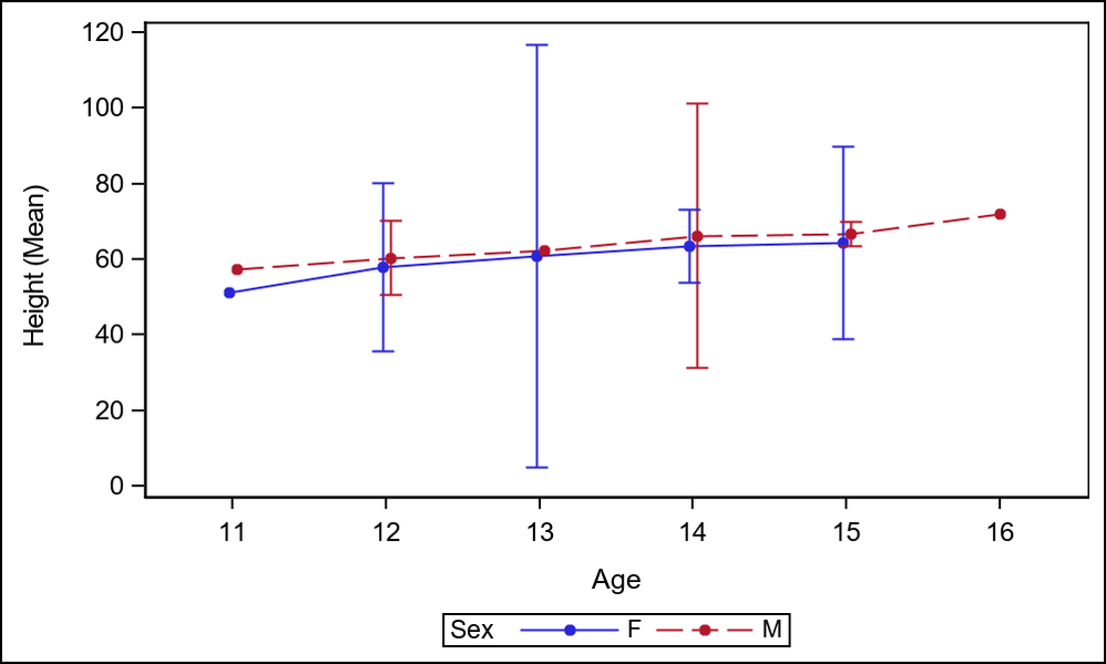
Extending on Draycut's reply, use GROUPDISPLAY=CLUSTER and CLUSTERWIDTH=0.2 to get this result.
proc sgplot data=sashelp.class;
vline age / response=height group=sex stat=mean limitstat=clm markers
 groupdisplay=cluster clusterwidth=0.1 arkerattrs=(size=5 symbol=circlefilled);
run;
- Mark as New
- Bookmark
- Subscribe
- Mute
- RSS Feed
- Permalink
- Report Inappropriate Content
Are you sure you want to present your data like this? See this short example, which I assume resemble yours
proc sgplot data=sashelp.class;
vline age / response=height group=sex stat=mean limitstat=clm;
run;
produces this
Already now, there are a lot of lines to grasp. And you want to offset the clm limits, adding more lines to the chart. I think you want to present your data in a more suitable manner? 🙂
- Mark as New
- Bookmark
- Subscribe
- Mute
- RSS Feed
- Permalink
- Report Inappropriate Content
Extending on Draycut's reply, use GROUPDISPLAY=CLUSTER and CLUSTERWIDTH=0.2 to get this result.
proc sgplot data=sashelp.class;
vline age / response=height group=sex stat=mean limitstat=clm markers
 groupdisplay=cluster clusterwidth=0.1 arkerattrs=(size=5 symbol=circlefilled);
run;
- Mark as New
- Bookmark
- Subscribe
- Mute
- RSS Feed
- Permalink
- Report Inappropriate Content
Thank you, this is what I want!
- Mark as New
- Bookmark
- Subscribe
- Mute
- RSS Feed
- Permalink
- Report Inappropriate Content
Thank you
- Mark as New
- Bookmark
- Subscribe
- Mute
- RSS Feed
- Permalink
- Report Inappropriate Content
You might provide an example data set that will let us see what you are currently getting or include an image. Then describe which "overlapping" error bars or confidence limits are not desired.
"non-overlapping" could have a number of interpretations. For example with the image shown by @PeterClemmensen perhaps you would only want the widest confidence limit shown, or the narrowest for each age.
Another possible interpretation could be to not have male and female in the same graph.
Don't miss out on SAS Innovate - Register now for the FREE Livestream!
Can't make it to Vegas? No problem! Watch our general sessions LIVE or on-demand starting April 17th. Hear from SAS execs, best-selling author Adam Grant, Hot Ones host Sean Evans, top tech journalist Kara Swisher, AI expert Cassie Kozyrkov, and the mind-blowing dance crew iLuminate! Plus, get access to over 20 breakout sessions.
Learn how use the CAT functions in SAS to join values from multiple variables into a single value.
Find more tutorials on the SAS Users YouTube channel.
 Click image to register for webinar
Classroom Training Available!
Select SAS Training centers are offering in-person courses. View upcoming courses for:


