- Home
- /
- Programming
- /
- Graphics
- /
- sgplot bubble xaxis values and legend order
- RSS Feed
- Mark Topic as New
- Mark Topic as Read
- Float this Topic for Current User
- Bookmark
- Subscribe
- Mute
- Printer Friendly Page

- Mark as New
- Bookmark
- Subscribe
- Mute
- RSS Feed
- Permalink
- Report Inappropriate Content
Hello, I am using SAS 9.3. (1) Is there a way to add more tick values to the xaxis? In this particular example, how can I add (15%), (5%), 5%, 15%, 25% to the existing xaxis? This graph code is inside a macro and is used to create many graphs (For many states and many products in each state) so the data varies for each state (this example is only for one state, XX), therefore there can be no hard coded values in a VALUES= statement.
(2) Is there a way to force the legend to always be in a static order? For this particular example I would like the legend to always be in the order shown belowa no matter what the size of the bubble is:
Below average rate/Below Average ratio Above average rate/Below Average ratio
Below average rate/Above Average ratio Above average rate/Above Average ratio
Below is my code and an image of the bubble chart:
data graphdataone;
infile datalines;
input
state $ 1-2
product $ 4-7
rank $ 9-10
name $ 12-22
sizeamt 24-32
xvalue 36-43
yvalue 45-51
quad $ 53-90
;
datalines;
XX Auto 1 Company AAA 776725.00 0.14153 0.7096 Above average rate/Above Average ratio
XX Auto 2 Company BBB 583933.00 0.04045 0.74602 Below average rate/Above Average ratio
XX Auto 3 Company CCC 225388.00 0.09141 0.58228 Below average rate/Below Average ratio
XX Auto 4 Company DDD 213436.00 0.22914 0.70447 Above average rate/Above Average ratio
XX Auto 5 Company EEE 174198.00 0.28477 0.61449 Above average rate/Below Average ratio
XX Auto 6 Company FFF 165755.00 0.25635 0.62687 Above average rate/Below Average ratio
XX Auto 7 Company GGG 163169.00 0.25077 0.78992 Above average rate/Above Average ratio
XX Auto 8 Company HHH 147465.00 0.11738 0.64021 Above average rate/Below Average ratio
XX Auto 9 Company III 78837.00 -0.15926 0.73657 Below average rate/Above Average ratio
XX Auto 10 Company JJJ 78170.00 -0.00147 0.61234 Below average rate/Below Average ratio
;
ods graphics on / reset
imagename = 'TestBubble'
outputfmt=png
antialias=on
height = 4in
width = 7in
scale=on;
data attrmap;
id='A'; value='Below average rate/Below Average ratio'; fillcolor='CX9999FF'; textcolor='black'; output;
id='A'; value='Above average rate/Below Average ratio'; fillcolor='CXFFCC99'; textcolor='black'; output;
id='A'; value='Below average rate/Above Average ratio'; fillcolor='CX808000'; textcolor='black'; output;
id='A'; value='Above average rate/Above Average ratio'; fillcolor='CX993366'; textcolor='black'; output;
run;
title;
footnote;
proc sgplot data = work.graphdataone noautolegend dattrmap=attrmap;
bubble x = xvalue y = yvalue size = sizeamt / group=quad
attrid=A
LINEATTRS=(Color= "black")
BRADIUSMAX= 50
BRADIUSMIN= 10
name='b1';
scatter x = xvalue y = yvalue / datalabel=name
markerattrs=(size=3);
yaxis grid
reverse
TICKVALUEFORMAT=percent7.0
thresholdmax=1
thresholdmin=1;
xaxis grid
TICKVALUEFORMAT=percent7.0
thresholdmax=1
thresholdmin=1;
keylegend 'b1' / valueattrs = (size=7) across=2 noborder;
run;
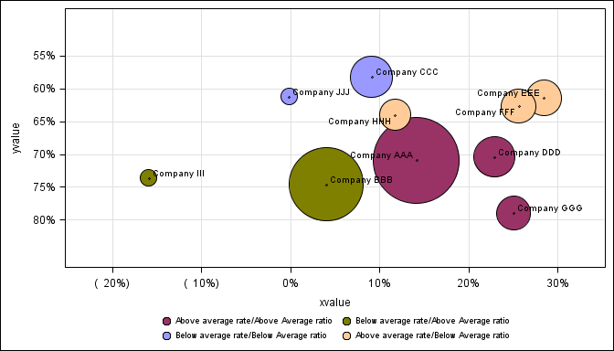
(3) I would like the xaxis and yaxis to begin and end on a tick mark. I have tried offsetmin=0, offsetmax=0, thresholdmin=1 and thresholdmax=1 on both the xaxsis and yaxis. On some of the graphs, depending on the size of the bubbles, some of the bubbles get chopped off. Below Company EEE and Company GGG get chopped.
Thank you for your help.

- Mark as New
- Bookmark
- Subscribe
- Mute
- RSS Feed
- Permalink
- Report Inappropriate Content
1. Yes, you can supply the values=(-0.2 to 0.3 by 0.05) on the x axis to get the tick values you want. This will also set the axis data min and max to the extreme values you provide. However, some values may not display if there is not enough space on the axis, and they collide. To see the values you provide either make the width of graph bigger, reduce the font size or set appropriate FitPolicy.
2. The legends are in the order in which the group values are encountered in the data. First group value in data is first in legend. To force the legend to always be in the order you want, you can add dummy values at the top of the data.with the appropriate group values but missing x or y axis value.
3. Axis tick values start drawing based on THRESHOLD. To always get an outer tick mark, set axis THRESHOLDMIN and MAX to 1. Refer doc for explanation of THRESHOLD. In your case you are already using Threshold min and max. Since you are adding scatter for data labels, the data label is setting offsets. you can set offsetmin and max = 0. Note, bubble at upper end of x axis is clipped.

Don't miss out on SAS Innovate - Register now for the FREE Livestream!
Can't make it to Vegas? No problem! Watch our general sessions LIVE or on-demand starting April 17th. Hear from SAS execs, best-selling author Adam Grant, Hot Ones host Sean Evans, top tech journalist Kara Swisher, AI expert Cassie Kozyrkov, and the mind-blowing dance crew iLuminate! Plus, get access to over 20 breakout sessions.
Learn how use the CAT functions in SAS to join values from multiple variables into a single value.

Find more tutorials on the SAS Users YouTube channel.
 Click image to register for webinar
Classroom Training Available!
Select SAS Training centers are offering in-person courses. View upcoming courses for:
-
1 reply
-
06-11-2015 02:39 PM
-
1546 views
-
0 likes
-
2 in conversation
-
