- Home
- /
- Programming
- /
- Graphics
- /
- Re: sas GRAPH Hbar with repeating period
- RSS Feed
- Mark Topic as New
- Mark Topic as Read
- Float this Topic for Current User
- Bookmark
- Subscribe
- Mute
- Printer Friendly Page
- Mark as New
- Bookmark
- Subscribe
- Mute
- RSS Feed
- Permalink
- Report Inappropriate Content
Dear all,
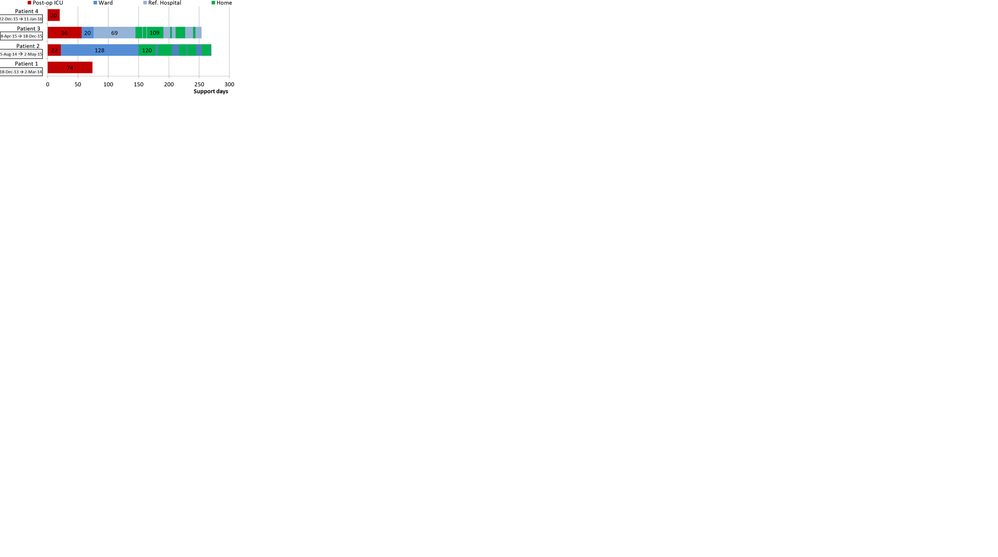
i would like to perform the graph in attachments.
I thought that it was possible usng Hbar with sgplot, but it does not.
The problem is that some period are repeating (in this case "Home").
Do you think that it was possible with SAS v9.4? What procedure?
Thanks for your support

Accepted Solutions
- Mark as New
- Bookmark
- Subscribe
- Mute
- RSS Feed
- Permalink
- Report Inappropriate Content
Maybe have a look through this blog:
http://blogs.sas.com/content/graphicallyspeaking/
Has loads of examples of all types of graphs.
- Mark as New
- Bookmark
- Subscribe
- Mute
- RSS Feed
- Permalink
- Report Inappropriate Content
Maybe have a look through this blog:
http://blogs.sas.com/content/graphicallyspeaking/
Has loads of examples of all types of graphs.
- Mark as New
- Bookmark
- Subscribe
- Mute
- RSS Feed
- Permalink
- Report Inappropriate Content
Thank you
- Mark as New
- Bookmark
- Subscribe
- Mute
- RSS Feed
- Permalink
- Report Inappropriate Content
I suggest to use the HIGHLOW plot statement, you have to prepare the data accordingly.
See below for an example, that gives you some ideas:
data highlow;
  infile cards dlm="," dsd missover;
  input
    patient : $32. low high type $ labelPoint labelValue $
  ;
  cards;
patient1 someDate,0,20,hospital,10,20
patient1 someDate,20,40,ward,,
patient1 someDate,40,50,hospital,,
patient1 someDate,50,52,home,,
patient1 someDate,52,55,ward,53.5,abc
patient2 01jan2010-25sep2010,0,25,hospital,,
patient2 01jan2010-25sep2010,25,45,home,,
patient2 01jan2010-25sep2010,45,46,ward,,
;

proc sgplot data=highlow;
  highlow y=patient low=low high=high / type=bar group=type;
  text y=patient x=labelPoint text=labelValue / position=center;
  yaxis type=discrete fitpolicy=splitalways;
run;- Mark as New
- Bookmark
- Subscribe
- Mute
- RSS Feed
- Permalink
- Report Inappropriate Content
Thank you,
i try to put the legend in top of the graph and one line with this sentence:
keylegend / position=top down=1;
But now i have Patient with different type and still on two rows for legends.
Can you help me?
- Mark as New
- Bookmark
- Subscribe
- Mute
- RSS Feed
- Permalink
- Report Inappropriate Content
Add the NAME= option to your plot statements, then in the KEYLEGEND statement you can say for which plot statements you would like to have a legend.
Sample:
proc sgplot data=highlow;
  highlow y=patient low=low high=high / type=bar group=type name="hl";
  text y=patient x=labelPoint text=labelValue / position=center name="txt";
  yaxis type=discrete fitpolicy=splitalways;
  keylegend "hl" / position=top  down=1 ;
run;
The placement might have something to do with space that is available, try to make your graph bigger.
- Mark as New
- Bookmark
- Subscribe
- Mute
- RSS Feed
- Permalink
- Report Inappropriate Content
Thank you again!
It's perfect.
Don't miss out on SAS Innovate - Register now for the FREE Livestream!
Can't make it to Vegas? No problem! Watch our general sessions LIVE or on-demand starting April 17th. Hear from SAS execs, best-selling author Adam Grant, Hot Ones host Sean Evans, top tech journalist Kara Swisher, AI expert Cassie Kozyrkov, and the mind-blowing dance crew iLuminate! Plus, get access to over 20 breakout sessions.
Learn how use the CAT functions in SAS to join values from multiple variables into a single value.
Find more tutorials on the SAS Users YouTube channel.
 Click image to register for webinar
Classroom Training Available!
Select SAS Training centers are offering in-person courses. View upcoming courses for:


