- Home
- /
- Programming
- /
- Graphics
- /
- Re: proc sgplot vbox reference lines
- RSS Feed
- Mark Topic as New
- Mark Topic as Read
- Float this Topic for Current User
- Bookmark
- Subscribe
- Mute
- Printer Friendly Page
- Mark as New
- Bookmark
- Subscribe
- Mute
- RSS Feed
- Permalink
- Report Inappropriate Content
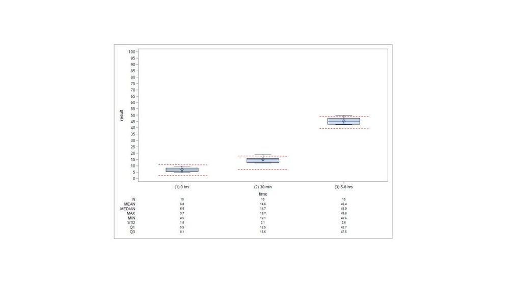
I'm creating 3 horizontal (side-by-side) boxplots in one graph using proc sgplot vbox and need two custom (high/low) horizontal (user-defined with values) reference lines for each of the 3 x-axis (non-numeric) categories. I only want the reference line pairs to show up within each category (which have different values for each category) and not go all the way across the graph. I tried the droplines option, but it looks like that only works for two categories. I was also thinking I can annotate, but without a numeric x-axis, not so sure I can. Thanks for any help.
- Mark as New
- Bookmark
- Subscribe
- Mute
- RSS Feed
- Permalink
- Report Inappropriate Content
Can you provide sample data and an example of what you want your plot to look like?
And the SAS version?
I think using markers is another option within SGPLOT but it depends a bit on your data. You may need to go to GTL to accomplish this because VBOX does have limitations on which procs can be used.
- Mark as New
- Bookmark
- Subscribe
- Mute
- RSS Feed
- Permalink
- Report Inappropriate Content
v 9.4
Sample data and code below (can't remember where I got the code, but works well for me).
Attached shows the pairs of reference lines (in red) that I need for each time point. I have values for these. These values are based on percentiles obtained using other data.
Thanks!
data have;
input time $ 1-11 result;
datalines;
(1) 0 hrs 9.5
(1) 0 hrs 6.5
(1) 0 hrs 5.5
(1) 0 hrs 8.1
(1) 0 hrs 5.2
(1) 0 hrs 6.6
(1) 0 hrs 6.8
(1) 0 hrs 9.7
(1) 0 hrs 4.5
(1) 0 hrs 5.7
(2) 30 min 15.6
(2) 30 min 14.4
(2) 30 min 13.9
(2) 30 min 12.2
(2) 30 min 16.7
(2) 30 min 15.3
(2) 30 min 18.7
(2) 30 min 12.1
(2) 30 min 15.0
(2) 30 min 12.5
(3) 5-8 hrs 45.2
(3) 5-8 hrs 46.4
(3) 5-8 hrs 47.5
(3) 5-8 hrs 48.5
(3) 5-8 hrs 42.6
(3) 5-8 hrs 43.6
(3) 5-8 hrs 44.6
(3) 5-8 hrs 42.7
(3) 5-8 hrs 42.7
(3) 5-8 hrs 49.8
;
run;
ods output sgplot=nogroup_rpt_s(rename=(BOX_result_X_Time___Y=Value BOX_result_X_Time__ST=Stat BOX_result_X_Time___X=Cat));
proc sgplot data=have; vbox result/category=time;
run;
proc print data=nogroup_rpt_s; run;
data merged_rpt_s;
set have nogroup_rpt_s(where=(value ne . and stat in ('N' 'MEAN' 'MEDIAN' 'MAX' 'MIN' 'STD' 'Q1' 'Q3')));
if stat eq 'N' then N=value; else if stat eq 'MEAN' then MEAN=value; else if stat eq 'MEDIAN' then MEDIAN=value;
else if stat eq 'MAX' then MAX=value; else if stat eq 'MIN' then MIN=value; else if stat eq 'STD' then STD=value;
else if stat eq 'Q1' then Q1=value; else if stat eq 'Q3' then Q3=value;
run;
**OUTPUT to pdf*;
ods graphics/reset attrpriority=color ANTIALIASMAX=41000 width=10in height=7in;
ODS PDF FILE = "C:\Temp\test.pdf"; options orientation=landscape;
proc sgplot data=merged_rpt_s NOAUTOLEGEND; yaxis values=(0 to 100 by 5); xaxis ;
format N 3.0; format mean median max min std q1 q3 4.1;
vbox result/category=time;
scatter x=Time y=result/jitter markerattrs=(symbol=circlefilled size=2 color=black) transparency=.1 clusterwidth=0.7;
xaxistable N mean median max min std q1 q3/x=cat location=outside classorder=ascending;
run;
ODS PDF CLOSE;
- Mark as New
- Bookmark
- Subscribe
- Mute
- RSS Feed
- Permalink
- Report Inappropriate Content
I haven't read your entire code, but if I may bring a few suggestions, then drop your
yaxis values=(0 to 100 by 5); statement. You have a lot of unnecessary white space because of that.
Also, I would drop the XAXISTABLE statement and let the plot speak for itself.
Just suggestions, use them if you like 🙂
- Mark as New
- Bookmark
- Subscribe
- Mute
- RSS Feed
- Permalink
- Report Inappropriate Content
Hey thanks.
re yaxis values=(0 to 100 by 5😞 agree, was applicable to the real data, not the sample data
re dropping the XAXISTABLE: agree, but my people say they want the table as well
- Mark as New
- Bookmark
- Subscribe
- Mute
- RSS Feed
- Permalink
- Report Inappropriate Content
What does your code look like now? And your data? 🙂
- Mark as New
- Bookmark
- Subscribe
- Mute
- RSS Feed
- Permalink
- Report Inappropriate Content
the sample data and code are posted
Don't miss out on SAS Innovate - Register now for the FREE Livestream!
Can't make it to Vegas? No problem! Watch our general sessions LIVE or on-demand starting April 17th. Hear from SAS execs, best-selling author Adam Grant, Hot Ones host Sean Evans, top tech journalist Kara Swisher, AI expert Cassie Kozyrkov, and the mind-blowing dance crew iLuminate! Plus, get access to over 20 breakout sessions.
Learn how use the CAT functions in SAS to join values from multiple variables into a single value.
Find more tutorials on the SAS Users YouTube channel.
 Click image to register for webinar
Classroom Training Available!
Select SAS Training centers are offering in-person courses. View upcoming courses for:


