- Home
- /
- Programming
- /
- Graphics
- /
- proc genmod graphics for count data model fit assessment
- RSS Feed
- Mark Topic as New
- Mark Topic as Read
- Float this Topic for Current User
- Bookmark
- Subscribe
- Mute
- Printer Friendly Page
- Mark as New
- Bookmark
- Subscribe
- Mute
- RSS Feed
- Permalink
- Report Inappropriate Content
You are not using the CDF function correctly. Here is a link to the doc. A random variable X follows the NB distribution if it returns the number of failures before N success in a sequence of independent trials in which the probability of success is p.
The value 1.04 is not an appropriate value for any of these parameters.
Here is an example of using the CDF function to plot the NB CDF for indep trials in which p=0.3 and we want the number of failures until the first success:
data NB;
do x = 0 to 20;                      /* X=0,1,...,20 = "num failures" */
   NBCDF = cdf("NegBin", x, 0.3, 1); /* p=0.3; draw until 1 success */
   output;
end;
proc sgplot data=NB;
   step x=X y=NBCDF;
run;- Mark as New
- Bookmark
- Subscribe
- Mute
- RSS Feed
- Permalink
- Report Inappropriate Content
Getting running out of time and steep learning curve, tempted to stick to poisson dist. defintely shall put more efforts in to understanding negbin later as it offers slightly a better fit to my data.
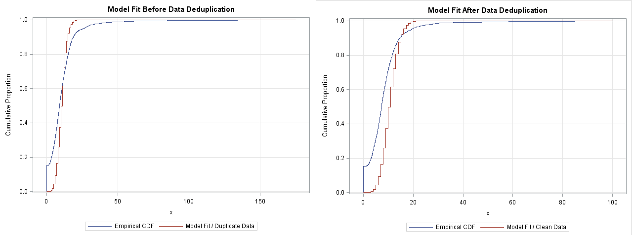
Looking at below cdf plots, my data cleaning seemed not to cause an appreciable difference. I don't know If I could even tell the plot on the right (model fit after deduplication) shows a better fit. What do you think? Please let me know if there're better diagnostic visuals that would show the impact of data cleaning on model fitting with more contrast than this?
- Mark as New
- Bookmark
- Subscribe
- Mute
- RSS Feed
- Permalink
- Report Inappropriate Content
Why not plot the difference to make it absolutely clear, especially since that's your interest.
- Mark as New
- Bookmark
- Subscribe
- Mute
- RSS Feed
- Permalink
- Report Inappropriate Content
- Mark as New
- Bookmark
- Subscribe
- Mute
- RSS Feed
- Permalink
- Report Inappropriate Content
No, if the difference is of interest, subtract the two distribution values across the entire series and plot the actual difference.
- Mark as New
- Bookmark
- Subscribe
- Mute
- RSS Feed
- Permalink
- Report Inappropriate Content
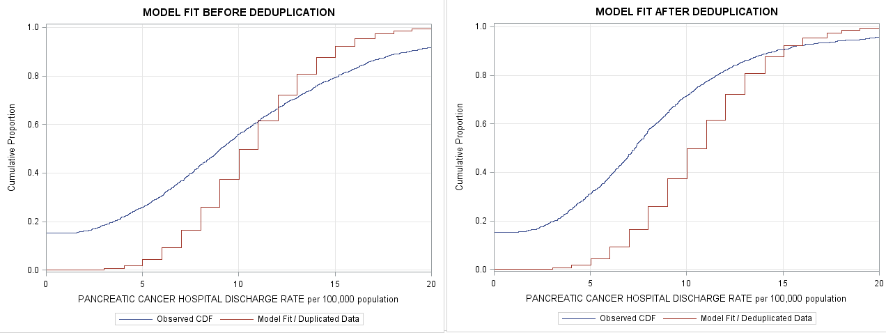
Most of the action is happening in the interval [0,20], but you can't see it because the X axis is so long. You might consider truncating the graphs into the interval [0,20]:or [0,25] like this:
xaxis offsetmin=0.0 offsetmax=0.0 min=0 max=20;
You ask about a better visualization. A PDF plot will be MUCH better at revealing differences between fit and data than a CDF plot. I've written several articles about overlaying PDF/PMF densities on histograms and bar charts. For a discrete distribution, I recommend the articles
http://blogs.sas.com/content/iml/2016/09/12/overlay-curve-bar-chart-sas.html
and
http://blogs.sas.com/content/iml/2012/04/04/fitting-a-poisson-distribution-to-data-in-sas.html
- Mark as New
- Bookmark
- Subscribe
- Mute
- RSS Feed
- Permalink
- Report Inappropriate Content
Thanks Rick, i had updated the x axis scale with truncation syntax you suggested. Looking at the plots, I realized that negbin fits better than poisson not just slightly but significantly. Lambda estimated from my negbin model in proc genmod is 10.7 instead 1.04.
Can you give me more direct hints as to what x, 0.3 and 1 (as used in your previous demo) would be in the context of my data?
I posted my data here for reference.
data mydata;
set outCDF;
NegbCDF = cdf("NegBin",x,0.3,1);
run;
- Mark as New
- Bookmark
- Subscribe
- Mute
- RSS Feed
- Permalink
- Report Inappropriate Content
Hi,
Final check, if you will. Below is how I'm approaching to negbin cdf plotting. Is it about right? Thanks much! Please ignore my previous question.
My reference:
http://support.sas.com/kb/24/166.html
ESTIMATING OF NEGBIN PARAMETERS:

proc genmod data=MYDATA;
      model outcome = / dist=negbin;
      ods output parameterestimates=post.pe;
      run;
   proc transpose data=post.pe out=post.tpe;
      var estimate;
      id parameter;
      run;
   data post.tpe;
      set;
      nb_k = 1/dispersion;
      nb_p = 1/(1+exp(intercept)*dispersion);
      nb_mean=nb_k*(1-nb_p)/nb_p;
      nb_var =nb_k*(1-nb_p)/nb_p**2;
      run;
   proc print;
      run;

CALCULATING CUM PROBS:

ods select cdfplot;
proc univariate data=post.MYDATA;
var rate;
cdfplot rate / vscale=proportion vscale=proportion odstitle="Empirical CDF" odstitle2="PROC UNIVARIATE";
ods output cdfplot=post.outCDF;
run;

FEEDING NEGBIN CDF DISTRIBUTION WITH PARAMETERS CALCULATED ABOVE:
data ALL; set outCDF;
NBCDF = cdf("NegBin", ECDFX,0.027774,0.474);
run;

PLOTTING:
title "MODEL FIT AFTER DEDUPLICATION";
proc sgplot data=ALL;
   step x=ECDFX y=ECDFY / legendlabel="ECDF";
   step x=ECDFX y=NBCDF / legendlabel="Model Fit";
   xaxis grid label="x" offsetmin=0.05 offsetmax=0.05;
   yaxis grid min=0 label="Cumulative Proportion";
run;- Mark as New
- Bookmark
- Subscribe
- Mute
- RSS Feed
- Permalink
- Report Inappropriate Content
Yes, that usage note (which is in the article that I linked to), is the correct way to model an intercept-only NB model.
In Pedan's paper and in your original post, you were using a model that includes a covariate and an offset. I don't know how to get the NB parameters in that case and unfortunately I don't have time to study Pedan's paper right now.
- Mark as New
- Bookmark
- Subscribe
- Mute
- RSS Feed
- Permalink
- Report Inappropriate Content
Hello,
I know I am a little late to this post, but I hope it is still recent enough that you may provide assistance. I am also trying to utilize Genmod graphics for model fit assessment to show negative binomial distribution is a better fit than poisson. I found the same Pedan paper and wanted to create a similar graph. I have been successful doing this without an offset. However, my data requires that an offset be included. In the Pedan paper, they state an offset was used. I was wondering if you had any luck including an offset in your analysis? Fit statistics suggest the negative binomial model fit the data the best, however, when visualized this is not the case. I believe I am estimating the parameters wrong, given that an offset should somehow be incorporated. Can you provide me any help, suggestions, or references? Thanks in advance!
- « Previous
-
- 1
- 2
- Next »
Don't miss out on SAS Innovate - Register now for the FREE Livestream!
Can't make it to Vegas? No problem! Watch our general sessions LIVE or on-demand starting April 17th. Hear from SAS execs, best-selling author Adam Grant, Hot Ones host Sean Evans, top tech journalist Kara Swisher, AI expert Cassie Kozyrkov, and the mind-blowing dance crew iLuminate! Plus, get access to over 20 breakout sessions.
Learn how use the CAT functions in SAS to join values from multiple variables into a single value.
Find more tutorials on the SAS Users YouTube channel.
 Click image to register for webinar
Classroom Training Available!
Select SAS Training centers are offering in-person courses. View upcoming courses for:


