- Home
- /
- Programming
- /
- Graphics
- /
- Re: proc gchart
- RSS Feed
- Mark Topic as New
- Mark Topic as Read
- Float this Topic for Current User
- Bookmark
- Subscribe
- Mute
- Printer Friendly Page
- Mark as New
- Bookmark
- Subscribe
- Mute
- RSS Feed
- Permalink
- Report Inappropriate Content
Below is the code I'm using, I will attach a work doc with the output. I'm trying to order the graph on the x axis. I tried a variable named sort but I'd like to have the dates as labels and I couldn't get the output to look the way I wanted. I added a number to preface the dates, it's working but I don't like the way it looks. So if there is an easy way to sort the x axis without labeling what the sort order is that would be a big help. Also notice the height of the bars do not coincide with the hight of the labels. When I started this I thought both would be an easy fix but I can't find anything.
I also tried formating the dates as date9. but the values changed in the gchart step. Here's my code:
proc freq data=mdj._1l_threshold_report_&monyear noprint;table 'Pass/Fail'n / out=Current;
proc freq data=mdj._1l_threshold_report_&p_monyear noprint;table pass_fail / out=previous;
proc freq data=mdj._1l_threshold_report_&p_monyear2 noprint;table pass_fail / out=previous2;
goptions reset=all cback=white border
htitle=11pt htext=11pt;
proc sql;
create table graph_prep as
select catx(' ','3)',"&Current") as Date ,count,'Pass/Fail'n
from Current
union
select catx(' ','2)',"&previous") as Date ,count,pass_fail as 'Pass/Fail'n
from previous
union
select catx(' ','1)',"&previous2") as Date ,count,pass_fail as 'Pass/Fail'n
from previous2
order by date;
data HE_Graph;
length function color text $ 8 style $ 20;
retain function 'label' color 'black' when 'a'
xsys ysys '2' position 'E' size 3 hsys '3';
set graph_prep;
style="'Albany AMT'";
midpoint=date;
subgroup='Pass/Fail'n;
text = count;
/* text=left(put(sales,dollar8.));*/
run;
/* Define axis characteristics */
axis1 minor=none;* label=(count);
/* Add a title to the graph */
title 'Executive Summary';
/* Produce the bar chart using the ANNO= */
/* option on the VBAR statement. */
proc gchart data=graph_prep;
vbar date / sumvar=count raxis=axis1
nozero anno=HE_Graph subgroup='Pass/Fail'n
width=12 space=3;
run;
quit;
Accepted Solutions
- Mark as New
- Bookmark
- Subscribe
- Mute
- RSS Feed
- Permalink
- Report Inappropriate Content
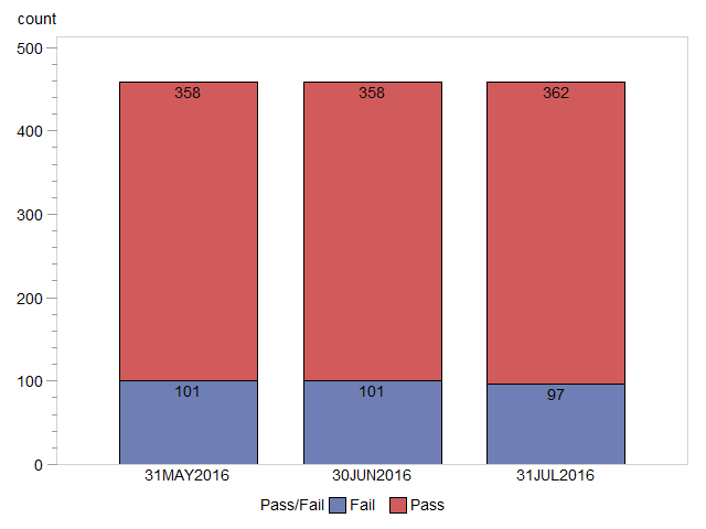
Assuming you want the order to be in the axis of the dates, then you'll want to use the actual SAS date values (which are numeric under-the-covers, and use a date-format so they show as you want). One trick with using date values as graph midpoints is that you need to use the 'discrete' option (otherwise gchart will try to 'group' the dates by midpoints).
Here's some code to re-create your graph, with simple sas dates:
data graph_prep;
length pass_fail $4;
format date date9.;
input date date9. pass_fail count;
datalines;
31may2016 Fail 101
31may2016 Pass 358
30jun2016 Fail 101
30jun2016 Pass 358
31jul2016 Fail 97
31jul2016 Pass 362
;
run;
axis1 label=none;
proc gchart data=graph_prep;
label pass_fail='Pass/Fail';
vbar date / discrete type=sum sumvar=count
inside=sum maxis=axis1
subgroup=pass_fail;
run;
- Mark as New
- Bookmark
- Subscribe
- Mute
- RSS Feed
- Permalink
- Report Inappropriate Content
With GChart your Axis control comes in your AXIS statements. Did you try an ORDER=() option on the axis for the horizontal axis?
You should be able to specify the data literals for the dates you are displaying
Axis2 order=('31MAY2016'D '30JUN2016'D '31JUL2016'D);
and have haxis=Axis2
or SORT the data by the VBAR variable Date. Some of the older graphics will assign the first display value in categorical charts like vbar or hbar by the order they are encountered when reading data.
The tops of those bars look to be displaying pretty close to 460 on the vertical axis. Add a REF=(460) to generate a reference line at the response axis value of 460 to demonstrate.
- Mark as New
- Bookmark
- Subscribe
- Mute
- RSS Feed
- Permalink
- Report Inappropriate Content
Assuming you want the order to be in the axis of the dates, then you'll want to use the actual SAS date values (which are numeric under-the-covers, and use a date-format so they show as you want). One trick with using date values as graph midpoints is that you need to use the 'discrete' option (otherwise gchart will try to 'group' the dates by midpoints).
Here's some code to re-create your graph, with simple sas dates:
data graph_prep;
length pass_fail $4;
format date date9.;
input date date9. pass_fail count;
datalines;
31may2016 Fail 101
31may2016 Pass 358
30jun2016 Fail 101
30jun2016 Pass 358
31jul2016 Fail 97
31jul2016 Pass 362
;
run;
axis1 label=none;
proc gchart data=graph_prep;
label pass_fail='Pass/Fail';
vbar date / discrete type=sum sumvar=count
inside=sum maxis=axis1
subgroup=pass_fail;
run;
- Mark as New
- Bookmark
- Subscribe
- Mute
- RSS Feed
- Permalink
- Report Inappropriate Content
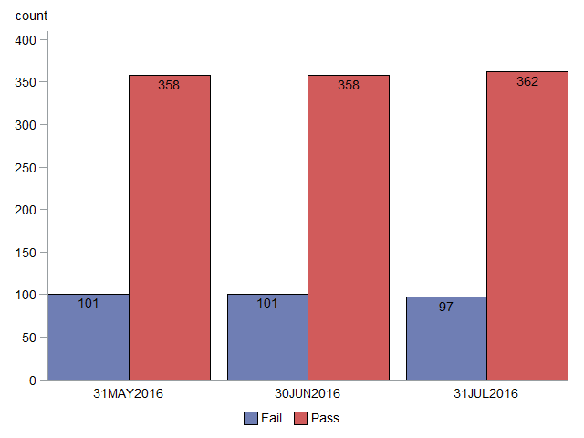
You also mentioned about the height of the bars not corresponding to the height of the labels. This is because you're using a stacked bar chart - the labels are for the value inside a single bar segment, whereas the numbers along the axis are for the combined/stacked bars.
I think it might be better to use a paired/grouped bar chart, rather than a stacked bar chart for this data, and here is the code for that:
data graph_prep;
length pass_fail $4;
format date date9.;
input date date9. pass_fail count;
datalines;
31may2016 Fail 101
31may2016 Pass 358
30jun2016 Fail 101
30jun2016 Pass 358
31jul2016 Fail 97
31jul2016 Pass 362
;
run;
axis1 label=none value=none;
axis2 label=none;
axis3 minor=none;
legend1 label=none;
proc gchart data=graph_prep;
vbar pass_fail / group=date space=0
type=sum sumvar=count noframe
inside=sum maxis=axis1 gaxis=axis2 raxis=axis3
subgroup=pass_fail legend=legend1;
run;
Don't miss out on SAS Innovate - Register now for the FREE Livestream!
Can't make it to Vegas? No problem! Watch our general sessions LIVE or on-demand starting April 17th. Hear from SAS execs, best-selling author Adam Grant, Hot Ones host Sean Evans, top tech journalist Kara Swisher, AI expert Cassie Kozyrkov, and the mind-blowing dance crew iLuminate! Plus, get access to over 20 breakout sessions.
Learn how use the CAT functions in SAS to join values from multiple variables into a single value.
Find more tutorials on the SAS Users YouTube channel.
 Click image to register for webinar
Classroom Training Available!
Select SAS Training centers are offering in-person courses. View upcoming courses for:


