- Home
- /
- Programming
- /
- Graphics
- /
- legend position in GTL/Proc template
- RSS Feed
- Mark Topic as New
- Mark Topic as Read
- Float this Topic for Current User
- Bookmark
- Subscribe
- Mute
- Printer Friendly Page
- Mark as New
- Bookmark
- Subscribe
- Mute
- RSS Feed
- Permalink
- Report Inappropriate Content
Hello,
I have a two fold question:
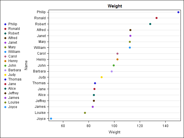
1. I Would like to replace Y axis values with legend is it possible to do this SAS GTL or any other SAS procedure? Alternatively how to place circle filled next to the y axis values. As an example, please see below for the graph, I would like to place blue filled circle next to Philip, and red filled circle next to Ronald.
2. How to manually specify the colors for the filled circle ?
Please SAS code for reproduciblity.
Many Thanks

proc template;
define statgraph dotplot;
begingraph;
entrytitle "Weight";
layout overlay/yaxisopts = (type=discrete griddisplay=on reverse=true);
scatterplot x = weight y=name/markerattrs=(symbol=circlefilled) name='dot' group = name
legendlabel = 'Weight';
discretelegend 'dot'/halign = left ORDER=rowmajor across=1 BORDER = FALSE pad=(top=5 bottom=5);
endlayout;
endgraph;
end;
run;
proc sort data = sashelp.class out = class;
by descending weight;
run;
proc sgrender data = class template = dotplot;
run;
- Mark as New
- Bookmark
- Subscribe
- Mute
- RSS Feed
- Permalink
- Report Inappropriate Content
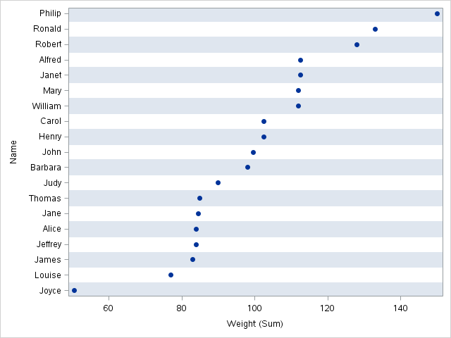
Creating a unique, distinct colors for this many category values would be extremely difficult because the color perception of people can vary widely. It appears that your goal is to improve the association of the dot to the category value. I'm not sure of your SAS version, but consider trying color bands to help with the association:
proc sgplot data=sashelp.class;
yaxis colorbands=odd;
dot name / response=weight categoryorder=respdesc;
run;

Don't miss out on SAS Innovate - Register now for the FREE Livestream!
Can't make it to Vegas? No problem! Watch our general sessions LIVE or on-demand starting April 17th. Hear from SAS execs, best-selling author Adam Grant, Hot Ones host Sean Evans, top tech journalist Kara Swisher, AI expert Cassie Kozyrkov, and the mind-blowing dance crew iLuminate! Plus, get access to over 20 breakout sessions.
Learn how use the CAT functions in SAS to join values from multiple variables into a single value.
Find more tutorials on the SAS Users YouTube channel.
 Click image to register for webinar
Classroom Training Available!
Select SAS Training centers are offering in-person courses. View upcoming courses for:


