- Home
- /
- Programming
- /
- Graphics
- /
- Re: histogram with break in y axis
- RSS Feed
- Mark Topic as New
- Mark Topic as Read
- Float this Topic for Current User
- Bookmark
- Subscribe
- Mute
- Printer Friendly Page

- Mark as New
- Bookmark
- Subscribe
- Mute
- RSS Feed
- Permalink
- Report Inappropriate Content
hi,
I need to compare the histogram of a discrete but quantitative variable (that has about 30 values with increment of one) between two groups. the last value of the x-variable has a mass of frequency much much higher that the others. Since I would like to show all the values on the x-axis, maybe a discontinuous Y axis would be the right way.
In alternative I can also use a line graph, but for the same reason I would need a break on the Y axis.
Is there a way to create such a graph possibly with an sg graph solution?
I'm running 9.2
Any help is greatly appreciated
thank you in advance
- Mark as New
- Bookmark
- Subscribe
- Mute
- RSS Feed
- Permalink
- Report Inappropriate Content
no hints?
isn't it possible with gtl? I would appreciate if someone could suggest a code for a problem like this.
anyway thank you all very much

- Mark as New
- Bookmark
- Subscribe
- Mute
- RSS Feed
- Permalink
- Report Inappropriate Content
The way statisticians handle this issue is to use a log-scale axis for Y. This is seen as being more "honest" than to break the axis.
A second approach is to alter the data so that the tall bar is not as tall, and then put an arrow over it (pointing up) with the true value.

- Mark as New
- Bookmark
- Subscribe
- Mute
- RSS Feed
- Permalink
- Report Inappropriate Content
Rick's idea is the easiest.
Now, you could use a GTL Lattice Layout with a two cell stack. Pre summarize (or bin) the data, and use a HistogramParm or a BarChart in each cell. Make upper cell shorter. Set the Y axis Viewmin and Viewmax to see the ranges you need. Here is example. Let me know if this work for you?
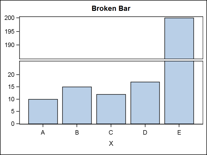
data TallBar;
input X $ Y;
datalines;
A 10
B 15
C 12
D 17
E 200
;
run;
proc print;run;
proc template;
define statgraph tall_bar;
begingraph;
entrytitle 'Broken Bar';
layout lattice / rows=2 columndatarange=union rowweights=(0.4 0.6) rowgutter=5;
columnaxes;
columnaxis;
endcolumnaxes;
layout overlay / yaxisopts=(display=(ticks tickvalues)
offsetmin=0 linearopts=(viewmin=185 tickvaluelist=(190 195 200)));
barchart x=x y=y;
endlayout;
layout overlay / yaxisopts=(display=(ticks tickvalues)
offsetmin=0 linearopts=(viewmax=25 tickvaluelist=(0 5 10 15 20)));
barchart x=x y=y;
endlayout;
endlayout;
endgraph;
end;
run;
ods graphics / reset width=4in height=3in imagename='Tall_bar';
proc sgrender data=TallBar template=tall_bar;
run;
- Mark as New
- Bookmark
- Subscribe
- Mute
- RSS Feed
- Permalink
- Report Inappropriate Content
wow, the example above seems what I was ooking for. I'll try to apply to my data and adapt to the group comparison
the idea of altering the taller bar is also very nice and looks quite simple. thank you very much to both.
- Mark as New
- Bookmark
- Subscribe
- Mute
- RSS Feed
- Permalink
- Report Inappropriate Content
See another idea (SAS 9.3) in blog article on Broken y-Axis.

Don't miss out on SAS Innovate - Register now for the FREE Livestream!
Can't make it to Vegas? No problem! Watch our general sessions LIVE or on-demand starting April 17th. Hear from SAS execs, best-selling author Adam Grant, Hot Ones host Sean Evans, top tech journalist Kara Swisher, AI expert Cassie Kozyrkov, and the mind-blowing dance crew iLuminate! Plus, get access to over 20 breakout sessions.
Learn how use the CAT functions in SAS to join values from multiple variables into a single value.

Find more tutorials on the SAS Users YouTube channel.
 Click image to register for webinar
Classroom Training Available!
Select SAS Training centers are offering in-person courses. View upcoming courses for:
-
5 replies
-
05-25-2012 09:23 AM
-
2072 views
-
1 like
-
3 in conversation
-
