- Home
- /
- Programming
- /
- Graphics
- /
- Re: gplot problem: values don't connect
- RSS Feed
- Mark Topic as New
- Mark Topic as Read
- Float this Topic for Current User
- Bookmark
- Subscribe
- Mute
- Printer Friendly Page

- Mark as New
- Bookmark
- Subscribe
- Mute
- RSS Feed
- Permalink
- Report Inappropriate Content
Dear all,
My values don't connect in a gplot although I write symbol statements. Does anybody know why this might happen? Here is my code (it shoul produce one line):
symbol1 interpol = join pointlabel height=0.75 line=1 color=CX113388 value=cube;
legend1 label=none position=(bottom center outside);
proc gplot data=mydata;
format num_var1 commax10.2;
plot num_var1 * char_var1 = num_var2 / autovref lautovref = 2 cautovref = CXEEEEEE
vzero
vaxis = axis1 haxis = axis2 vreverse
legend = legend1;
axis1 label=("My label" angle=90) minor=none order=(1 to 5 by 1) offset=(1cm);
axis2 label=none;
run;
quit;
num_var1 and num_var2 are numeric
char_var1 is character
Everything is done from the symbol statement except the interpol=join.
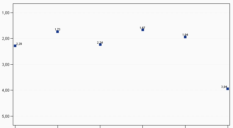
(I removed the labels, legend and values on the screenshot as it is company data)
Best wishes
Eva

- Mark as New
- Bookmark
- Subscribe
- Mute
- RSS Feed
- Permalink
- Report Inappropriate Content
Hi,
One way to control your SAS plots is in 'goption'. For example using SAS example ( it produce a graph like yours):
/* Put this line above your Graph, I put it here. This line is not in SAS example*/
goptions reset=global device=activex ypixels=600 xpixels=800;
data jobs;
length eng $5;
input eng dollars num;
datalines;
Civil 27308 73273
Aero 29844 70192
Elec 22920 89382
Mech 32816 19601
Chem 28116 25541
Petro 18444 34833
;
title1 "Member Profile";
title2 "Salaries and Number of Member Engineers";
axis1 label=none
offset=(5,5);
axis2 order=(0 to 40000 by 10000)
label=none;
proc gplot data=jobs;
format dollars dollar9. num comma7.0;
bubble dollars*eng=num / haxis=axis1
vaxis=axis2
vminor=1
bcolor=darkred
blabel
bsize=3;
run;
quit;
Then right click on the graph.Select "Graph Properties" and choose what you want. You can connect dots using regression, lines and ... .

- Mark as New
- Bookmark
- Subscribe
- Mute
- RSS Feed
- Permalink
- Report Inappropriate Content
Try leaving off the "= num_var2" in your plot statement.
- Mark as New
- Bookmark
- Subscribe
- Mute
- RSS Feed
- Permalink
- Report Inappropriate Content
@Mahommad: I want the value to be connected at start, not by manually selecting activex options.
@Robert: this works. But now I manipulate my data so that I have two distinct values of num_var2 in the data file. I'd like to have 2 lines then. So I have to include the "= num_var". Then the values aren't connected anymore 😞
- Mark as New
- Bookmark
- Subscribe
- Mute
- RSS Feed
- Permalink
- Report Inappropriate Content
Can you post some sample data (without real/proprietary values) that reproduces the problem?
- Mark as New
- Bookmark
- Subscribe
- Mute
- RSS Feed
- Permalink
- Report Inappropriate Content
Funny thing is that when I leave out "= num_var" I get two lines.
I have nearly the same plot with different data where my plot statement is
plot num_var1 * num_var2 = num_var3
i.e. are variables are numeric. This is the only difference. And here I get all lines for all the values of num_var3
Do you think the var type is the problem?
- Mark as New
- Bookmark
- Subscribe
- Mute
- RSS Feed
- Permalink
- Report Inappropriate Content
And are you using device=activex, or device=png? (this might make a difference)
- Mark as New
- Bookmark
- Subscribe
- Mute
- RSS Feed
- Permalink
- Report Inappropriate Content
I still use activex. Haven't found the time to switch to png.

- Mark as New
- Bookmark
- Subscribe
- Mute
- RSS Feed
- Permalink
- Report Inappropriate Content
Don't know if this issue is resolved. Here is SGPLOT solution:
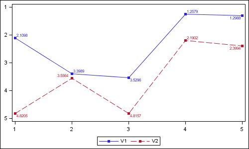
data values;
do x=1 to 5;
V1= 1+3*ranuni(2);
V2= 2+3*ranuni(2);
output;
end;
run;
ods graphics / reset width=5in height=3in imagename='Series';
proc sgplot data=values;
series x=x y=v1 / markers datalabel=v1 markerattrs=(symbol=squarefilled) ;
series x=x y=v2 / markers datalabel=v2 markerattrs=(symbol=squarefilled) ;
xaxis display=(nolabel);
yaxis display=(nolabel) reverse;
run;
- Mark as New
- Bookmark
- Subscribe
- Mute
- RSS Feed
- Permalink
- Report Inappropriate Content
Dear all,
in the meantime I found the reason for the problem. The reason is not activex. The problem was in my data. I had a fourth variable which had wrong values. After I fixed that, the plot was shown correctly!
Best wishes
Eva

Don't miss out on SAS Innovate - Register now for the FREE Livestream!
Can't make it to Vegas? No problem! Watch our general sessions LIVE or on-demand starting April 17th. Hear from SAS execs, best-selling author Adam Grant, Hot Ones host Sean Evans, top tech journalist Kara Swisher, AI expert Cassie Kozyrkov, and the mind-blowing dance crew iLuminate! Plus, get access to over 20 breakout sessions.
Learn how use the CAT functions in SAS to join values from multiple variables into a single value.

Find more tutorials on the SAS Users YouTube channel.
 Click image to register for webinar
Classroom Training Available!
Select SAS Training centers are offering in-person courses. View upcoming courses for:
-
9 replies
-
01-09-2013 04:01 AM
-
1156 views
-
0 likes
-
4 in conversation
-
