- Home
- /
- Programming
- /
- Graphics
- /
- gchart/gplot template or other
- RSS Feed
- Mark Topic as New
- Mark Topic as Read
- Float this Topic for Current User
- Bookmark
- Subscribe
- Mute
- Printer Friendly Page

- Mark as New
- Bookmark
- Subscribe
- Mute
- RSS Feed
- Permalink
- Report Inappropriate Content
Hi,
I've been searching hi & low for code similar to this:http://robslink.com/SAS/democd33/rugby_info.htm
mainly interesting in the pki values with a bar chart using a different format via gchart. I've just begun understanding how to create simple charts and want to understand concepts working with more complex charts. Currently I do this using excel and make an invisible line with a visible tick or line marker. using the code from Robs website seems fine however I'd like to use dataskin=sheen or the other 5 options with dataskin. For the bars I'd like to make them have 2yaxis for the % (mean & goal bars).
I've searched everywhere and this is the ONLY example I've found that fits perfectly, however not sure how to transform this into gplot or sgplot for that matter. If anyone has similar charts I'd be very interesting in looking at the code. Cheers
Marv
Accepted Solutions

- Mark as New
- Bookmark
- Subscribe
- Mute
- RSS Feed
- Permalink
- Report Inappropriate Content
One possible option is the High-Low plot.
proc sgplot data=mydata;
vbarparm category=original_order response=points/ barwidth=0.6 dataskin=sheen fillattrs=(color=cx4f81bd);
highlow x=original_order high=mean_high low=mean_low/type=bar clusterwidth=1 fillattrs=(color=red) nooutline;
highlow x=original_order high=goal_high low=goal_low/type=bar clusterwidth=1 fillattrs=(color=yellow) nooutline;
run;
You have to add mean_high and mean_low / goal_high and goal_low to the dataset, something like this:
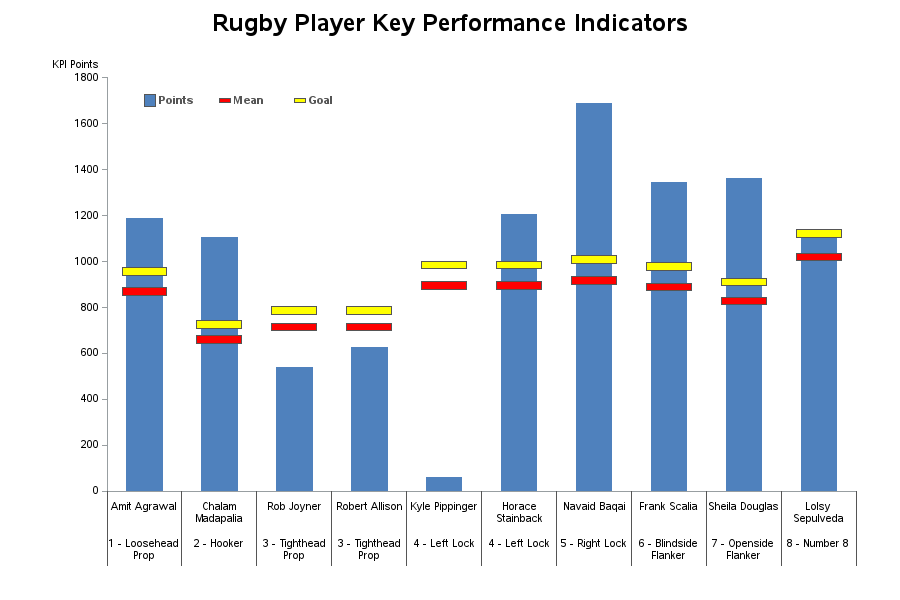
data mydata;
input PlayerPosition $ 1-22 PlayerName $ 24-41 Points Mean Goal;
original_order+1;
mean_high=mean+15;
mean_low=mean-15;
goal_high=goal+15;
goal_low=goal-15;
datalines;
1 - Loosehead\Prop     Amit Agrawal       1187.06  870.58  957.638
2 - Hooker             Chalam\Madapalia   1105.64  660.62  726.682
3 - Tighthead\Prop     Rob Joyner          539.33  715.33  786.863
3 - Tighthead\Prop     Robert Allison      627.14  715.33  786.863
4 - Left Lock          Kyle Pippinger       61.04  896.17  985.787
4 - Left Lock          Horace\Stainback   1204.15  896.17  985.787
5 - Right Lock         Navaid Baqai       1688.76  916.90 1008.590
6 - Blindside\Flanker  Frank Scalia       1342.54  890.15  979.165
7 - Openside\Flanker   Sheila Douglas     1362.77  827.35  910.085
8 - Number 8           Lolsy\Sepulveda    1119.28 1020.48 1122.528
;
run;
I don't do the other fancy stuff in Rob's as that would take some time, but it's not terribly difficult in SGPLOT.


- Mark as New
- Bookmark
- Subscribe
- Mute
- RSS Feed
- Permalink
- Report Inappropriate Content
Similar to the 'dataskins', you can use ods styles in sas/graph (gchart, gplot, etc). Ods styles are not quite as fancy as skins though.
Here is the image from the above example - maybe if the ods graphics folks see it, they'll know of an easy way to do this with sgplot and such...
- Mark as New
- Bookmark
- Subscribe
- Mute
- RSS Feed
- Permalink
- Report Inappropriate Content
One possible option is the High-Low plot.
proc sgplot data=mydata;
vbarparm category=original_order response=points/ barwidth=0.6 dataskin=sheen fillattrs=(color=cx4f81bd);
highlow x=original_order high=mean_high low=mean_low/type=bar clusterwidth=1 fillattrs=(color=red) nooutline;
highlow x=original_order high=goal_high low=goal_low/type=bar clusterwidth=1 fillattrs=(color=yellow) nooutline;
run;
You have to add mean_high and mean_low / goal_high and goal_low to the dataset, something like this:
data mydata;
input PlayerPosition $ 1-22 PlayerName $ 24-41 Points Mean Goal;
original_order+1;
mean_high=mean+15;
mean_low=mean-15;
goal_high=goal+15;
goal_low=goal-15;
datalines;
1 - Loosehead\Prop     Amit Agrawal       1187.06  870.58  957.638
2 - Hooker             Chalam\Madapalia   1105.64  660.62  726.682
3 - Tighthead\Prop     Rob Joyner          539.33  715.33  786.863
3 - Tighthead\Prop     Robert Allison      627.14  715.33  786.863
4 - Left Lock          Kyle Pippinger       61.04  896.17  985.787
4 - Left Lock          Horace\Stainback   1204.15  896.17  985.787
5 - Right Lock         Navaid Baqai       1688.76  916.90 1008.590
6 - Blindside\Flanker  Frank Scalia       1342.54  890.15  979.165
7 - Openside\Flanker   Sheila Douglas     1362.77  827.35  910.085
8 - Number 8           Lolsy\Sepulveda    1119.28 1020.48 1122.528
;
run;
I don't do the other fancy stuff in Rob's as that would take some time, but it's not terribly difficult in SGPLOT.
- Mark as New
- Bookmark
- Subscribe
- Mute
- RSS Feed
- Permalink
- Report Inappropriate Content
Snoopy,
Thank you so much! This is exactly what I was looking for. The type=bar is the key!
Rob,
Thanks for your input and by the way excellent site you have, I can't seem to find a site on SAS anywhere like yours and it's the BEST!
Marv

Don't miss out on SAS Innovate - Register now for the FREE Livestream!
Can't make it to Vegas? No problem! Watch our general sessions LIVE or on-demand starting April 17th. Hear from SAS execs, best-selling author Adam Grant, Hot Ones host Sean Evans, top tech journalist Kara Swisher, AI expert Cassie Kozyrkov, and the mind-blowing dance crew iLuminate! Plus, get access to over 20 breakout sessions.
Learn how use the CAT functions in SAS to join values from multiple variables into a single value.

Find more tutorials on the SAS Users YouTube channel.
 Click image to register for webinar
Classroom Training Available!
Select SAS Training centers are offering in-person courses. View upcoming courses for:
-
3 replies
-
09-23-2013 09:22 PM
-
1281 views
-
1 like
-
3 in conversation
-
