- Home
- /
- Programming
- /
- Graphics
- /
- draw time line plot using proc gplot
- RSS Feed
- Mark Topic as New
- Mark Topic as Read
- Float this Topic for Current User
- Bookmark
- Subscribe
- Mute
- Printer Friendly Page
- Mark as New
- Bookmark
- Subscribe
- Mute
- RSS Feed
- Permalink
- Report Inappropriate Content
Hi all -
I want to draw a time line plot, the x-axis is start and stop times, and y-axis is id, each id has three rows of observations (activity), the data set looks like this:
id activity start000 stop000 start001 stop001 start002 stop002 start003 stop003
1 work 0:23 0:54 1:20 1:34 2:25 2:40 3:43 3:54
1 rounds 0:43 0:50 1:12 1:45 2:32 2:45 3:21 3:32
1 edu 0:10 0:43 1:23 1:28 2:03 2:55 3:08 3:43
2 work 1:43 1:50 3:23 3:26
2 rounds 2:45 3:54
2 edu 3:10 3:55
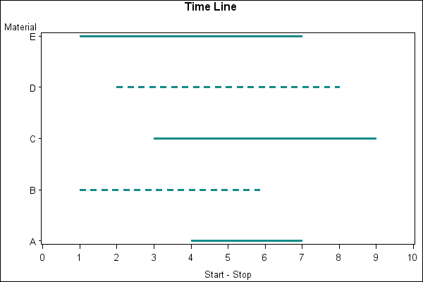
I found a link using proc gplot to draw this graph, I tried the code but did not work very well. The sample graph and code is attached here (http://support.sas.com/kb/24/937.html😞
 /* Set the graphics environment */
goptions reset=all cback=white border htitle=12pt htext=10pt;

 /* Create a sample data set */
data a;
   input Material $ Start Stop Linetype;
   datalines;
A 4 7 1
B 1 6 2
C 3 9 1
D 2 8 2
E 1 7 1
;
run;

 /* Create the annotate data set to use with */
 /* PROC GPLOT.                              */
data anno;
   length function color $8;
   retain xsys ysys '2' size 2 color 'vibg';
   set a;
   line=linetype;
   function='move';
   x=start; yc=Material;
   output;
   function='draw';
   x=stop; yc=Material;
   output;
run;

axis1 order=(0 to 10) label=('Start - Stop') minor=none;
symbol1 interpol=none value=none;

 /* Add a title to the graph */
title1 'Time Line';

 /* Create the graph using the ANNO= */
 /* option on the PLOT statement.    */
proc gplot data=a;
   plot Material*stop / anno=anno haxis=axis1;
run;
quit;
I think the main problem right now is that my time format is exact time, not exact number like from 0 to 10, and I have
mutiple start and stop time varibles.
Do you have ideas on how to draw the graph?
Thanks!!!
- Mark as New
- Bookmark
- Subscribe
- Mute
- RSS Feed
- Permalink
- Report Inappropriate Content
Hi Panda,
To create the annotate data seem to be the right way to draw the timeline, but you might need to change your data shape like start and stop
id activity start stop
1 work xx:xx1 yy:yy1
1 work xx:xx2 yy:yy2
1 rounds xx:xx3 yy:yy3
...
run;
create three annotate datasets by activity and then put them together.
change the axis statement like following:
Axis1 order=('00:00:00't to '24:00:00't by 3600) ;
it would draw bunch of dash lines for the subjects and their activity if they have multiple sessions.
good luck
Don't miss out on SAS Innovate - Register now for the FREE Livestream!
Can't make it to Vegas? No problem! Watch our general sessions LIVE or on-demand starting April 17th. Hear from SAS execs, best-selling author Adam Grant, Hot Ones host Sean Evans, top tech journalist Kara Swisher, AI expert Cassie Kozyrkov, and the mind-blowing dance crew iLuminate! Plus, get access to over 20 breakout sessions.
Learn how use the CAT functions in SAS to join values from multiple variables into a single value.
Find more tutorials on the SAS Users YouTube channel.
 Click image to register for webinar
Classroom Training Available!
Select SAS Training centers are offering in-person courses. View upcoming courses for:


