- Home
- /
- Programming
- /
- Graphics
- /
- Re: Various scales on axes proc sgpanel (SAS 9.3)
- RSS Feed
- Mark Topic as New
- Mark Topic as Read
- Float this Topic for Current User
- Bookmark
- Subscribe
- Mute
- Printer Friendly Page

- Mark as New
- Bookmark
- Subscribe
- Mute
- RSS Feed
- Permalink
- Report Inappropriate Content
Hi,
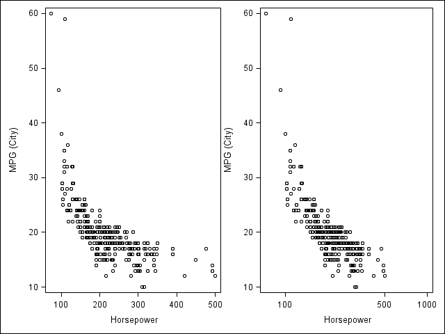
I want to create a two-panel graph using proc sgpanel in SAS 9.3. The y-axis should be the same for the two panels, but I want one x-axis to be on a linear scale and the other on a logarithmic scale (expand). Can that be done in 9.3, or do you have any other way to create this type of graph?
Best regards,
Tommy
Accepted Solutions

- Mark as New
- Bookmark
- Subscribe
- Mute
- RSS Feed
- Permalink
- Report Inappropriate Content
Hi Tommy,
You can use GTL to do this, below is an example.
proc template;
define statgraph plot_linearlog;
begingraph;
layout lattice / rows = 1 columns = 2;
layout overlay / xaxisopts=(type = linear);
scatterplot x = Horsepower y = MPG_City;
endlayout;
layout overlay / xaxisopts=(type = log logopts = (tickintervalstyle = logexpand));
scatterplot x = Horsepower y = MPG_City;
endlayout;
endlayout;
endgraph;
end;
run;
proc sgrender data = sashelp.cars template = plot_linearlog;
run;
- Mark as New
- Bookmark
- Subscribe
- Mute
- RSS Feed
- Permalink
- Report Inappropriate Content
Thanks djrisks, you opened up a new world for me when introducing GLT. A little bit tricky to sort it all out, but I could create the graph exactly as I wanted.
Tommy
- Mark as New
- Bookmark
- Subscribe
- Mute
- RSS Feed
- Permalink
- Report Inappropriate Content
That's fine Tommy / Chris. I agree GTL is a lot more powerful and tricky, and I'm glad you were able to figure it out and create the graph exactly as you wanted.

Don't miss out on SAS Innovate - Register now for the FREE Livestream!
Can't make it to Vegas? No problem! Watch our general sessions LIVE or on-demand starting April 17th. Hear from SAS execs, best-selling author Adam Grant, Hot Ones host Sean Evans, top tech journalist Kara Swisher, AI expert Cassie Kozyrkov, and the mind-blowing dance crew iLuminate! Plus, get access to over 20 breakout sessions.
Learn how use the CAT functions in SAS to join values from multiple variables into a single value.

Find more tutorials on the SAS Users YouTube channel.
 Click image to register for webinar
Classroom Training Available!
Select SAS Training centers are offering in-person courses. View upcoming courses for:
-
3 replies
-
03-09-2015 05:47 AM
-
2332 views
-
0 likes
-
2 in conversation
-
