- Home
- /
- Programming
- /
- Graphics
- /
- Re: Using PROC GCHART to create image. I need some guidance.
- RSS Feed
- Mark Topic as New
- Mark Topic as Read
- Float this Topic for Current User
- Bookmark
- Subscribe
- Mute
- Printer Friendly Page

- Mark as New
- Bookmark
- Subscribe
- Mute
- RSS Feed
- Permalink
- Report Inappropriate Content
Hi, this is my first time to use PROC GCHART to create a image on SAS, and I need some guidance for it.
Now I have a data set named information, and
my purpose is to use this data set to create a chart that shows:
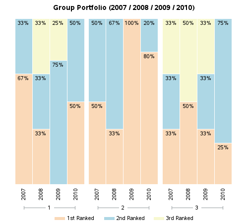
1. From year 2007 to 2010, how many times GY1(Group Y 1), GY2, GY3 are ranked in each year. (numbers under the bar)
2. Within each year, the proportions are respectively that GY1, GY2, GY3 are ranked as 1st, 2nd, 3rd.(percentages within each bar)
3. Assign different colors to different rank class.
4. The image is in format GIF.
Accepted Solutions

- Mark as New
- Bookmark
- Subscribe
- Mute
- RSS Feed
- Permalink
- Report Inappropriate Content
And here's one way to create a similar graph with SAS/Graph Gchart ...
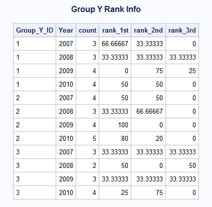
data my_data;
input Group_Y_ID Year count rank_1st rank_2nd rank_3rd;
label rank_1st='1st Ranked' rank_2nd='2nd Ranked' rank_3rd='3rd Ranked';
datalines;
1 2007 3 66.66667 33.33333 0
1 2008 3 33.33333 33.3333 33.33333
1 2009 4 0 75 25
1 2010 4 50 50 0
2 2007 4 50 50 0
2 2008 3 33.33333 66.66667 0
2 2009 4 100 0 0
2 2010 5 80 20 0
3 2007 3 33.33333 33.33333 33.33333
3 2008 2 50 0 50
3 2009 3 33.33333 33.33333 33.33333
3 2010 4 25 75 0
;
run;
proc transpose data=my_data (drop=count) out=tran_data;
by Group_Y_ID year;
run;
data tran_data; set tran_data;
format col1 percentn6.0;
col1=col1/100;
run;
goptions xpixels=500 ypixels=450;
goptions gunit=pct htitle=3 ftitle="albany amt/bold" htext=2.5 ftext="albany amt";
legend1 label=none;
pattern1 v=s c=cxfad9b8;
pattern2 v=s c=cxadd7e5;
pattern3 v=s c=cxf7f8d0;
axis1 label=none value=none style=0 major=none minor=none;
axis2 label=none value=(angle=90) style=0;
axis3 label=none;
title1 ls=1.5 "Group Portfolio (2007 / 2008 / 2009 / 2010)";
proc gchart data=tran_data;
vbar year / discrete
group=Group_Y_ID
type=sum sumvar=col1 inside=sum
subgroup=_label_ legend=legend1
raxis=axis1 maxis=axis2 gaxis=axis3 noframe
width=8 space=0 coutline=white;
run;
And here's what the output looks like:
- Mark as New
- Bookmark
- Subscribe
- Mute
- RSS Feed
- Permalink
- Report Inappropriate Content
I got someone to fix the image uploads, and I'll go ahead and upload your images:
- Mark as New
- Bookmark
- Subscribe
- Mute
- RSS Feed
- Permalink
- Report Inappropriate Content
And here's one way to create a similar graph with SAS/Graph Gchart ...
data my_data;
input Group_Y_ID Year count rank_1st rank_2nd rank_3rd;
label rank_1st='1st Ranked' rank_2nd='2nd Ranked' rank_3rd='3rd Ranked';
datalines;
1 2007 3 66.66667 33.33333 0
1 2008 3 33.33333 33.3333 33.33333
1 2009 4 0 75 25
1 2010 4 50 50 0
2 2007 4 50 50 0
2 2008 3 33.33333 66.66667 0
2 2009 4 100 0 0
2 2010 5 80 20 0
3 2007 3 33.33333 33.33333 33.33333
3 2008 2 50 0 50
3 2009 3 33.33333 33.33333 33.33333
3 2010 4 25 75 0
;
run;
proc transpose data=my_data (drop=count) out=tran_data;
by Group_Y_ID year;
run;
data tran_data; set tran_data;
format col1 percentn6.0;
col1=col1/100;
run;
goptions xpixels=500 ypixels=450;
goptions gunit=pct htitle=3 ftitle="albany amt/bold" htext=2.5 ftext="albany amt";
legend1 label=none;
pattern1 v=s c=cxfad9b8;
pattern2 v=s c=cxadd7e5;
pattern3 v=s c=cxf7f8d0;
axis1 label=none value=none style=0 major=none minor=none;
axis2 label=none value=(angle=90) style=0;
axis3 label=none;
title1 ls=1.5 "Group Portfolio (2007 / 2008 / 2009 / 2010)";
proc gchart data=tran_data;
vbar year / discrete
group=Group_Y_ID
type=sum sumvar=col1 inside=sum
subgroup=_label_ legend=legend1
raxis=axis1 maxis=axis2 gaxis=axis3 noframe
width=8 space=0 coutline=white;
run;
And here's what the output looks like:

Don't miss out on SAS Innovate - Register now for the FREE Livestream!
Can't make it to Vegas? No problem! Watch our general sessions LIVE or on-demand starting April 17th. Hear from SAS execs, best-selling author Adam Grant, Hot Ones host Sean Evans, top tech journalist Kara Swisher, AI expert Cassie Kozyrkov, and the mind-blowing dance crew iLuminate! Plus, get access to over 20 breakout sessions.
Learn how use the CAT functions in SAS to join values from multiple variables into a single value.

Find more tutorials on the SAS Users YouTube channel.
 Click image to register for webinar
Classroom Training Available!
Select SAS Training centers are offering in-person courses. View upcoming courses for:
-
2 replies
-
06-26-2015 05:30 AM
-
1058 views
-
0 likes
-
2 in conversation
-
