- Home
- /
- Programming
- /
- Graphics
- /
- Re: Stacked bar charts with positive and negative values
- RSS Feed
- Mark Topic as New
- Mark Topic as Read
- Float this Topic for Current User
- Bookmark
- Subscribe
- Mute
- Printer Friendly Page
- Mark as New
- Bookmark
- Subscribe
- Mute
- RSS Feed
- Permalink
- Report Inappropriate Content
Hi,
I have change data on a 4-point response scale. So patients can have up to a 3 category improvement, stay the same, or have up to a 3 category deterioration. So I have 7 categories a pt can fall into.
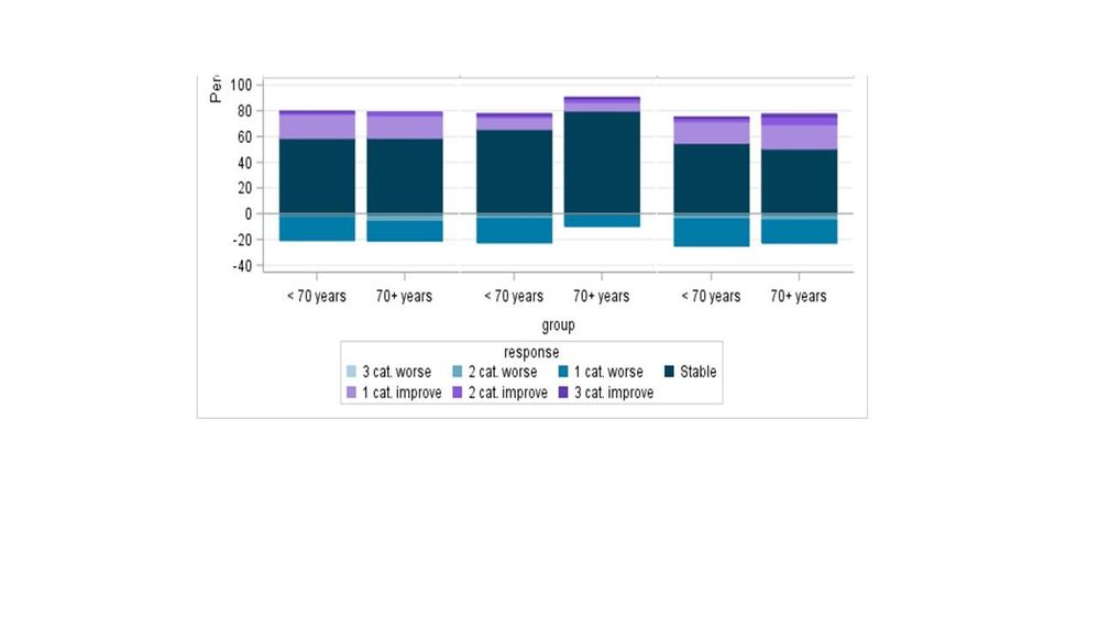
At the moment I have the data structured as below and use proc sgpanel with vbar. This gets me close, but what I want to have is the stable (response = 0) in the middle, with the 0 y axis starting here with those who improved stacked on top, and then below the 0 axis have those who worsened.
Something like this (vertical or horizontal isn't a major worry) https://www.google.com/search?q=stacked+bar+chart+of+change&source=lnms&tbm=isch&sa=X&ved=0ahUKEwiR9...
data have;
input group percent response;
cards;
1 14.3 -3
1 14.3 -2
1 14.3 -1
1 14.3 0
1 14.3 1
1 14.3 2
1 14.3 3
0 14.3 -3
0 14.3 -2
0 14.3 -1
0 14.3 0
0 14.3 1
0 14.3 2
0 14.3 3
;
run;
proc sgpanel data = have;
format response chg.;
styleattrs datacolors=( cxAACEE2 cx65ABC4 cx017BA8 cx004159 cxA88BDD cx8959E0 cx643BAF)
datacontrastcolors=( cxAACEE2 cx65ABC4 cx017BA8 cx004159 cxA88BDD cx8959E0 cx643BAF);
vbar group / response= percent group=response ;
rowaxis label = 'Percent (%)' ;
colaxis label =' ' display=(novalues notick);
title 'Change from Baseline Frequencies - Month 3';
run;
Thank you!!
- Mark as New
- Bookmark
- Subscribe
- Mute
- RSS Feed
- Permalink
- Report Inappropriate Content
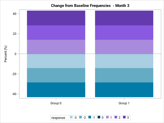
Is this what you want?
Basically, this required a little data tweak in a temporary data set that was, then, fed into PROC SGPLOT. The code is below. Let me know if this works for you,
Thanks!
Dan
data have;
input group percent response;
cards;
1 14.3 -3
1 14.3 -2
1 14.3 -1
1 14.3 0
1 14.3 1
1 14.3 2
1 14.3 3
0 14.3 -3
0 14.3 -2
0 14.3 -1
0 14.3 0
0 14.3 1
0 14.3 2
0 14.3 3
;
run;

proc format;
value grpfmt 0="Group 0"
             1="Group 1";
run;

data temp;
set have;
format group grpfmt.;
if response < 0 then percent = percent * -1;
else if response=0 then percent=0;
run;

proc sgplot data = temp;
styleattrs datacolors=( cxAACEE2 cx65ABC4 cx017BA8 cx004159 cxA88BDD cx8959E0 cx643BAF)
datacontrastcolors=( cxAACEE2 cx65ABC4 cx017BA8 cx004159 cxA88BDD cx8959E0 cx643BAF);
vbar group / response= percent group=response ;
yaxis label = 'Percent (%)' ;
xaxis label =' ';
title 'Change from Baseline Frequencies  - Month 3';
run;- Mark as New
- Bookmark
- Subscribe
- Mute
- RSS Feed
- Permalink
- Report Inappropriate Content
Thank you!! This now has the 0 line where I need it, just one small problem the 3 category deterioration is directly below the 0 line, I guess I can just flip the change (my worry is that gets a little confusing) but I don't see a way around. Any order like ideas that would prevent possible confusion would be appreciated!
Don't miss out on SAS Innovate - Register now for the FREE Livestream!
Can't make it to Vegas? No problem! Watch our general sessions LIVE or on-demand starting April 17th. Hear from SAS execs, best-selling author Adam Grant, Hot Ones host Sean Evans, top tech journalist Kara Swisher, AI expert Cassie Kozyrkov, and the mind-blowing dance crew iLuminate! Plus, get access to over 20 breakout sessions.
Learn how use the CAT functions in SAS to join values from multiple variables into a single value.
Find more tutorials on the SAS Users YouTube channel.
 Click image to register for webinar
Classroom Training Available!
Select SAS Training centers are offering in-person courses. View upcoming courses for:


