- Home
- /
- Programming
- /
- Graphics
- /
- Re: Spiral / Radar Type Plot
- RSS Feed
- Mark Topic as New
- Mark Topic as Read
- Float this Topic for Current User
- Bookmark
- Subscribe
- Mute
- Printer Friendly Page
- Mark as New
- Bookmark
- Subscribe
- Mute
- RSS Feed
- Permalink
- Report Inappropriate Content
I would like to produce a plot like the one here: http://www.climate-lab-book.ac.uk/2016/spiralling-global-temperatures/ where there are obviously multiple data points for each month (one for each year). Ideally I would like to use a different colour for each year. The RADAR procedure comes close to providing what I need but not close enough.
- Mark as New
- Bookmark
- Subscribe
- Mute
- RSS Feed
- Permalink
- Report Inappropriate Content
Spiral Plot:http://blogs.sas.com/content/graphicallyspeaking/2014/07/08/spirals/
You can just color the spiral or the needles with the appropriate color.
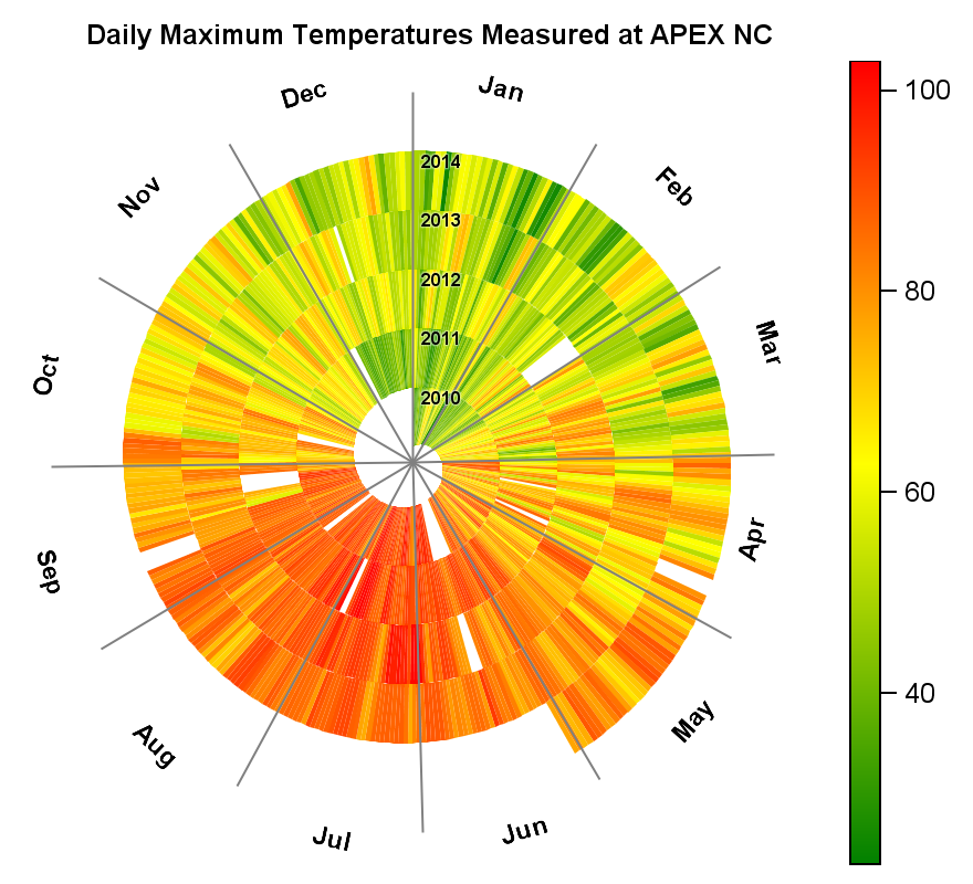
While this may not be what you want, I also created a Spiral Heat Map to display the mean temperature by month over 5 years using SAS 9.4. Image is attached. I will post an article on this soon.

- Mark as New
- Bookmark
- Subscribe
- Mute
- RSS Feed
- Permalink
- Report Inappropriate Content
Dear Sanjay, thanks for your prompt and helpful reply. The example in http://blogs.sas.com/content/graphicallyspeaking/2014/07/08/spirals/ doesn't include the 12 axes for each month of the year that I would need but I note that your attached image does have this feature and so I very much look forward to your forhcoming article.
- Mark as New
- Bookmark
- Subscribe
- Mute
- RSS Feed
- Permalink
- Report Inappropriate Content
The code is meant to show you how to create a spiral using the SGPLOT code. It is not meant as a canned solution to your needs. You can modify the code to suit your needs.
- Mark as New
- Bookmark
- Subscribe
- Mute
- RSS Feed
- Permalink
- Report Inappropriate Content
Thanks and understood.
- Mark as New
- Bookmark
- Subscribe
- Mute
- RSS Feed
- Permalink
- Report Inappropriate Content
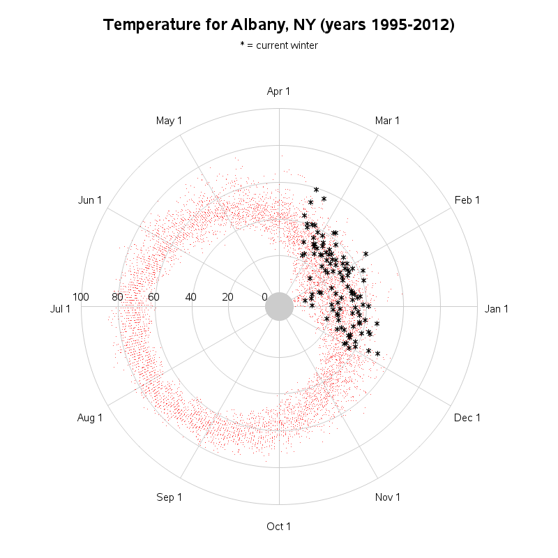
Here's a custom SAS/Graph with 12 monthly spokes you might could use as a starting place to modify into the graph you're wanting:
http://robslink.com/SAS/democd55/albany_ny_circular.htm
http://robslink.com/SAS/democd55/albany_ny_circular_info.htm
- Mark as New
- Bookmark
- Subscribe
- Mute
- RSS Feed
- Permalink
- Report Inappropriate Content
Robert, many thanks that is really helpful and will save me reinventing the wheel (or maybe that should be reinventing the spokes).
Don't miss out on SAS Innovate - Register now for the FREE Livestream!
Can't make it to Vegas? No problem! Watch our general sessions LIVE or on-demand starting April 17th. Hear from SAS execs, best-selling author Adam Grant, Hot Ones host Sean Evans, top tech journalist Kara Swisher, AI expert Cassie Kozyrkov, and the mind-blowing dance crew iLuminate! Plus, get access to over 20 breakout sessions.
Learn how use the CAT functions in SAS to join values from multiple variables into a single value.
Find more tutorials on the SAS Users YouTube channel.
 Click image to register for webinar
Classroom Training Available!
Select SAS Training centers are offering in-person courses. View upcoming courses for:


