- Home
- /
- Programming
- /
- Graphics
- /
- Specify location of datalabels in sgplot
- RSS Feed
- Mark Topic as New
- Mark Topic as Read
- Float this Topic for Current User
- Bookmark
- Subscribe
- Mute
- Printer Friendly Page

- Mark as New
- Bookmark
- Subscribe
- Mute
- RSS Feed
- Permalink
- Report Inappropriate Content
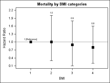
Hi, I am trying to change the location of the datalabels in my plot so that they appear on top of the CIs instead of being at the center (to make nicer graphs) but I cannot find a way to do it.
I also want to modify the first datalabel so that instead of a '1' I can write '1 [Reference]' Is this option available in SAS 9.3? Thanks!
data x;
input ct ucl lcl hr;
cards ;
1 1 1 1
2 2 0.3 1
3 1.8 0.1 0.9
4 1.6 0.2 0.8
run;
proc template;
Define style styles.mystyle;
Parent=styles.journal;
Style GraphTitleText / color=black fontsize=13pt fontfamily="swiss" fontweight=bold;
Style GraphValueText / color=black fontsize=10pt fontfamily="swiss" fontweight=medium;
Style GraphLabelText / color=black fontsize=10pt fontfamily="swiss" fontweight=medium;
style GraphDataText from GraphDataText /fontsize=10pt;
end;
run;
ods html style=mystyle;
title "Mortality by BMI categories";
*title2 'Hazards Ratio and 95% CI';
proc sgplot data=x noautolegend;
scatter y=hr x=ct /
yerrorupper=ucl yerrorlower=lcl
datalabel=hr markerattrs=(size=10 symbol=squarefilled color=black)
errorbarattrs=(color=black);
refline 1 / axis=y;
yaxis minor values=(0.1 to 2.3 by 0.3) label='Hazard Ratio';
xaxis minor values=(1 to 4 by 1) label='BMI' ;
run;
Accepted Solutions

- Mark as New
- Bookmark
- Subscribe
- Mute
- RSS Feed
- Permalink
- Report Inappropriate Content
You can use a different column for labels. Also you could compute the location just above the ucl, as long as you are ok setting the value in data coordinates. If the first one is really a reference value, it need not be in the data, and you can use a reference line as suggested by Anca.
data x;
length hrlabel $15;
input ct ucl lcl hr;
hrlabel=put(hr, 3.1);
if _n_ = 1 then hrlabel="1 [Reference]";
labelloc=ucl+0.1;
cards ;
1 1 1 1
2 2 0.3 1
3 1.8 0.1 0.9
4 1.6 0.2 0.8
run;
proc print; run;
proc template;
Define style styles.mystyle;
Parent=styles.journal;
Style GraphTitleText / color=black fontsize=13pt fontfamily="swiss" fontweight=bold;
Style GraphValueText / color=black fontsize=10pt fontfamily="swiss" fontweight=medium;
Style GraphLabelText / color=black fontsize=10pt fontfamily="swiss" fontweight=medium;
style GraphDataText from GraphDataText /fontsize=10pt;
end;
run;
ods html style=mystyle;
ods listing close;
ods listing;footnote;
title "Mortality by BMI categories";
*title2 'Hazards Ratio and 95% CI';
proc sgplot data=x noautolegend;
scatter y=hr x=ct /
yerrorupper=ucl yerrorlower=lcl
markerattrs=(size=10 symbol=squarefilled color=black)
errorbarattrs=(color=black);
scatter x=ct y=labelloc / markercharacter=hrlabel;
refline 1 / axis=y;
yaxis minor values=(0.1 to 2.3 by 0.3) label='Hazard Ratio';
xaxis minor values=(1 to 4 by 1) label='BMI' ;
run;

- Mark as New
- Bookmark
- Subscribe
- Mute
- RSS Feed
- Permalink
- Report Inappropriate Content
Hi.
I don't know how to change the location of the data labels ![]()
However, to modify the first data label so that instead of a '1' to get '1 [Reference]'
this is what i suggest:
data x;
set x;
if hr = 1 & ucl = 1 & lcl = 1 then label = . ;
else label = hr;
run;
/*more of your code*/
/*Then I changed the datalabel value to the 'label' variable:*/
proc sgplot data=x noautolegend tmplout = "&plot_path.\tmpl.sas";
scatter y=hr x=ct /yerrorupper=ucl yerrorlower=lcl
datalabel=label datalabelattrs = (size=10 color=black)
markerattrs=(size=10 symbol=squarefilled color=black)
errorbarattrs=(color=black);
refline 1/ label=("1 [Reference]")axis = y labelloc = inside labelpos = min;
yaxis minor values=(0.1 to 2.3 by 0.3) label='Hazard Ratio';
xaxis minor values=(1 to 4 by 1) label='BMI' ;
run;
Good luck!
Anca.

- Mark as New
- Bookmark
- Subscribe
- Mute
- RSS Feed
- Permalink
- Report Inappropriate Content
You can put the labels over the UCL by making two changes:
1. In the data step, make two columns for label position and label content. The label position is derived from the UCL value.
data x;
input ct ucl lcl hr;
if (ucl = hr) then labelpos = ucl + 0.05;
else labelpos = ucl + 0.025;
label = put(hr, 3.1);
cards ;
1 1 1 1
2 2 0.3 1
3 1.8 0.1 0.9
4 1.6 0.2 0.8
run;
2. Instead of using the DATALABEL option on the scatter plot, add another scatter plot with the MARKERCHAR option to plot the label over the UCL.
proc sgplot data=x noautolegend;
scatter y=hr x=ct /
yerrorupper=ucl yerrorlower=lcl
markerattrs=(size=10 symbol=squarefilled color=black)
errorbarattrs=(color=black);
refline 1 / axis=y;
scatter y=labelpos x=ct / markerchar=label;
yaxis minor values=(0.1 to 2.3 by 0.3) label='Hazard Ratio';
xaxis minor values=(1 to 4 by 1) label='BMI' ;
run;
As for the content of the first label, you can modify the first value in the "label" column in the data step processing.
Hope this helps!
Dan
- Mark as New
- Bookmark
- Subscribe
- Mute
- RSS Feed
- Permalink
- Report Inappropriate Content
You can use a different column for labels. Also you could compute the location just above the ucl, as long as you are ok setting the value in data coordinates. If the first one is really a reference value, it need not be in the data, and you can use a reference line as suggested by Anca.
data x;
length hrlabel $15;
input ct ucl lcl hr;
hrlabel=put(hr, 3.1);
if _n_ = 1 then hrlabel="1 [Reference]";
labelloc=ucl+0.1;
cards ;
1 1 1 1
2 2 0.3 1
3 1.8 0.1 0.9
4 1.6 0.2 0.8
run;
proc print; run;
proc template;
Define style styles.mystyle;
Parent=styles.journal;
Style GraphTitleText / color=black fontsize=13pt fontfamily="swiss" fontweight=bold;
Style GraphValueText / color=black fontsize=10pt fontfamily="swiss" fontweight=medium;
Style GraphLabelText / color=black fontsize=10pt fontfamily="swiss" fontweight=medium;
style GraphDataText from GraphDataText /fontsize=10pt;
end;
run;
ods html style=mystyle;
ods listing close;
ods listing;footnote;
title "Mortality by BMI categories";
*title2 'Hazards Ratio and 95% CI';
proc sgplot data=x noautolegend;
scatter y=hr x=ct /
yerrorupper=ucl yerrorlower=lcl
markerattrs=(size=10 symbol=squarefilled color=black)
errorbarattrs=(color=black);
scatter x=ct y=labelloc / markercharacter=hrlabel;
refline 1 / axis=y;
yaxis minor values=(0.1 to 2.3 by 0.3) label='Hazard Ratio';
xaxis minor values=(1 to 4 by 1) label='BMI' ;
run;
- Mark as New
- Bookmark
- Subscribe
- Mute
- RSS Feed
- Permalink
- Report Inappropriate Content
Thanks Anca, Dan, and Sanjay. Problem solved and nice graphs ready to present!

Don't miss out on SAS Innovate - Register now for the FREE Livestream!
Can't make it to Vegas? No problem! Watch our general sessions LIVE or on-demand starting April 17th. Hear from SAS execs, best-selling author Adam Grant, Hot Ones host Sean Evans, top tech journalist Kara Swisher, AI expert Cassie Kozyrkov, and the mind-blowing dance crew iLuminate! Plus, get access to over 20 breakout sessions.
Learn how use the CAT functions in SAS to join values from multiple variables into a single value.

Find more tutorials on the SAS Users YouTube channel.
 Click image to register for webinar
Classroom Training Available!
Select SAS Training centers are offering in-person courses. View upcoming courses for:
-
4 replies
-
01-29-2013 12:55 PM
-
6221 views
-
5 likes
-
4 in conversation
-
