- Home
- /
- Programming
- /
- Graphics
- /
- Re: SGPlot RefLine label and labelattrs
- RSS Feed
- Mark Topic as New
- Mark Topic as Read
- Float this Topic for Current User
- Bookmark
- Subscribe
- Mute
- Printer Friendly Page

- Mark as New
- Bookmark
- Subscribe
- Mute
- RSS Feed
- Permalink
- Report Inappropriate Content
Hi All,
I'm using SGPLOT to make a scatterplot that has a data driven reference line.
I'm having 2 problems:
1. When I try to label the reference line, I get a note that means (I think) you are not allowed to label reference lines when the value of the reference line is a variable.
2. Ignoring that, if I use a value for a reference line (rather than a variable), and try to use the LABELATTRS= option to make the label the same color as the line, the LABELATTRS option causes as error (unknown option) even though I'm on 9.3.1M2 (on linux).
Sample code below:
proc sql;
 create table myclass as
   select age,height,mean(height) as mHeight
   from sashelp.class
 ;
quit;

proc sgplot data=myclass;
  scatter x=age y=height;
  refline mHeight /axis=y label="Mean Height" lineattrs=(color=red) ;
  refline 65 /axis=y label="Another ref line" lineattrs=(color=green) /*labelattrs=(color=green)*/;
run;
The inability to label a reference line when the value is driven by a variable seems odd. Since my variable is a constant, I can work around it in this case by creating a macro variable with the value. But of course not all reference lines are constant...
Not sure why LABELATTRS is not working. Before I dive into in-line formatting or the style template to try forcing the font color that way, was wondering if there were any thoughts.
Thanks,
--Q.
Accepted Solutions

- Mark as New
- Bookmark
- Subscribe
- Mute
- RSS Feed
- Permalink
- Report Inappropriate Content
Cynthia and Dan have provided alternate solutions.
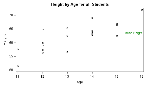
You have run into the 80-20 limitation for SGPlot. If you are willing to venture into GTL, here is the equivalent GTL code to get what you want. Note, when the value(s) for the ReferenceLine comes from a variable, the label also needs to come from a variable (since there may be multiple lines). If you have a label for each value, it will look dark due to overplotting of the name repeatedly. So, it may be useful to only add the label when needed.
proc sql;
create table myclass as
select age,height,mean(height) as mHeight
from sashelp.class
;
quit;
/*--Add Label--*/
data myclass2;
set myclass;
length mHeightLabel $12;
if _n_ eq 1 then mHeightLabel='Mean Height';
run;
/*--Define template--*/
proc template;
define statgraph RefLineLabel;
begingraph;
entrytitle 'Height by Age for all Students';
layout overlay;
scatterplot x=age y=height / group=sex name='a';
referenceline y=mheight / curvelabel=mHeightLabel lineattrs=(color=green)
curvelabellocation=inside curvelabelattrs=(color=green);
endlayout;
endgraph;
end;
run;
/*--Create Graph--*/
ods listing;
ods graphics / reset width=5in height=3in imagename='RefLineLabel';
proc sgrender data=myclass2 template=RefLineLabel;
run;

- Mark as New
- Bookmark
- Subscribe
- Mute
- RSS Feed
- Permalink
- Report Inappropriate Content
Hi:
LABELATTRS is for Axis labels, I don't think it was designed to "touch" reference line labels. I'm not sure you can change the label color in the REFLINE statement.
Don't bother with in-line formatting, it was never designed to work with the ODS GRAPHICS or SAS/GRAPH -- the only piece that works is the UNICODE function with ODS GRAPHICS to insert symbols like alpha and mu.
Also, about the style element you would change to impact the reference lines. I'm not sure there is a separate style element for the axis ticks versus the reference line labels, which leads me to believe that they are all meant to be black and not draw too much attention to one line or label over the other lines or labels. If you try the code below, you will end up getting all the various labels cyan (#1) or getting the X and Y axis different colors (#2). You might have to work with ANNOTATE and ODS GRAPHICS to get differently colored text for the reference lines. Or just live with plain old black text.
cynthia
proc sql noprint;
select mean(height) as mHeight into :mheight
from sashelp.class
;
quit;
%put mean height = &mheight;
title;
ods path work.tmp(update) sasuser.templat(update)
sashelp.tmplmst(read);
proc template;
define style styles.mygraf;
parent=styles.statistical;
class GraphValueText /
font = GraphFonts('GraphValueFont')
color=cyan;
end;
run;
ods listing close;
ods html path='c:\temp' (url=none)
file='trylabel.html' style=styles.mygraf;
proc sgplot data=sashelp.class;
title '1) Using STYLE template everything is CYAN';
scatter x=age y=height;
refline &mheight /axis=y label="Mean Height" lineattrs=(color=red) ;
refline 65 /axis=y label="Another ref line" lineattrs=(color=green);
run;
proc sgplot data=sashelp.class;
title '2) Override XAXIS and YAXIS Values';
scatter x=age y=height;
refline &mheight /axis=y label="Mean Height" lineattrs=(color=red) ;
refline 65 /axis=y label="Another ref line" lineattrs=(color=green);
xaxis labelattrs=(color=purple) valueattrs=(color=purple);
yaxis labelattrs=(color=blue) valueattrs=(color=blue);
run;
ods html close;

- Mark as New
- Bookmark
- Subscribe
- Mute
- RSS Feed
- Permalink
- Report Inappropriate Content
Another alternative is to use the macro variable to drive an annotation label. That way, you do not have to do any style manipulation. You also get the benefit of text wrapping support in the annotation facility. As a side note, the LABELATTRS issue with REFLINEs is fixed in the next release. Here is the code for the anno approach:
proc sql;
 create table myclass as
   select age,height
   from sashelp.class
 ;
 select mean(height) into :mHeight
   from sashelp.class
 ;
quit;

data anno;
function="text"; x1=101; y1=&mHeight; x1space="wallpercent"; y1space="datavalue"; anchor="left";
label="Mean Height"; textcolor="green";
run;

proc sgplot data=myclass pad=(right=10%) sganno=anno;
  scatter x=age y=height;
  refline &mHeight /axis=y lineattrs=(color=green);
run;
- Mark as New
- Bookmark
- Subscribe
- Mute
- RSS Feed
- Permalink
- Report Inappropriate Content
Cynthia and Dan have provided alternate solutions.
You have run into the 80-20 limitation for SGPlot. If you are willing to venture into GTL, here is the equivalent GTL code to get what you want. Note, when the value(s) for the ReferenceLine comes from a variable, the label also needs to come from a variable (since there may be multiple lines). If you have a label for each value, it will look dark due to overplotting of the name repeatedly. So, it may be useful to only add the label when needed.
proc sql;
create table myclass as
select age,height,mean(height) as mHeight
from sashelp.class
;
quit;
/*--Add Label--*/
data myclass2;
set myclass;
length mHeightLabel $12;
if _n_ eq 1 then mHeightLabel='Mean Height';
run;
/*--Define template--*/
proc template;
define statgraph RefLineLabel;
begingraph;
entrytitle 'Height by Age for all Students';
layout overlay;
scatterplot x=age y=height / group=sex name='a';
referenceline y=mheight / curvelabel=mHeightLabel lineattrs=(color=green)
curvelabellocation=inside curvelabelattrs=(color=green);
endlayout;
endgraph;
end;
run;
/*--Create Graph--*/
ods listing;
ods graphics / reset width=5in height=3in imagename='RefLineLabel';
proc sgrender data=myclass2 template=RefLineLabel;
run;
- Mark as New
- Bookmark
- Subscribe
- Mute
- RSS Feed
- Permalink
- Report Inappropriate Content
Wow, many thanks to you all! (didn't I hear that SAS was closed for the holidays? : )
Really appreciate the alternate solutions.
Sanjay and Dan, I have your Statistical Graphics Procedures by Example book out on my desk today, it has been a great introduction to SG procs. So thanks for that as well. (And Sanjay's SGRENDER solution might encourage me to get back into Warren Kuhfeld's GTL book, which I figured I'd dive into after spending more time with basic SGPLOT... )
--Q.

Don't miss out on SAS Innovate - Register now for the FREE Livestream!
Can't make it to Vegas? No problem! Watch our general sessions LIVE or on-demand starting April 17th. Hear from SAS execs, best-selling author Adam Grant, Hot Ones host Sean Evans, top tech journalist Kara Swisher, AI expert Cassie Kozyrkov, and the mind-blowing dance crew iLuminate! Plus, get access to over 20 breakout sessions.
Learn how use the CAT functions in SAS to join values from multiple variables into a single value.

Find more tutorials on the SAS Users YouTube channel.
 Click image to register for webinar
Classroom Training Available!
Select SAS Training centers are offering in-person courses. View upcoming courses for:
-
4 replies
-
12-28-2012 08:21 AM
-
38378 views
-
7 likes
-
4 in conversation
-
