- Home
- /
- Programming
- /
- Graphics
- /
- SAS GRAPHS
- RSS Feed
- Mark Topic as New
- Mark Topic as Read
- Float this Topic for Current User
- Bookmark
- Subscribe
- Mute
- Printer Friendly Page
- Mark as New
- Bookmark
- Subscribe
- Mute
- RSS Feed
- Permalink
- Report Inappropriate Content
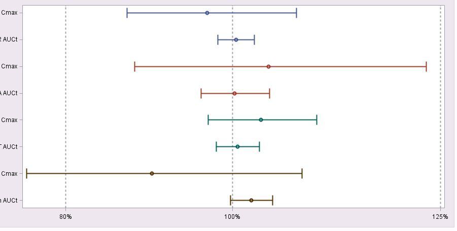
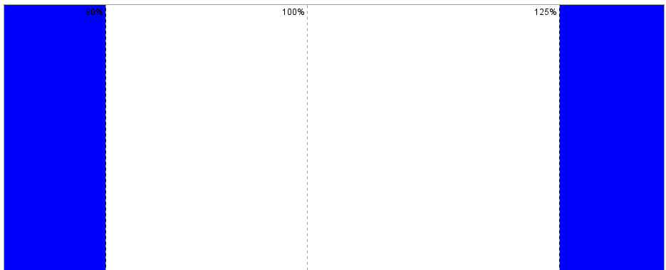
Hi, I need some changes in my template for adding colours before 80% and after 125% and change labels from bottom to up.
proc template;
define statgraph sgdesign;
dynamic _MEAN _PARLB _PAR1A _HIGHT _LOW;
begingraph / designwidth=950px designheight=450px backgroundcolor=CXE8E6E8;
layout lattice / rowdatarange=data columndatarange=data rowgutter=10 columngutter=10;
layout overlay / wallcolor=CXFFFFFF walldisplay=(OUTLINE FILL)
xaxisopts=( display=(TICKS TICKVALUES LINE ) griddisplay=on gridattrs=GraphAxisLines(pattern=2 thickness=2 ) linearopts=( tickvaluepriority=TRUE tickvalueformat=BEST6. tickvaluelist=(80.0 100.0 125.0) tickdisplaylist=("80%" "100%" "125%")))
yaxisopts=( reverse=true display=(TICKS LINE TICKVALUES ) griddisplay=off gridattrs=(color=CX848284 pattern=2 thickness=1 ) discreteopts=( tickvaluefitpolicy=none));
scatterplot x=_MEAN y=_PARLB / group=_PAR1A xerrorupper=_HIGHT xerrorlower=_LOW name='scatter' grouporder=ascending markerattrs=(weight=bold ) errorbarattrs=(thickness=2 );
endlayout;
endlayout;
endgraph;
end;
run
Vahe
- Mark as New
- Bookmark
- Subscribe
- Mute
- RSS Feed
- Permalink
- Report Inappropriate Content
Search here:
- Mark as New
- Bookmark
- Subscribe
- Mute
- RSS Feed
- Permalink
- Report Inappropriate Content
You will have to describe what this means: "change labels from bottom to up."
If you want the 80%, 100% etc displayed at the top of the graph then the scatterplot should have the option: xaxis=x2
- Mark as New
- Bookmark
- Subscribe
- Mute
- RSS Feed
- Permalink
- Report Inappropriate Content
Hi,
maybe you could add 2 thick reference lines before 80 and after 120 before the scatterplot statement:
referenceline x=75 / lineattrs=(thickness=60 color=blue);
referenceline x=130 / lineattrs=(thickness=60 color=blue);
you will need to play with the x and the thickness to find the values that match your graphic at best
- Cheers -
- Mark as New
- Bookmark
- Subscribe
- Mute
- RSS Feed
- Permalink
- Report Inappropriate Content
Vahe
- Mark as New
- Bookmark
- Subscribe
- Mute
- RSS Feed
- Permalink
- Report Inappropriate Content
Hi,
I think you can reach this with a blockplot overlaid statement like described in Example 1: BlockPlot Overlaid with SeriesPlot
In the example the variable 'release' marks the end of the color strip.
         blockplot x=date block=release /
           datatransparency=0.3 valuevalign=top
           labelposition=top display=(fill values label)
extendblockonmissing=true ;- Cheers -
Don't miss out on SAS Innovate - Register now for the FREE Livestream!
Can't make it to Vegas? No problem! Watch our general sessions LIVE or on-demand starting April 17th. Hear from SAS execs, best-selling author Adam Grant, Hot Ones host Sean Evans, top tech journalist Kara Swisher, AI expert Cassie Kozyrkov, and the mind-blowing dance crew iLuminate! Plus, get access to over 20 breakout sessions.
Learn how use the CAT functions in SAS to join values from multiple variables into a single value.
Find more tutorials on the SAS Users YouTube channel.
 Click image to register for webinar
Classroom Training Available!
Select SAS Training centers are offering in-person courses. View upcoming courses for:


