- Home
- /
- Programming
- /
- Graphics
- /
- SAS 9.1 proc gplot order axis
- RSS Feed
- Mark Topic as New
- Mark Topic as Read
- Float this Topic for Current User
- Bookmark
- Subscribe
- Mute
- Printer Friendly Page

- Mark as New
- Bookmark
- Subscribe
- Mute
- RSS Feed
- Permalink
- Report Inappropriate Content
Hi can somebody help mi with this.
My question is how to put two dimension on horizontal axis wk and year to get proper order from wk 42/2013 to 1/2014.
This script was fine until first week of 2014.
I tried to make new variable with compress (year|| "*"||wk) and then to split axis by * but there was error : All variables must be the same type for overlay request.
Thank you in advance
data pass_fail; |
| input wk actual pass fail year; | ||||
| datalines; | ||||
| 1 | 423 | 423 | 0 | 2014 |
| 42 | 6929 | 6915 | 14 | 2013 |
| 43 | 9344 | 9334 | 10 | 2013 |
| 44 | 7329 | 7322 | 7 | 2013 |
| 45 | 8263 | 8248 | 15 | 2013 |
| 46 | 8266 | 8252 | 14 | 2013 |
| 47 | 7525 | 7520 | 5 | 2013 |
| 48 | 10299 | 10276 | 23 | 2013 |
| 49 | 11059 | 11056 | 3 | 2013 |
| 50 | 10444 | 10443 | 1 | 2013 |
| 51 | 11776 | 11776 | 0 | 2013 |
| 52 | 5015 | 5014 | 1 | 2013 |
;
run;
data plan;
| set pass_fail; | |
| plan = 8400; | |
| format ratio percent7.; | |
| ratio = pass / (pass + fail ) ; | |
| week=wk-.13; |
run;
goptions reset=ALL gsfmode=replace htext=30pt cback=white border htitle=32pt htext=16pt ftext="Arial/bold";
axis1 label=(a=90 h=25pt 'Actual /Plan') order=(0 to 12000 by 2000) minor=none offset=(0,0);
axis2 label=(a=90 h=25pt'Ratio') order=(.82 to 1.00 by .01) minor=none offset=(0,0);
axis3 label=( h=25pt'Week') minor=none offset=(0,10) value=(t=1 ' ');
symbol1 value=dot cv=purple height=2 interpol=join width=5 color=purple ;
symbol2 value=none interpol=needle width=50 color=red;
symbol3 value=none interpol=needle width=50 color=blue;
footnote h = 25pt c = black 'Actual ' c=Red f=marker 'U'
| h = 25pt c=black f='Arial/bold' ' Plan ' c=blue f=marker 'U' | ||
| h = 25pt c=black f='Arial/bold' ' Ratio ' c=purple '____'; |
proc gplot data=plan;
plot actual*wk=2 plan*week=3 / overlay
vzero vaxis=axis1 haxis=axis3 autovref cvref=graydd;
plot2 ratio*wk=1 / vaxis=axis2 ;
run;
quit;
Accepted Solutions

- Mark as New
- Bookmark
- Subscribe
- Mute
- RSS Feed
- Permalink
- Report Inappropriate Content
Gplot doesn't support a 2-level axis (like a grouped bar chart, with year & week).
In your case, I'd recommend using real SAS 'date' values, and applying a 'week' format (such as weeku, weekv, or weekw). Here's a page describing thesw formats:
http://support.sas.com/documentation/cdl/en/lrdict/64316/HTML/default/viewer.htm#a002604217.htm
- Mark as New
- Bookmark
- Subscribe
- Mute
- RSS Feed
- Permalink
- Report Inappropriate Content
Hi Robert
Thank you very much. Your solution was helpful.
Thanks again.
- Mark as New
- Bookmark
- Subscribe
- Mute
- RSS Feed
- Permalink
- Report Inappropriate Content
Rpbert
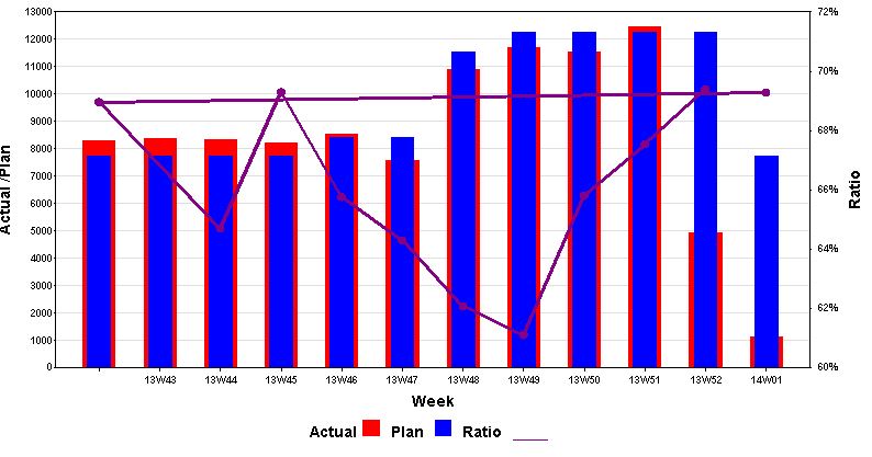
Just one more question. As you can see on image there is two lines for Ratio.
In previous example I used week = wk - ..13; to avoid this.
This was worked because wk was formated as numeric. Now I use different format, weekv5., which not allow me to do the same.
proc gplot data=plan;
plot actual*wk=2 plan*week=3 / overlay
vzero vaxis=axis1 haxis=axis3 autovref cvref=graydd;
plot2 ratio*wk=1 / vaxis=axis2 ;
run;
Is there any way how to fix this and get proper result?
Thank you in advance
- Mark as New
- Bookmark
- Subscribe
- Mute
- RSS Feed
- Permalink
- Report Inappropriate Content
The underlying date values are still numeric, so you can still use the "subtract an offset" technique to get one of the needle-bars to move to the left. But the offset will have to be a much larger number now - experiment with it a little, and see what offset works best for your situation.
- Mark as New
- Bookmark
- Subscribe
- Mute
- RSS Feed
- Permalink
- Report Inappropriate Content
Thank you for quick answer.
My problem is in two RATIO lines. It should be just one line showing ratio for period 3013/2014 .
Now I have one line for each year. Not sure where the problem is.
Thanks
- Mark as New
- Bookmark
- Subscribe
- Mute
- RSS Feed
- Permalink
- Report Inappropriate Content
Ahh - now I understand.
I think you'll need to sort your data by the date variable. Since you have the data from the 2nd year first in your data, it starts drawing the line there, and then when it gets to the data from the first year it then connects the points on the right of the graph to the points back on the left of the graph (creating the extra/stray line across the graph). Gplot simply connects the points in the order they are in the data.
- Mark as New
- Bookmark
- Subscribe
- Mute
- RSS Feed
- Permalink
- Report Inappropriate Content
Yes, sorting was helpful.
Thank you very much.

Don't miss out on SAS Innovate - Register now for the FREE Livestream!
Can't make it to Vegas? No problem! Watch our general sessions LIVE or on-demand starting April 17th. Hear from SAS execs, best-selling author Adam Grant, Hot Ones host Sean Evans, top tech journalist Kara Swisher, AI expert Cassie Kozyrkov, and the mind-blowing dance crew iLuminate! Plus, get access to over 20 breakout sessions.
Learn how use the CAT functions in SAS to join values from multiple variables into a single value.

Find more tutorials on the SAS Users YouTube channel.
 Click image to register for webinar
Classroom Training Available!
Select SAS Training centers are offering in-person courses. View upcoming courses for:
-
7 replies
-
01-08-2014 05:37 AM
-
1692 views
-
6 likes
-
2 in conversation
-
