- Home
- /
- Programming
- /
- Graphics
- /
- Re: SAS 9.1 and graphs
- RSS Feed
- Mark Topic as New
- Mark Topic as Read
- Float this Topic for Current User
- Bookmark
- Subscribe
- Mute
- Printer Friendly Page

- Mark as New
- Bookmark
- Subscribe
- Mute
- RSS Feed
- Permalink
- Report Inappropriate Content
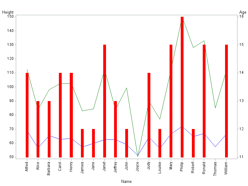
Hi to all
Can somebody tell me is it possible to create graph in SAS 9.1 like in attachment?
Regards
Thank you in advance.
Bob

Accepted Solutions

- Mark as New
- Bookmark
- Subscribe
- Mute
- RSS Feed
- Permalink
- Report Inappropriate Content
Here's one way to do it, using most any version of SAS (no matter how old)...
axis1 minor=none;
axis2 value=(angle=90) offset=(5,5);
symbol1 value=none interpol=needle width=8 color=red repeat=1;
symbol2 value=none interpol=join color=blue repeat=1;
symbol3 value=none interpol=join color=green repeat=1;
proc gplot data=sashelp.class;
plot height*name=2 weight*name=3 / overlay vaxis=axis1 haxis=axis2;
plot2 age*name=1 / vaxis=axis1 haxis=axis2;
run;
- Mark as New
- Bookmark
- Subscribe
- Mute
- RSS Feed
- Permalink
- Report Inappropriate Content
Hi Robert
Than you very much. Working like a charm but i need a little more help with these.
My data:
| data test; | |
| length week $ 2 operation $ 2 sum_week $ 5; |
format percent percentn10.2 ;
| input week operation percent sum_week; | |
| datalines; |
18 a 0.21 5842
18 b 0.34 5842
18 c 0.13 5842
18 d 0.15 5842
18 e 0.02 5842
18 f 0.11 5842
19 a 0.11 8501
19 b 0.14 8501
19 c 0.23 8501
19 d 0.25 8501
19 e 0.32 8501
19 f 0.21 8501
20 a 0.21 7007
20 b 0.34 7007
20 c 0.13 7007
20 d 0.15 7007
20 e 0.02 7007
| 20 f 0.11 7007 |
;
run;
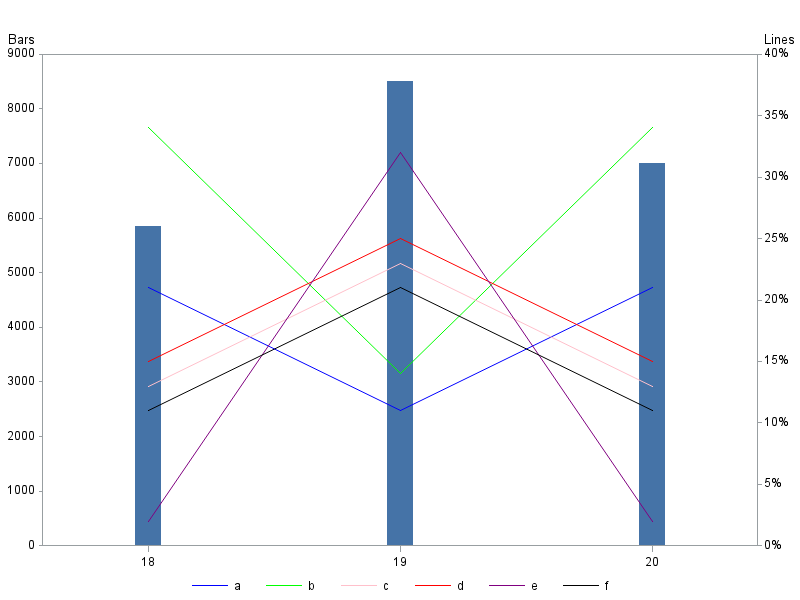
I need to export graph same as in previous attachment:
On left side percent, on vertical bar sum_week, right side sum_week, ,the five variables(a,b,c,d,e,f) should be percent for single operations and also legend for each operations color + operations name.
Thank you again .
Bob
- Mark as New
- Bookmark
- Subscribe
- Mute
- RSS Feed
- Permalink
- Report Inappropriate Content
As is usually the case, the "data prep" is the part that makes this difficult. If this is the way (rows/columns) your data is arranged in, then it'll take a little bit of manipulation (transposing, etc) to get it into the necessary format. I've written some code (below) to do this - I kinda used brute-force (... there's probably a more elegant way, if somebody wants to provide a tip! ![]()
Also, your character sum_week would cause problems, so I treat it as numeric instead (and also the character week could cause problems, unless you make sure to use the z. format to pad zeroes on the left ... I just treat it as numeric to be on the safe side).
data test;
length operation $1;
format percent percentn10.2;
input week operation percent sum_week;
datalines;
18 a 0.21 5842
18 b 0.34 5842
18 c 0.13 5842
18 d 0.15 5842
18 e 0.02 5842
18 f 0.11 5842
19 a 0.11 8501
19 b 0.14 8501
19 c 0.23 8501
19 d 0.25 8501
19 e 0.32 8501
19 f 0.21 8501
20 a 0.21 7007
20 b 0.34 7007
20 c 0.13 7007
20 d 0.15 7007
20 e 0.02 7007
20 f 0.11 7007
;
run;
proc sort data=test (drop=sum_week) out=test1;
by week;
run;
proc transpose data=test1 out=test1 (drop=_name_);
by week;
id operation;
run;
proc sql;
create table test2 as
select unique week, sum_week
from test;
create table test_final as
select unique test1.*, test2.sum_week
from test1 left join test2
on test1.week=test2.week;
quit; run;
axis1 label=('Lines') order=(0 to .40 by .05) minor=none offset=(0,0);
axis2 label=none minor=none offset=(15,15);
axis3 label=('Bars') order=(0 to 9000 by 1000) minor=none offset=(0,0);
symbol1 value=none interpol=needle width=25 color=cx4573a7 repeat=1;
symbol2 value=none interpol=join repeat=1 color=blue;
symbol3 value=none interpol=join repeat=1 color=cx00ff00;
symbol4 value=none interpol=join repeat=1 color=pink;
symbol5 value=none interpol=join repeat=1 color=red;
symbol6 value=none interpol=join repeat=1 color=purple;
symbol7 value=none interpol=join repeat=1 color=black;
legend1 position=(bottom center) down=1 label=none;
proc gplot data=test_final;
format a percent7.0;
plot sum_week*week=1 / vaxis=axis3 haxis=axis2;
plot2 a*week=2 b*week=3 c*week=4 d*week=5 e*week=6 f*week=7 / overlay
vaxis=axis1 haxis=axis2 legend=l1gend1;
run;
- Mark as New
- Bookmark
- Subscribe
- Mute
- RSS Feed
- Permalink
- Report Inappropriate Content
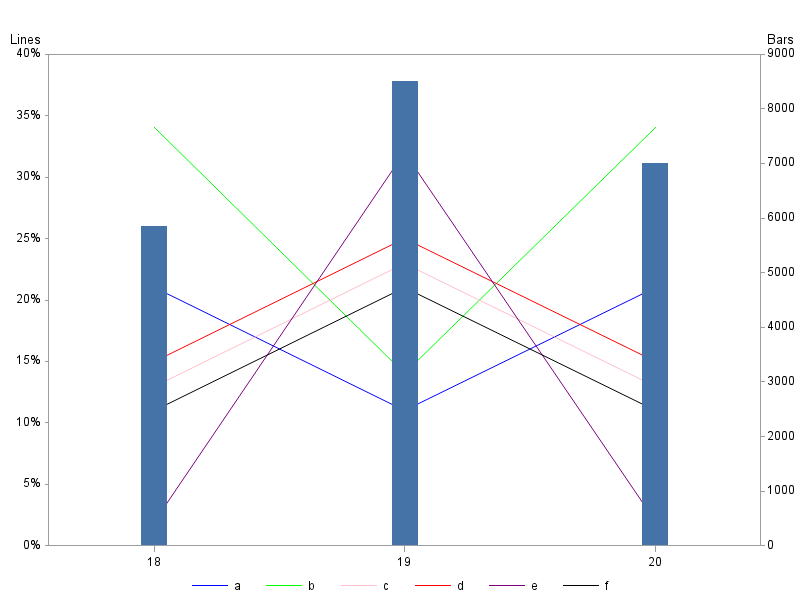
I put the line axis on the right so the lines would be on top of the bars.
If you want the line axis on the left, you can just reverse your plot & plot2 ...
(but the lines will be behind the bars)
proc gplot data=test_final;
format a percent7.0;
plot a*week=2 b*week=3 c*week=4 d*week=5 e*week=6 f*week=7 / overlay
vaxis=axis1 haxis=axis2 legend=l1gend1;
plot2 sum_week*week=1 / vaxis=axis3 haxis=axis2;
run;
- Mark as New
- Bookmark
- Subscribe
- Mute
- RSS Feed
- Permalink
- Report Inappropriate Content
Hi Robert
Thank you very much. This is great and exactly what I'm looking for.
Thank you again
Bob
- Mark as New
- Bookmark
- Subscribe
- Mute
- RSS Feed
- Permalink
- Report Inappropriate Content
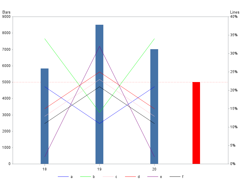
Hi Robert
Thank you for your help. Can you help me with one more thing about this graph.
I want to add new bar for every week. Target bar with fixed value 5000.
How to implement this into graph?
Thank you in advance
Bob
- Mark as New
- Bookmark
- Subscribe
- Mute
- RSS Feed
- Permalink
- Report Inappropriate Content
It would get a little tricky to add a real target bar (via inserting something in the data ... when the data changes from run to run).
So I'd recommend adding extra 'offset' space in the horizontal axis (haxis), and then annotating a bar with height of 5000 into that space. Here's an example of how to do those 2 things. Oh, and I've also added a red dashed refline at 5000, as that might be useful.
data test;
length operation $1;
format percent percentn10.2;
input week operation percent sum_week;
datalines;
18 a 0.21 5842
18 b 0.34 5842
18 c 0.13 5842
18 d 0.15 5842
18 e 0.02 5842
18 f 0.11 5842
19 a 0.11 8501
19 b 0.14 8501
19 c 0.23 8501
19 d 0.25 8501
19 e 0.32 8501
19 f 0.21 8501
20 a 0.21 7007
20 b 0.34 7007
20 c 0.13 7007
20 d 0.15 7007
20 e 0.02 7007
20 f 0.11 7007
;
run;
proc sort data=test (drop=sum_week) out=test1;
by week;
run;
proc transpose data=test1 out=test1 (drop=_name_);
by week;
id operation;
run;
proc sql;
create table test2 as
select unique week, sum_week
from test;
create table test_final as
select unique test1.*, test2.sum_week
from test1 left join test2
on test1.week=test2.week;
quit; run;
data anno_target;
xsys='3'; ysys='2'; when='a';
x=80; y=0; function='move'; output;
x=x+3; y=5000; function='bar'; style='solid'; color='red'; output;
run;
axis1 label=('Lines') order=(0 to .40 by .05) minor=none offset=(0,0);
axis2 label=none minor=none offset=(15,35);
axis3 label=('Bars') order=(0 to 9000 by 1000) minor=none offset=(0,0);
symbol1 value=none interpol=needle width=25 color=cx4573a7 repeat=1;
symbol2 value=none interpol=join repeat=1 color=blue;
symbol3 value=none interpol=join repeat=1 color=cx00ff00;
symbol4 value=none interpol=join repeat=1 color=pink;
symbol5 value=none interpol=join repeat=1 color=red;
symbol6 value=none interpol=join repeat=1 color=purple;
symbol7 value=none interpol=join repeat=1 color=black;
legend1 position=(bottom center) down=1 label=none;
proc gplot data=test_final;
format a percent7.0;
plot sum_week*week=1 / vaxis=axis3 haxis=axis2
anno=anno_target vref=5000 cvref=red lvref=33;
plot2 a*week=2 b*week=3 c*week=4 d*week=5 e*week=6 f*week=7 / overlay
vaxis=axis1 haxis=axis2 legend=l1gend1;
run;
- Mark as New
- Bookmark
- Subscribe
- Mute
- RSS Feed
- Permalink
- Report Inappropriate Content
Hi Robert
Thank you very much, working like a charm.
One more question
What in case that each week has different target (each week two connected bars in different colors ) and target value is in input test table?
Thank you again
Bob
- Mark as New
- Bookmark
- Subscribe
- Mute
- RSS Feed
- Permalink
- Report Inappropriate Content
Perhaps we should name this thread "bring me a shrubbery!" ![]()
I'm not exactly sure what you want your final graph to look like. Could you perhaps provide some sample data, and a hand-drawn version of the graph you'd like to be produced from the data?
- Mark as New
- Bookmark
- Subscribe
- Mute
- RSS Feed
- Permalink
- Report Inappropriate Content
Hi Robert
My apology for previous “explanations” I will make it simple.
data test;
format percent percentn10.2;
input week percent sum_week target;
datalines;
18 0.83 8953 8400
19 0.85 6970 6720
20 0.87 9766 8400
21 0.88 9493 8400
22 0.91 10104 8400
;
run;
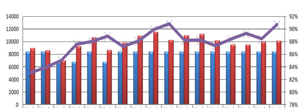
Blue – target
Red – sum_week
Purple – percent
Horizontal - week
Thank you very much
Bob
- Mark as New
- Bookmark
- Subscribe
- Mute
- RSS Feed
- Permalink
- Report Inappropriate Content
data test;
format percent percentn8.0;
input week percent sum_week target;
week_left=week-.13;
datalines;
18 0.83 8953 8400
19 0.85 6970 6720
20 0.87 9766 8400
21 0.88 9493 8400
22 0.91 10104 8400
;
run;
axis1 label=none order=(0 to 14000 by 2000) minor=none offset=(0,0);
axis2 label=none order=(.78 to .92 by .02) minor=none offset=(0,0);
axis3 label=none minor=none offset=(0,10) value=(t=1 ' ');
symbol1 value=X cv=pink height=3 interpol=join width=4 color=purple;
symbol2 value=none interpol=needle width=16 color=red;
symbol3 value=none interpol=needle width=16 color=blue;
proc gplot data=test;
plot sum_week*week=2 target*week_left=3 / overlay
vzero vaxis=axis1 haxis=axis3 autovref cvref=graydd;
plot2 percent*week=1 / vaxis=axis2;
run;
- Mark as New
- Bookmark
- Subscribe
- Mute
- RSS Feed
- Permalink
- Report Inappropriate Content
Hi Robert
Thank you very much, that is exactly what I'm looking for. ![]()
Thank you
Bob

Don't miss out on SAS Innovate - Register now for the FREE Livestream!
Can't make it to Vegas? No problem! Watch our general sessions LIVE or on-demand starting April 17th. Hear from SAS execs, best-selling author Adam Grant, Hot Ones host Sean Evans, top tech journalist Kara Swisher, AI expert Cassie Kozyrkov, and the mind-blowing dance crew iLuminate! Plus, get access to over 20 breakout sessions.
Learn how use the CAT functions in SAS to join values from multiple variables into a single value.

Find more tutorials on the SAS Users YouTube channel.
 Click image to register for webinar
Classroom Training Available!
Select SAS Training centers are offering in-person courses. View upcoming courses for:
-
12 replies
-
06-14-2013 09:33 AM
-
1963 views
-
9 likes
-
2 in conversation
-
