- Home
- /
- Programming
- /
- Graphics
- /
- Re: Resizing xaxis in sgplot
- RSS Feed
- Mark Topic as New
- Mark Topic as Read
- Float this Topic for Current User
- Bookmark
- Subscribe
- Mute
- Printer Friendly Page

- Mark as New
- Bookmark
- Subscribe
- Mute
- RSS Feed
- Permalink
- Report Inappropriate Content
I have a plot where a lot of the data is clustered around the 0 to 250 values on xaxis. It's difficult to see how many datapoints there are and so I'd like to expand the x-axis. However, the max value for the x-axis is over 2000 and there are not many datapoints in between 1000 and 2000. Therefore making the plot wider also increases the dead space. Is there any way to zoom in on the lower end of the x-axis and then truncate the the middle of the plot? Ideally, I'd like to show 0 to 500 by 50 and then 500 to 2000 by 500.
Thanks!
Sarah
Accepted Solutions

- Mark as New
- Bookmark
- Subscribe
- Mute
- RSS Feed
- Permalink
- Report Inappropriate Content
Looks like we left that off the SGPLOT scatter statement due to advent of Bubble.:
proc sgplot data=sashelp.class;
bubble x=height y=weight size=age;
run;
If you must have scatter, then use GTL.,
proc template;
define statgraph markerSize;
begingraph / datasymbols=(circlefilled squarefilled);
entrytitle 'Weight by Height by Age for all Students';
layout overlay;
scatterplot x=height y=weight / markersizeresponse=age group=sex name='a' filledoutlinedmarkers=true;
discretelegend 'a';
endlayout;
endgraph;
end;
run;
proc sgrender data=sashelp.class template=markerSize;
run;

- Mark as New
- Bookmark
- Subscribe
- Mute
- RSS Feed
- Permalink
- Report Inappropriate Content
Sarah, a few options might be to log the x-axis if there are no 0 values, or to use Broken axis. I don't know what version of SAS you have but I'm sure one of these links will help you to utilise broken axis techniques:
Broken Y-Axis - Graphically Speaking
Broken Axis - Graphically Speaking
Thanks,
Kriss
- Mark as New
- Bookmark
- Subscribe
- Mute
- RSS Feed
- Permalink
- Report Inappropriate Content
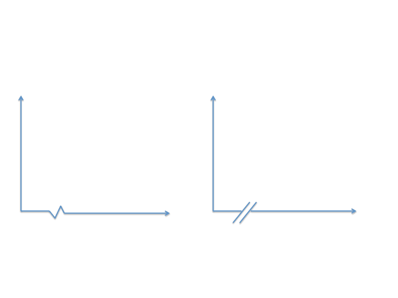
Thanks. Is there a way to limit the broken piece to just the x-axis like in the image on the right below?
Another option might be to increase the dot/bubble size according to the frequency. I have a number of the same values and increasing the size of the dot would be a good way to show the data. I have searched for this on the forum using the term bubble, but those articles usually apply to a third variable, not the frequency. Do you have any advice on that?
Thanks
- Mark as New
- Bookmark
- Subscribe
- Mute
- RSS Feed
- Permalink
- Report Inappropriate Content
For now, the options for you will be to use one of the following:
- Use the broken axis as is now, but erase the full break indicator using DRAW or Annotate.
- Use the panel idea to break (Broken Y-Axis) using GTL,and turn off the cell borders and axis lines.
- I have seen users add a break symbol like you want using draw or annotate.
To set size by frequency, generally we use a third variable for sizing. You can use the BUBBLE plot or SCATTER with MarkerSizeResponse=variable option. You will have to process your data to only keep unique (x,y) values with frequency counts. See blog article on Bivariate Response. You make a good suggestion to automatically size by frequency when the (x, y) values are identical. We will see if it is feasible to add.
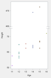
Finally, we have heard from many users including yourself that often a simple axis break may be preferred. So, while this does not help you now, I am happy to say this is now included for the next release as shown here. Multiple break symbols are supported including the ones you have shown. Break is only shown if there is an axis or frame to break. Yes, the data is made up to test the feature, with values of height > 470. ![]()
- Mark as New
- Bookmark
- Subscribe
- Mute
- RSS Feed
- Permalink
- Report Inappropriate Content
Thanks Sanjay, these are great options!
- Mark as New
- Bookmark
- Subscribe
- Mute
- RSS Feed
- Permalink
- Report Inappropriate Content
To see what you can do now, see: Axis Break Appearance Macro - Graphically Speaking
- Mark as New
- Bookmark
- Subscribe
- Mute
- RSS Feed
- Permalink
- Report Inappropriate Content
Hi Sanjay,
Thank you for these tips. With the MarkerSizeResponse=variable option, I'm unsure of how to use that. I created a frequency variable called count and added it to my program:
proc sgplot data=freqs noautolegend;
scatter x= VAR1 y=VAR2/group=VAR3 MarkerSizeResponse=count markerattrs=(size=9);
xaxis label....
run;
Thanks,
Sarah
- Mark as New
- Bookmark
- Subscribe
- Mute
- RSS Feed
- Permalink
- Report Inappropriate Content
Sorry I see now that I need to use proc template. I've never used that proc, but I got the markersizeresponse option to work with it. I'm just having trouble keeping the group variable intact so that the circles will be two different colors depending on the group.
Thanks!
Sarah
- Mark as New
- Bookmark
- Subscribe
- Mute
- RSS Feed
- Permalink
- Report Inappropriate Content
Looks like we left that off the SGPLOT scatter statement due to advent of Bubble.:
proc sgplot data=sashelp.class;
bubble x=height y=weight size=age;
run;
If you must have scatter, then use GTL.,
proc template;
define statgraph markerSize;
begingraph / datasymbols=(circlefilled squarefilled);
entrytitle 'Weight by Height by Age for all Students';
layout overlay;
scatterplot x=height y=weight / markersizeresponse=age group=sex name='a' filledoutlinedmarkers=true;
discretelegend 'a';
endlayout;
endgraph;
end;
run;
proc sgrender data=sashelp.class template=markerSize;
run;

Don't miss out on SAS Innovate - Register now for the FREE Livestream!
Can't make it to Vegas? No problem! Watch our general sessions LIVE or on-demand starting April 17th. Hear from SAS execs, best-selling author Adam Grant, Hot Ones host Sean Evans, top tech journalist Kara Swisher, AI expert Cassie Kozyrkov, and the mind-blowing dance crew iLuminate! Plus, get access to over 20 breakout sessions.
Learn how use the CAT functions in SAS to join values from multiple variables into a single value.

Find more tutorials on the SAS Users YouTube channel.
 Click image to register for webinar
Classroom Training Available!
Select SAS Training centers are offering in-person courses. View upcoming courses for:
-
8 replies
-
11-16-2014 09:42 AM
-
4976 views
-
9 likes
-
3 in conversation
-
