- Home
- /
- Programming
- /
- Graphics
- /
- Proc template or sgplanel graph with distinct axis
- RSS Feed
- Mark Topic as New
- Mark Topic as Read
- Float this Topic for Current User
- Bookmark
- Subscribe
- Mute
- Printer Friendly Page
- Mark as New
- Bookmark
- Subscribe
- Mute
- RSS Feed
- Permalink
- Report Inappropriate Content
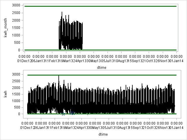
I am trying to create 2 graphs within a panel of the same series of data, where 1 is a subset of the other. Basically I want to create an overall and zoomed in view of the data. My goal is to have 1 graph's x-axis be a month and the other graph's x-axis be a year. Below is a graph that I have gotten as I want it with the exception that the axis are both on a year's scale. I would like the top graph to limit the data being graphed to where the data exists. Any suggestions for how to control the axis or create the graphs I am looking for would be appreciated.
- Mark as New
- Bookmark
- Subscribe
- Mute
- RSS Feed
- Permalink
- Report Inappropriate Content
Within proc template you can set the template up as gridded layout, see the example in this document:
http://www2.sas.com/proceedings/sugi31/262-31.pdf
Shows exactly what you want. I would also bookmark this website:
https://blogs.sas.com/content/graphicallyspeaking/
As it is an invaluable graph resource with code.
Don't miss out on SAS Innovate - Register now for the FREE Livestream!
Can't make it to Vegas? No problem! Watch our general sessions LIVE or on-demand starting April 17th. Hear from SAS execs, best-selling author Adam Grant, Hot Ones host Sean Evans, top tech journalist Kara Swisher, AI expert Cassie Kozyrkov, and the mind-blowing dance crew iLuminate! Plus, get access to over 20 breakout sessions.
Learn how use the CAT functions in SAS to join values from multiple variables into a single value.
Find more tutorials on the SAS Users YouTube channel.
 Click image to register for webinar
Classroom Training Available!
Select SAS Training centers are offering in-person courses. View upcoming courses for:


