- Home
- /
- Programming
- /
- Graphics
- /
- Proc sgplot Waterfall graph "Double" Waterfall
- RSS Feed
- Mark Topic as New
- Mark Topic as Read
- Float this Topic for Current User
- Bookmark
- Subscribe
- Mute
- Printer Friendly Page

- Mark as New
- Bookmark
- Subscribe
- Mute
- RSS Feed
- Permalink
- Report Inappropriate Content
Hello. I am using the waterfall option in proc sgplot.
I have an initial value (Full) and then several additions/subtractions A-E, resulting in 'Leftover'. The code below does this perfectly. However, I wish to further decompose 'Leftover' to attain 'Leftover2'. I want to do this by introducing a new value F=.6. Is there a way to do this? My code is below, here is a link to a picture of the desired output data Pictures, data Images, data Photos, data Videos - Image - TinyPic - Free Image Hosting, Photo S....
data have;
input category $ type $ percent order;
datalines;
X Full 1 1
X B -.04 .
X A -.02 .
X E 0 .
X D .03 .
X C .01 .
;
run;
/*additional data point*/
/*X F .6 .*/
proc sort data=have(where=(percent<0))
out=neg;
by percent;
run;
data neg;
set neg;
order=_N_+1;
run;
proc sql noprint;
select max(order) into :max_order from neg;
quit;
proc sort data=have(where=(percent>0 and type not in ("Full")))
out=pos;
by descending percent;
run;
data pos;
set pos;
order=_N_+&max_order.;
run;
data x_have;
set have(where=(type="Full")) neg pos;
run;
proc sort data=x_have;
by order;
run;
proc sgplot data=have(where=(percent ne 0)) noautolegend;
waterfall category=type response=percent / colorgroup=type dataskin=sheen datalabel name='a'
finalbartickvalue='Leftover';
;
xaxis display=(nolabel);
yaxis grid display=(nolabel) offsetmin=0;
run;
Accepted Solutions

- Mark as New
- Bookmark
- Subscribe
- Mute
- RSS Feed
- Permalink
- Report Inappropriate Content
Do you want another value F=0.6 after the leftover to get a second leftover? Waterfall does not support that.
However, you could compute the low and high value of each bar yourself in datastep, including the Leftover value, followed by F=0.6 and the final Leftover2 value. Then, use HIGHLOW plot to draw your own custom waterfall chart.
- Mark as New
- Bookmark
- Subscribe
- Mute
- RSS Feed
- Permalink
- Report Inappropriate Content
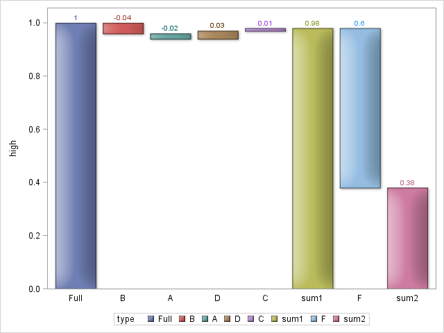
Thanks, Sanjay. I took your advice and worked through this in data steps and highlow.
data have;
input category $ type $ percent order;
datalines;
X Full 1 1
X B -.04 .
X A -.02 .
X E 0 .
X D .03 .
X C .01 .
X F .6 .
X sum1 . .
X sum2 . .
;
run;
proc sql noprint;
select sum(percent)
into :sum
from have
where type in ('A','B','C','D','E');
select percent
into :F
from have
where type='F';
select percent
into :maxperc
from have
where type="Full";
quit;
data have_mod;
set have;
if type='sum1' then percent=1+&sum.;
if type='sum2' then percent=1+&sum.-&F.;
run;
proc sort data=have_mod(where=(percent<0))
out=neg;
by percent;
run;
data neg;
set neg;
order=_N_+1;
run;
proc sql noprint;
select max(order) into :max_neg from neg;
quit;
proc sort data=have_mod(where=(percent>0 and type not in ("Full","sum1","sum2","F")))
out=pos;
by descending percent;
run;
data pos;
set pos;
order=_N_+&max_neg.;
run;
proc sql noprint;
select max(order) into :max_pos from pos;
quit;
data x_have;
set have_mod(where=(type in ("Full", "F", "sum1", "sum2"))) neg pos;
if type='sum1' then order=1+&max_pos.;
if type='F' then order=2+&max_pos.;
if type='sum2' then order=3+&max_pos.;
run;
proc sort data=x_have;
by order;
run;
proc sql noprint;
select percent, order
into :sum1, :ordersum1
from x_have
where type='sum1';
quit;
data want;
set x_have;
by category;
if first.category then sumpercent=0;
sumpercent+percent;
if type in ('sum1','F','sum2') then sumpercent=percent;
if type in ('Full','sum1','sum2') then high=sumpercent;
else if type='F' then high=&sum1.;
else if order=&ordersum1.-1 then high=&sum1.;
else if order=2 then high=&maxperc.;
else if percent>0 then high=sumpercent;
else if percent<0 then high=sumpercent+abs(percent);
if type in ('Full','sum1','sum2') then low=0;
else if percent<0 then low=sumpercent;
else if type='F' then low=high-sumpercent;
else if percent>0 then low=sumpercent-percent;
run;
proc sgplot data=want;
highlow x=type high=high low=low / group=type type=bar
groupdisplay=cluster highlabel=percent lineattrs=graphoutlines
dataskin=matte;
xaxis display=(nolabel noticks);
yaxis offsetmin=0;
run;
- Mark as New
- Bookmark
- Subscribe
- Mute
- RSS Feed
- Permalink
- Report Inappropriate Content
Cool. Did you get what you wanted? You can overlay a step plot or a series plot to join the end and start points for each bar segment.
- Mark as New
- Bookmark
- Subscribe
- Mute
- RSS Feed
- Permalink
- Report Inappropriate Content
Yes! The highlow plot was excellent. I may take your advice on the line plot as well. Thanks again.

Don't miss out on SAS Innovate - Register now for the FREE Livestream!
Can't make it to Vegas? No problem! Watch our general sessions LIVE or on-demand starting April 17th. Hear from SAS execs, best-selling author Adam Grant, Hot Ones host Sean Evans, top tech journalist Kara Swisher, AI expert Cassie Kozyrkov, and the mind-blowing dance crew iLuminate! Plus, get access to over 20 breakout sessions.
Learn how use the CAT functions in SAS to join values from multiple variables into a single value.

Find more tutorials on the SAS Users YouTube channel.
 Click image to register for webinar
Classroom Training Available!
Select SAS Training centers are offering in-person courses. View upcoming courses for:
-
4 replies
-
04-08-2015 06:32 PM
-
1656 views
-
0 likes
-
2 in conversation
-
