- Home
- /
- Programming
- /
- Graphics
- /
- Re: Proc Gchart: Pie, consistent colors
- RSS Feed
- Mark Topic as New
- Mark Topic as Read
- Float this Topic for Current User
- Bookmark
- Subscribe
- Mute
- Printer Friendly Page
- Mark as New
- Bookmark
- Subscribe
- Mute
- RSS Feed
- Permalink
- Report Inappropriate Content
I am presenting survey data and all my questions are categorical (Strongly Disagree, Disagree, Neutral, Agree, Strongly Agree). I wrote a macro using arrays and Proc Gchart to output pie charts for all of the survey questions.
Now I want all the colors to match up. For example, I want the strongly agree category to always be red in the pie chart and Strongly Disagree to always be Blue. I have been looking into this and I can't figure out how to assign colors to categories.
I know I can.
I am on SAS 9.2. I tried using goptions and the pattern.. but it seems pattern1 always lines up with the first category for that variable. Often times, a pie chart would not have all 6 categories, since all respondents would only strongly agree and agree for that statement. so if strongly agree is pattern6, in this case, the piechart uses pattern1 for strongly agree, since it is the first category with data. So I am trying to find a solution. Anyone have any thoughts?
- Mark as New
- Bookmark
- Subscribe
- Mute
- RSS Feed
- Permalink
- Report Inappropriate Content
Yes, with Gchart the first value encountered in the data gets the first pattern assignment.
Solutions involve getting the categories in the order you need.
One way is to have a data set with the values of the categorical variable in the order you want and all missing values for any summary type variables. Then the data to be graphed is appended to that set. If there are subgroup variables then all the combinations have to be in that dummy set.
This set might be easily added to your macro. Here is a stub:
data dummy;
responsevar= . ; /* this would be what the gchart summarizes*/
do catvar = 1 to 5; /* if your categorical variable is text then list IN DESIRED ORDER the values
do catvar= 'Strongly Agree','Agree','Neutral','Disgree','Strongly Disagree';
Spelling counts here!!*/
output;
end;
end;
run;
The alternative with SGplot in 9.2 is similar the data order controls the appearance assignments. 9.3 and later attributes are available to help.
- Mark as New
- Bookmark
- Subscribe
- Mute
- RSS Feed
- Permalink
- Report Inappropriate Content
Hi,
at the moment I'm dealing with a similar issue of color consistency. I tried your suggestion, but it doesn't work - I believe that GCHART ignores response values with either . or 0.
I hope I understood your post well. Here is my code:
data data1; set sashelp.cars; dummy = 1; run;
data data2; set data1; where Origin NE "Asia"; run;
data help;
length Origin $6.;
dummy = .;
do Origin = "Asia", "Europe", "USA";
output;
end;
run;
data data3; set data2 help; run;
proc sort data=data3; by Origin; run;
pattern1 color = red;
pattern2 color = green;
pattern3 color = blue;
legend1 label=none position=(right middle) across=1;
proc gchart data=data1; pie Origin / freq=dummy discrete percent=outside value=outside legend=legend1; run;
proc gchart data=data3; pie Origin / freq=dummy discrete percent=outside value=outside legend=legend1; run;
So, is there any way to make group colors consistent?
(I run SAS 9.4)
- Mark as New
- Bookmark
- Subscribe
- Mute
- RSS Feed
- Permalink
- Report Inappropriate Content
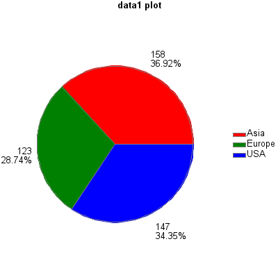
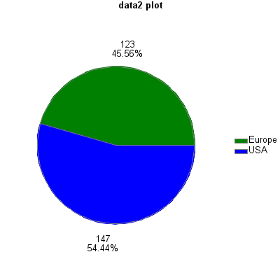
I would recommend pre-summarizing your data, and doing the frequency count yourself (rather than letting gchart do it).
Here is my slightly modified version of your code:
data data1; set sashelp.cars; run;
data data2; set data1; where Origin NE "Asia"; run;
proc sql;
create table legendfiller as select unique origin from sashelp.cars;
quit; run;
%macro do_plot(dataset);
proc sql;
create table plotdata as
select unique legendfiller.origin, count(&dataset..model) as count
from legendfiller left join &dataset
on legendfiller.origin=&dataset..origin
group by &dataset..origin;
quit; run;
data plotdata; set plotdata;
if count=. then count=0;
run;
goptions xpixels=400 ypixels=400 htext=10pt;
pattern1 color = red;
pattern2 color = green;
pattern3 color = blue;
legend1 label=none position=(right middle) across=1;
title "&dataset plot";
proc gchart data=plotdata;
pie Origin / type=sum sumvar=count percent=outside value=outside
noheader coutline=gray legend=legend1;
run;
%mend;
%do_plot(data1);
%do_plot(data2);
- Mark as New
- Bookmark
- Subscribe
- Mute
- RSS Feed
- Permalink
- Report Inappropriate Content
Thank you so much for this!
At first I was struggling with your code, because on a new clean SAS session, data 2 plot had both two categories in blue color. Then I added
goptions reset=all;and it works!
Do you happen to know what was the catch here?
Don't miss out on SAS Innovate - Register now for the FREE Livestream!
Can't make it to Vegas? No problem! Watch our general sessions LIVE or on-demand starting April 17th. Hear from SAS execs, best-selling author Adam Grant, Hot Ones host Sean Evans, top tech journalist Kara Swisher, AI expert Cassie Kozyrkov, and the mind-blowing dance crew iLuminate! Plus, get access to over 20 breakout sessions.
Learn how use the CAT functions in SAS to join values from multiple variables into a single value.
Find more tutorials on the SAS Users YouTube channel.
 Click image to register for webinar
Classroom Training Available!
Select SAS Training centers are offering in-person courses. View upcoming courses for:


