- Home
- /
- Programming
- /
- Graphics
- /
- Re: PROC SGPLOT - different value colors
- RSS Feed
- Mark Topic as New
- Mark Topic as Read
- Float this Topic for Current User
- Bookmark
- Subscribe
- Mute
- Printer Friendly Page
- Mark as New
- Bookmark
- Subscribe
- Mute
- RSS Feed
- Permalink
- Report Inappropriate Content
Hello,
Can you please advise how to assign different colors for datalabels in sgplot hbar chart? With
datalabelattrs =(color=) statement I can put just 1 color for all datalabels together, I need different color for each series (4 bars - "1","2","3" and "4" - I need to assign different color for each bar). THANK YOU!!!
proc sgplot data=Americas noborder noopaque nowall pad=0 noautolegend;
goption xpixels=400 ypixels=300;
hbar ID / response=TotalCases stat=sum datalabel group=ID dataskin=matte
nooutline nostatlabel datalabelattrs=(size=12) clusterwidth=0.9 barwidth=0.96;
styleattrs datacolors=('#D4002C' '#009354' '#EF820F' '#6C206B');
xaxis display=none valueattrs=(color=black size=11pt)
LABELATTRS=(color=black size=12pt);
yaxis values=( "1" "2" "3" "4") display=(NOVALUES NOLINE) display=none display=(noticks) label=' ' ;
run;
Accepted Solutions
- Mark as New
- Bookmark
- Subscribe
- Mute
- RSS Feed
- Permalink
- Report Inappropriate Content
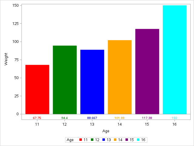
How about this approach?
proc summary data=sashelp.class nway;
class age;
var weight;
output out=class mean=;
run;

proc sgplot data=class;
styleattrs datacolors=(red green blue orange purple cyan) datacontrastcolors=(red green blue orange purple cyan);
vbarparm category=age response=weight / group=age;
xaxistable weight / colorgroup=age location=inside nolabel;
run;- Mark as New
- Bookmark
- Subscribe
- Mute
- RSS Feed
- Permalink
- Report Inappropriate Content
You can use data attribute maps to set colour and style. http://documentation.sas.com/?docsetId=grstatproc&docsetTarget=n18szqcwir8q2nn10od9hhdh2ksj.htm&docs...
- Mark as New
- Bookmark
- Subscribe
- Mute
- RSS Feed
- Permalink
- Report Inappropriate Content
Hello,
bar colors are working fine. Can you advise please how to set different colors for data labels (response values)?
E.g. - First bar is called "1" and it is red - value is 155 and should be red also. Second bar is called "2" and it is green - value is 255 and should be green ...
- Mark as New
- Bookmark
- Subscribe
- Mute
- RSS Feed
- Permalink
- Report Inappropriate Content
Bar labels use the default text color, and are not colored by group. Since the label is right above the bar, it is not clear the benefit of coloring it.
If you do need it colored, you can overlay a TEXT plot with the value and group and place it at the top of your bar. If the bars are not summarized, this will be easy. If they are summarized, then you will need to run PROC MEANS to get the computed values.
- Mark as New
- Bookmark
- Subscribe
- Mute
- RSS Feed
- Permalink
- Report Inappropriate Content
Thank you for your answer but unfortunately this will not solve my problem.
Reason why I need it colored is because the bar values can vary significantly - e.g. 10 for the first bar and 100k for the second bar. In this case the first one will not be visible because of the measuring scale. Because I am not displaying the axis values (there are about 10 charts in the ppt slide and only 1 legend is displayed for all of them) then it is not obvious what the first bar represents. To use hardcoded position of values will not be good because the bars can reach different values. Also absolute positioning is not possible for ods powerpoint output (as far as I know).
To sum up, is there an answer that this is just simply not possible with SAS?
- Mark as New
- Bookmark
- Subscribe
- Mute
- RSS Feed
- Permalink
- Report Inappropriate Content
How about this approach?
proc summary data=sashelp.class nway;
class age;
var weight;
output out=class mean=;
run;

proc sgplot data=class;
styleattrs datacolors=(red green blue orange purple cyan) datacontrastcolors=(red green blue orange purple cyan);
vbarparm category=age response=weight / group=age;
xaxistable weight / colorgroup=age location=inside nolabel;
run;- Mark as New
- Bookmark
- Subscribe
- Mute
- RSS Feed
- Permalink
- Report Inappropriate Content
Thank you very much, this solution is sufficient for my needs.
Is there any way how to set a transparent background for the axistable?
- Mark as New
- Bookmark
- Subscribe
- Mute
- RSS Feed
- Permalink
- Report Inappropriate Content
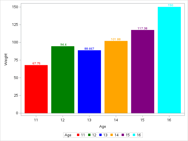
Sanjay made a great suggestion to use a TEXT plot for this case, since we are pre-computing the data. See if this works for you:
proc summary data=sashelp.class nway;
class age;
var weight;
output out=class mean=;
run;

proc sgplot data=class;
styleattrs datacolors=(red green blue orange purple cyan) datacontrastcolors=(red green blue orange purple cyan);
vbarparm category=age response=weight / group=age;
text x=age y=weight text=weight / group=age position=top;
run;Don't miss out on SAS Innovate - Register now for the FREE Livestream!
Can't make it to Vegas? No problem! Watch our general sessions LIVE or on-demand starting April 17th. Hear from SAS execs, best-selling author Adam Grant, Hot Ones host Sean Evans, top tech journalist Kara Swisher, AI expert Cassie Kozyrkov, and the mind-blowing dance crew iLuminate! Plus, get access to over 20 breakout sessions.
Learn how use the CAT functions in SAS to join values from multiple variables into a single value.
Find more tutorials on the SAS Users YouTube channel.
 Click image to register for webinar
Classroom Training Available!
Select SAS Training centers are offering in-person courses. View upcoming courses for:


