- Home
- /
- Programming
- /
- Graphics
- /
- Re: Overlay with yaxis and y2axis using same zero
- RSS Feed
- Mark Topic as New
- Mark Topic as Read
- Float this Topic for Current User
- Bookmark
- Subscribe
- Mute
- Printer Friendly Page

- Mark as New
- Bookmark
- Subscribe
- Mute
- RSS Feed
- Permalink
- Report Inappropriate Content
I'm building an overlay layout that has needle plots for trades and bandplots for cumulative positions. The positions can grow to overshadow the trades, making the needles tiny, so I've placed trades on the yaxis and the position on the y2axis. I'd like the zero value of the y axes to be the same, i.e. that the axes are scaled differently, but "pinned" to a common ground. Is this possible?

- Mark as New
- Bookmark
- Subscribe
- Mute
- RSS Feed
- Permalink
- Report Inappropriate Content
This should be doable by setting MIN =0 on both Y and Y2 axes.. You could also set OFFSETMIN=0 for both Y and Y2 axes to ensure the needles touch the X axis.
- Mark as New
- Bookmark
- Subscribe
- Mute
- RSS Feed
- Permalink
- Report Inappropriate Content
Ah, but zero is in the middle: trades and positions can be positive or negative.
- Mark as New
- Bookmark
- Subscribe
- Mute
- RSS Feed
- Permalink
- Report Inappropriate Content
Aah. Interesting. Then I suggest set the MIN and MAX for both Y and Y2 in the same proportion. So, if for band (on Y) the min= -100 and max= +200, then make the min and max for the needle (on Y2) in the same proportion. So, if the needle min= -20 and max=+20, make Y2 min= -20 and max=+40. I believe this should set the zero at the same place for both axes. Place a reference line for Y=0 and see how it lines up with Y2.
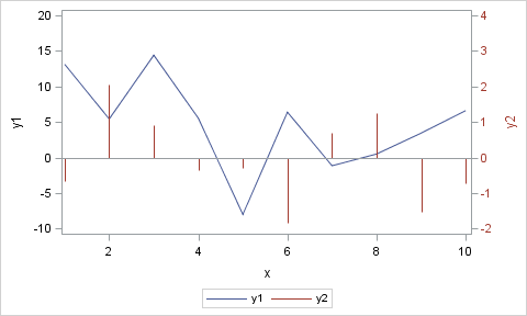
data synch;
do x=1 to 10 by 1;
y1=10*rannor(2);
y2=rannor(2);
output;
end;
run;
proc sgplot data=synch cycleattrs;
series x=x y=y1;
needle x=x y=y2 / y2axis;
refline 0;
yaxis min=-10 max=20;
y2axis min=-2 max=4 valueattrs=graphdata2 labelattrs=graphdata2;
run;
- Mark as New
- Bookmark
- Subscribe
- Mute
- RSS Feed
- Permalink
- Report Inappropriate Content
Thanks. I guess I did not overlook the built-in option for this to does it automagically.
I don't want to hard code these values, and detecting them and scaling sounds like a fair bit of effort. I'm using proc template and I'd have to pass some dynamic or macro vars, which I find troublesome (i.e. I have trouble getting them to work).
- Mark as New
- Bookmark
- Subscribe
- Mute
- RSS Feed
- Permalink
- Report Inappropriate Content
No, automatic solution at this time. Yes, you can use some logic to compute the min and max values in macro variables, and set on the axis. Alternately, do you have to use overlaid plots? Could you place each plot in its own graph, with a common x axis. Or, use the Waterfall chart, where each observation is a transaction and the cumulative result is automatically computed. Waterfall is available in SG, but to create a two cell graph with common X axis, you need GTL.
- Mark as New
- Bookmark
- Subscribe
- Mute
- RSS Feed
- Permalink
- Report Inappropriate Content
Thanks again for all the help. I don't have to use overlaid charts, and I think that's the best option. Waterfall may work, so long as I can give it a starting base value. (The graph actually has needles for two kinds of trading [stocks and swaps], a band for each, and a seriesplot fo the total cumulative position. I'm not inclined to ditch it all at this point.) It's interesting that so many chart types can be transformed to server other purposes.

Don't miss out on SAS Innovate - Register now for the FREE Livestream!
Can't make it to Vegas? No problem! Watch our general sessions LIVE or on-demand starting April 17th. Hear from SAS execs, best-selling author Adam Grant, Hot Ones host Sean Evans, top tech journalist Kara Swisher, AI expert Cassie Kozyrkov, and the mind-blowing dance crew iLuminate! Plus, get access to over 20 breakout sessions.
Learn how use the CAT functions in SAS to join values from multiple variables into a single value.

Find more tutorials on the SAS Users YouTube channel.
 Click image to register for webinar
Classroom Training Available!
Select SAS Training centers are offering in-person courses. View upcoming courses for:
-
6 replies
-
02-24-2014 01:26 PM
-
1415 views
-
6 likes
-
2 in conversation
-
