- Home
- /
- Programming
- /
- Graphics
- /
- Re: Need assistance replicating a bar chart
- RSS Feed
- Mark Topic as New
- Mark Topic as Read
- Float this Topic for Current User
- Bookmark
- Subscribe
- Mute
- Printer Friendly Page
- Mark as New
- Bookmark
- Subscribe
- Mute
- RSS Feed
- Permalink
- Report Inappropriate Content
Hello everyone,
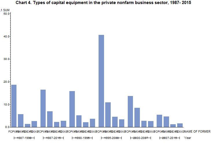
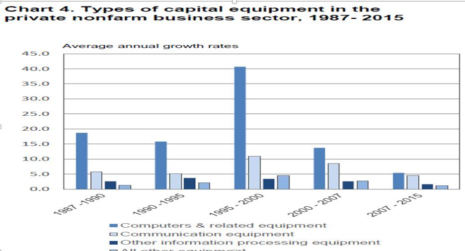
I wanted to ask for some help with graphs. Specifically bar charts. I am trying to replicate a chart that is normally done in excel. I have made some efforts using PROC GCHART but I did not come close, only in shape of the bar chart and grouping.
The image I am trying to replicate is attached and is called ORGINAL1.jpg
Here is the table I am using
data chartexample;
input year $9. FCPIXG FMIXG FOIXG FOEXG;
datalines;
1987-2015 16.5 6.9 2.7 2.3
1987-1990 18.7 5.7 2.6 1.3
1990-1995 15.8 5.2 3.7 2.1
1995-2000 40.7 10.9 3.4 4.5
2000-2007 13.7 8.5 2.6 2.7
2007-2015 5.4 4.6 1.6 1.2
;
run;
This is the code I used to attempt the replication.
proc sort data=chart4 out=yo;
by year; run;
proc transpose data=yo out=chrto;
by year;
var FCPIXG FMIXG FOIXG FOEXG;
run;
title 'Chart 4. Types of capital equipment in the private nonfarm business sector, 1987- 20XX ';
proc gchart data=chrto;
vbar _NAME_ / noframe sumvar=col1 group=year
legend = legend1
coutline=same ;
run ;
quit ;
The output graph is attached and is called IMAGE1.jpg
Any assistance (links, websites) would be greatly appreciated.
Best,


Accepted Solutions
- Mark as New
- Bookmark
- Subscribe
- Mute
- RSS Feed
- Permalink
- Report Inappropriate Content
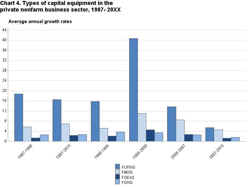
I'm not clear on which elements you are looking to replicate and how exactly you want to replicate them, but the SGPLOT below gets you the general type of graph you want. Also, I did not know how to map your variables to the descriptions, so you'll want to make sure that's correct. Otherwise, take a look and then see what elements need to be fixed. If you cannot figure out how to fix them, I'll be happy to see if I know how.
data chartexample;
input year $9. FCPIXG FMIXG FOIXG FOEXG;
datalines;
1987-2015 16.5 6.9 2.7 2.3
1987-1990 18.7 5.7 2.6 1.3
1990-1995 15.8 5.2 3.7 2.1
1995-2000 40.7 10.9 3.4 4.5
2000-2007 13.7 8.5 2.6 2.7
2007-2015 5.4 4.6 1.6 1.2
;

proc sort data=chartexample out = chartexample2;
    by year;
run;

proc transpose data=chartexample2 out=chartexample3(rename=(_name_ = eqType)) ;
    by year;
    var FCPIXG FMIXG FOIXG FOEXG;
run;

proc format;
    value $eq
    'FCPIXG' = 'Computers & related...'
    'FMIXG' = 'Communication...'
    'FOIXG' = 'Other information...'
    'FOEXG' = 'All other...';
run;

proc sgplot data = chartexample3 noautolegend;
    title 'Chart 4. Types of capital equipment in the private nonfarm business sector, 1987- 20XX ';
    format eqType $eq.;
    vbar year / group = eqType response = col1 groupdisplay = cluster name = 'yr';
    xaxis display=(nolabel);
    yaxis display=(nolabel);
    keylegend 'yr' / noborder across = 1;
run;
- Mark as New
- Bookmark
- Subscribe
- Mute
- RSS Feed
- Permalink
- Report Inappropriate Content
Thank you for responding. Your code produced the answer I was looking for. I haven’t had much experience with SGPLOT but seeing the output generated is enough for me to start exploring. I need to do some additional formatting, (add the gridlines) but that shouldn’t be too much.
Thanks
- Mark as New
- Bookmark
- Subscribe
- Mute
- RSS Feed
- Permalink
- Report Inappropriate Content
You were on the right track - you just needed to fine-tune it with a few more options ...
data chart4;
input year $9. FCPIXG FMIXG FOIXG FOEXG;
datalines;
1987-2015 16.5 6.9 2.7 2.3
1987-1990 18.7 5.7 2.6 1.3
1990-1995 15.8 5.2 3.7 2.1
1995-2000 40.7 10.9 3.4 4.5
2000-2007 13.7 8.5 2.6 2.7
2007-2015 5.4 4.6 1.6 1.2
;
run;
proc sort data=chart4 out=yo;
by year; run;
proc transpose data=yo out=chrto;
by year;
var FCPIXG FMIXG FOIXG FOEXG;
run;
axis1 label=none value=none;
axis2 label=none value=(angle=45) offset=(3,3);
axis3 label=none order=(0 to 45 by 4) major=none minor=none;
legend1 label=none across=1 shape=bar(.15in,.15in);
pattern1 v=s c=cx4f81be;
pattern2 v=s c=cxc5daef;
pattern3 v=s c=cx1f487c;
pattern4 v=s c=cx8cb4e5;
title1 j=l h=3pct 'Chart 4. Types of capital equipment in the';
title2 j=l h=3pct 'private nonfarm business sector, 1987- 20XX ';
title3 ' ';
title4 j=l move=(+4,+0) 'Average annual growth rates';
proc gchart data=chrto;
vbar _NAME_ / subgroup=_name_
noframe sumvar=col1 group=year
legend = legend1
maxis=axis1 gaxis=axis2 raxis=axis3 space=0
legend=legend1
autoref clipref cref=graydd
coutline=gray55;
run ;
quit ;
- Mark as New
- Bookmark
- Subscribe
- Mute
- RSS Feed
- Permalink
- Report Inappropriate Content
Hi Robert,
Thank you for responding. Your code produced the answer I was looking for. I am actually a big fan of yours when it comes to creating geospatial heat maps. I usually go to your site(http://robslink.com/SAS/Home.htm) often for clues for the next great visualization project in SAS…
Many thanks.
Don't miss out on SAS Innovate - Register now for the FREE Livestream!
Can't make it to Vegas? No problem! Watch our general sessions LIVE or on-demand starting April 17th. Hear from SAS execs, best-selling author Adam Grant, Hot Ones host Sean Evans, top tech journalist Kara Swisher, AI expert Cassie Kozyrkov, and the mind-blowing dance crew iLuminate! Plus, get access to over 20 breakout sessions.
Learn how use the CAT functions in SAS to join values from multiple variables into a single value.
Find more tutorials on the SAS Users YouTube channel.
 Click image to register for webinar
Classroom Training Available!
Select SAS Training centers are offering in-person courses. View upcoming courses for:


