- Home
- /
- Programming
- /
- Graphics
- /
- Lognormal scale boxplot
- RSS Feed
- Mark Topic as New
- Mark Topic as Read
- Float this Topic for Current User
- Bookmark
- Subscribe
- Mute
- Printer Friendly Page

- Mark as New
- Bookmark
- Subscribe
- Mute
- RSS Feed
- Permalink
- Report Inappropriate Content
Hi all,
This SGPLOT-HBOX graph is almost what I want
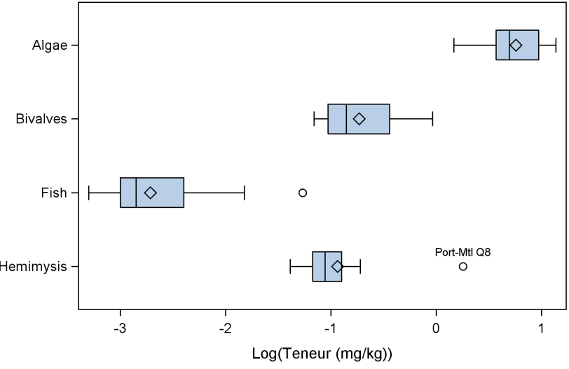
It shows the distribution of a concentration on a log10 scale. Means and far outliers are also determined on a log scale. What I would like is the X axis to show original units instead of log units. I need a solution that will accommodate BY processing with varying ranges on the X axis.
Thanks.
PG
Accepted Solutions

- Mark as New
- Bookmark
- Subscribe
- Mute
- RSS Feed
- Permalink
- Report Inappropriate Content
Here is a trick that might work for you:
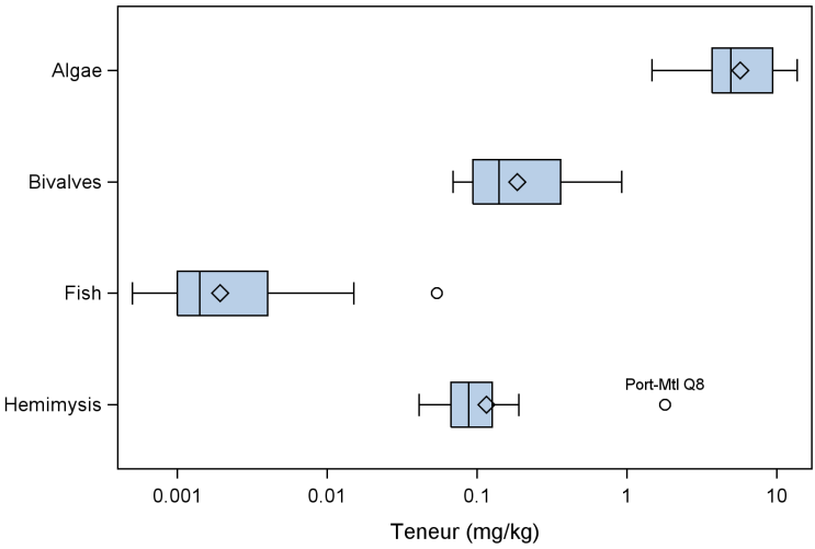
1. Create a user-defined format that maps the log tick values back to the original values. Create a mapping that will encompass the total range of data across the BY-groups. The INTEGER option that you're using should make that mapping easier to create.
2. Use the TICKVALUEFORMAT option to assign the format to the X-axis.
Hope that helps!
Dan
- Mark as New
- Bookmark
- Subscribe
- Mute
- RSS Feed
- Permalink
- Report Inappropriate Content
Can you post the SGPLOT code you're using? What logstyle are you using?
- Mark as New
- Bookmark
- Subscribe
- Mute
- RSS Feed
- Permalink
- Report Inappropriate Content
Here is the code
proc sgplot data=metDet;
by element;
hbox logvaleur / category=grpOrganisme datalabel=site labelfar;
*xaxis type=log logbase=10 label="Teneur (mg/kg)";
xaxis label="Log(Teneur (mg/kg))" integer;
yaxis display=(nolabel);
run;
If I use the commented out XAXIS and valeur instead of logvaleur, the mean and outliers (and whiskers, I think) will be determined on a linear scale, which is not what I want.
PG
Message was edited by: PG Added the change of variable required to go to a linear scale.
- Mark as New
- Bookmark
- Subscribe
- Mute
- RSS Feed
- Permalink
- Report Inappropriate Content
Here is a trick that might work for you:
1. Create a user-defined format that maps the log tick values back to the original values. Create a mapping that will encompass the total range of data across the BY-groups. The INTEGER option that you're using should make that mapping easier to create.
2. Use the TICKVALUEFORMAT option to assign the format to the X-axis.
Hope that helps!
Dan
- Mark as New
- Bookmark
- Subscribe
- Mute
- RSS Feed
- Permalink
- Report Inappropriate Content
But that's cheating! OK, I'll try it ![]() . Thanks Dan. - PG
. Thanks Dan. - PG
- Mark as New
- Bookmark
- Subscribe
- Mute
- RSS Feed
- Permalink
- Report Inappropriate Content
It worked nicely in most cases. It wouldn't look good for cases where the X range is too short.
Thanks again!
PG

Don't miss out on SAS Innovate - Register now for the FREE Livestream!
Can't make it to Vegas? No problem! Watch our general sessions LIVE or on-demand starting April 17th. Hear from SAS execs, best-selling author Adam Grant, Hot Ones host Sean Evans, top tech journalist Kara Swisher, AI expert Cassie Kozyrkov, and the mind-blowing dance crew iLuminate! Plus, get access to over 20 breakout sessions.
Learn how use the CAT functions in SAS to join values from multiple variables into a single value.

Find more tutorials on the SAS Users YouTube channel.
 Click image to register for webinar
Classroom Training Available!
Select SAS Training centers are offering in-person courses. View upcoming courses for:
-
5 replies
-
08-28-2013 12:20 PM
-
2091 views
-
0 likes
-
2 in conversation
-
