- Home
- /
- Programming
- /
- Graphics
- /
- Re: Linked micromaps in SAS
- RSS Feed
- Mark Topic as New
- Mark Topic as Read
- Float this Topic for Current User
- Bookmark
- Subscribe
- Mute
- Printer Friendly Page

- Mark as New
- Bookmark
- Subscribe
- Mute
- RSS Feed
- Permalink
- Report Inappropriate Content
I recently started reading an excellent book "Visualizing Data Patterns with Micromaps " by Carr and Pickle on visualizing geographical data linked to graphical plots. As an example, see below for an example of linked micromaps from their R package.
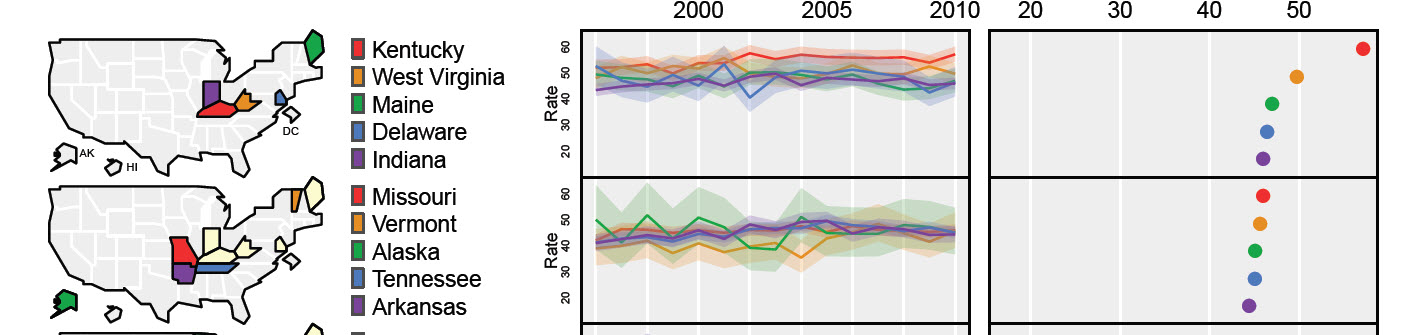
I tried replicating the above graph using SAS 9.3 sgplot and sgpanel. I have not been successful so far,
Below are my questions:
1, What SAS procedures show I use to create the time series and dot plots as shown above ?
2. How to create a legend like the one above ?
3. How to arrange maps/legends and plots as shown above ? Specifically procedures. I have tried using SAS proc greplay but have not been successful so far?
Any help would be greatly appreciated.
Thanks

- Mark as New
- Bookmark
- Subscribe
- Mute
- RSS Feed
- Permalink
- Report Inappropriate Content
If the map, labels, and two graphs need to line up nicely, I suggest using GTL. With SAS 9.3, the map can only be an outline shape. Some examples have been shown in Graphically Speaking blog. With SAS 9.4M1, one can use the POLYGON plot to create filled and choro maps.
- Mark as New
- Bookmark
- Subscribe
- Mute
- RSS Feed
- Permalink
- Report Inappropriate Content
@Sanjay, I'm only aware of Polygon plot in sgplot, can you please let me know if I can use the same in the GTL/proc template. Graphically speaking blog is great, can you please point me to the examples that you are referring. Many Thanks

Don't miss out on SAS Innovate - Register now for the FREE Livestream!
Can't make it to Vegas? No problem! Watch our general sessions LIVE or on-demand starting April 17th. Hear from SAS execs, best-selling author Adam Grant, Hot Ones host Sean Evans, top tech journalist Kara Swisher, AI expert Cassie Kozyrkov, and the mind-blowing dance crew iLuminate! Plus, get access to over 20 breakout sessions.
Learn how use the CAT functions in SAS to join values from multiple variables into a single value.

Find more tutorials on the SAS Users YouTube channel.
 Click image to register for webinar
Classroom Training Available!
Select SAS Training centers are offering in-person courses. View upcoming courses for:
-
2 replies
-
03-02-2015 08:09 PM
-
959 views
-
0 likes
-
2 in conversation
-
