- Home
- /
- Programming
- /
- Graphics
- /
- Re: Linear values on a log-scale y-axis
- RSS Feed
- Mark Topic as New
- Mark Topic as Read
- Float this Topic for Current User
- Bookmark
- Subscribe
- Mute
- Printer Friendly Page
- Mark as New
- Bookmark
- Subscribe
- Mute
- RSS Feed
- Permalink
- Report Inappropriate Content
Hi.
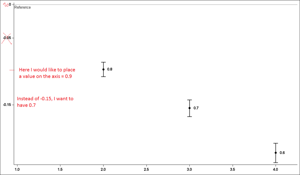
I have hazard ratios (HR) from a survival model. I want to plot the log of HR with the associated confidence interval, BUT display the LINEAR values.
I got the data labels to show the linear values, but I can't figure out how to modify the y-axis to plot the log values, but show the linear values.
Below is what I have, as an example,
data have;
input Group HR Low High;
l_hr=log10(hr);
l_low=log10(low);
l_high=log10(high);
datalines;
1 . . .
2 0.80 0.78 0.82
3 0.70 0.68 0.72
4 0.60 0.58 0.62
;
run;
proc template;
define statgraph Graph;
dynamic _GROUP _L_HR _L_HIGH _L_LOW _HR;
begingraph / designwidth=1327 designheight=775;
layout lattice / rowdatarange=data columndatarange=data rowgutter=10 columngutter=10;
layout overlay / walldisplay=none xaxisopts=( display=(TICKS TICKVALUES LINE )
tickvalueattrs=(size=12 style=NORMAL weight=BOLD ))
yaxisopts=( display=(TICKS TICKVALUES LINE )
tickvalueattrs=(size=12 style=NORMAL weight=BOLD)
linearopts=( /*tickvaluesequence=( start=-0.25 end=0.0 INCREMENT = 0.05)*/
tickvaluelist=(-0.25 -0.15 -0.05 0.00 )) logopts=( base=10));
scatterplot x=_GROUP y=_L_HR / datalabel=_HR yerrorupper=_L_HIGH yerrorlower=_L_LOW name='scatter'
datalabelposition=RIGHT datalabelattrs = (size = 12 WEIGHT = BOLD) markerattrs=(symbol=CIRCLEFILLED size=9 ) errorbarattrs=(thickness=2 );
referenceline y=0.0 / name='href' curvelabel = "Reference"
curvelabelposition = min curvelabelattrs = (size = 12) yaxis=Y;
endlayout;
endlayout;
endgraph;
end;
run;
proc sgrender data=WORK.have template=Graph;
dynamic _GROUP="GROUP" _L_HR="'L_HR'n" _L_HIGH="'L_HIGH'n" _L_LOW="'L_LOW'n" _HR="HR";
run;
Any suggestions are appreciated!
Thank you!
Anca.
PS: how can I paste SAS code in this compose box and make it look like SAS code (color coded)?

Accepted Solutions
- Mark as New
- Bookmark
- Subscribe
- Mute
- RSS Feed
- Permalink
- Report Inappropriate Content
You are transforming the data itself into the log scale. What if you keep the data as is, and set the Y axis to log?
- Mark as New
- Bookmark
- Subscribe
- Mute
- RSS Feed
- Permalink
- Report Inappropriate Content
You are transforming the data itself into the log scale. What if you keep the data as is, and set the Y axis to log?
- Mark as New
- Bookmark
- Subscribe
- Mute
- RSS Feed
- Permalink
- Report Inappropriate Content
Thank you Sanjay,
I was transferring from old way of GPLOT + ANNO where I needed to use the logs...
Thanks.
Got it!
Anca.
Don't miss out on SAS Innovate - Register now for the FREE Livestream!
Can't make it to Vegas? No problem! Watch our general sessions LIVE or on-demand starting April 17th. Hear from SAS execs, best-selling author Adam Grant, Hot Ones host Sean Evans, top tech journalist Kara Swisher, AI expert Cassie Kozyrkov, and the mind-blowing dance crew iLuminate! Plus, get access to over 20 breakout sessions.
Learn how use the CAT functions in SAS to join values from multiple variables into a single value.
Find more tutorials on the SAS Users YouTube channel.
 Click image to register for webinar
Classroom Training Available!
Select SAS Training centers are offering in-person courses. View upcoming courses for:


